Know your NEM: Watch the ISP, not the NEG

Figure 7: electricity volumes

ISP is the key

Whatever the pro coal lobby thinks about the National Energy Guarantee (NEG), it’s going to work itself into a full lather when it realises the implications of the forthcoming Integrated System Plan (ISP).

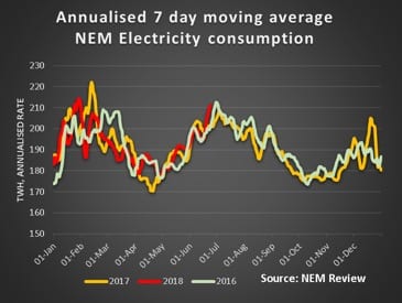
That’s due to be released in the next week or so. It has many, many implications, but perhaps the most critical will be how to manage the investment in an era of flat consumption.

Of course, electric vehicles could, over time, boost consumption and thereby make all the required investment easier, but – naturally – we don’t have an EV policy.

To put a dimension on this, Australian vehicles travel about 250 billion kms per year. If we work on 19 kilowatt hours per 100 km for an EV, that implies 100% replacement would be around 130TWh. Since that includes West Australia, it’s about 45% of current electricity demand.

Looked at another way, there are about 450,000 new vehicle sales a year driving on average 13.5 000km each per year for about 3TWh of electricity if they were all electric. So at our current pace its going to take a while ….

So, leaving that aside we need to manage the transmission investment and the new plants to meet the Queensland and Victorian renewable targets, and the coal replacement in NSW against flat demand.

That’s even after we agree on the ISP. Fortunately, the ISP won’t require COAG to come on board, but it will required the AEMC to dump its antiquated RIT-1 test for new interconnectors.

Let’s hope the new AEMC commissioners can help AEMC chairman John Pierce finally join the 21stcentury.

China

May statistics were released for China last week. The investment banks are divided about the outlook for China. There is tightness in the China banking sector but there is ongoing property growth. Even in China you can’t  have both for an extended period of time.

Your analyst’s focus remains on one key indicator. New floorspace started. When this is growing China’s industrial economy will continue to move forward, cement, aluminium, petrochemicals all find markets in construction. Meanwhile thermal electricity production is growing and carbon emissions with it.

Figure 1 China selected stats. Source: China Bureau of Statistics

The market action

We have made changes to our data:

FY22 base load futures have been added to the summary table. As Liddell closes in FY22 you probably want to keep an eye out for the NSW futures price that year.

It’s been in our chart for a while and what we notice is that the NSW price is now just $4/MWh below the South Australian price.

We plan to write more about energy v capacity market designs. As a first step now publish the weekly cap prices for the NEM regions.

In the interests of space this is just a chart to start with. The chart speaks for itself, at least to start with.

We will add some interpretation later. Caps are only quoted by the ASX out to 2021 but baseload futures are to 2022. Go figure.

Figure 2 Cap prices by State. Source: NEM Review

We have added spot LNG prices, to the extent that Factset carries them.

These seem to represent the Japanese LNG import price. We are still learning what this data actually represents but it’s safe to say that adjusted for transport costs (the net-back price) this is what domestic gas users in Australia have to compete with to get an LNG manufacturer’s attention.

These kind of prices would not fill me with joy if I was looking to buy from an Australian LNG importer.

Gas prices rising

The main feature of a colder week has been rising spot gas prices. These are now at last year’s levels (fig 15). Despite some low spot prices in QLD overall the spot market was above last year’s level driven by higher consumption across each region in the NEM.

As we remark else where futures and cap prices in the out years in South Australia, traditionally the expensive State are now very close to NSW and that’s despite NSW’s ability to import cheap power from QLD.

REC prices are still being quoted for the out years but you would have to be an optimist to think you could trade much in those years.

Figure 3: Summary
Figure 4: Commodity prices. Source: Factset

The gap between US and Australian bond rates has widened marginally. It’s the coal price though, particularly in A$ that is most relevant to electricity markets.

The spot price is more than 2.5X higher than the numbers used by AEMO in its ISP assumptions work sheet.

Think about it….. The AEMO numbers are quoted in $/GJ, whereas we show Japan quality (higher than South Korean, and signicantly higher than Australia) in $/t. How many GJ per ton? Answers on a postcard please.

Share Prices

Figure 5 Selected utility share prices

We’ll be adding in some listed solar fund(s) here soon. However, being infrastructure yield based investments share prices will tend to mostly move with interest rates and deal flow. Ie the prices won’t change much of the time.

Of course, keen readers will appreciate that the 7.6% yield quoted by New Energy Solar as the acquisition metric for the Manildra PV farm is not its internal rate of return [IRR] The yield is the short term project yield defined as revenue less opex.

It excludes depreciation, interest and tax.

However, it only goes out to 2030. To get to the value of the project you really need to factor in your estimate of the post 2030 revenue.

We very much doubt that this project will be getting $80 MWh in real terms post 2030.

Figure 6: Weekly and monthly share price performance

Volumes

Figure 7: electricity volumes

Baseload futures, $MWh

Figure 12: Baseload futures financial year time weighted average

Figure 12: Baseload futures financial year time weighted average

REC prices

Figure 13 Source: Mercari

Gas Prices

Figure 14: STTM gas prices


Figure 15 30 day moving average of Adelaide, Brisbane, Sydney STTM price. Source: AEMO

David Leitch is principal of ITK. He was formerly a Utility Analyst for leading investment banks over the past 30 years. The views expressed are his own. Please note our new section, Energy Markets, which will include analysis from Leitch on the energy markets and broader energy issues. And also note our live generation widget, and the APVI solar contribution.

David Leitch is a regular contributor to Renew Economy and co-host of the weekly Energy Insiders Podcast. He is principal at ITK, specialising in analysis of electricity, gas and decarbonisation drawn from 33 years experience in stockbroking research & analysis for UBS, JPMorgan and predecessor firms.

Comments

10 responses to “Know your NEM: Watch the ISP, not the NEG”

  1. trackdaze Avatar
    trackdaze

    I think there are about 1,000,000 vehicles sales per year perhaps the 450,000 is net additions?

    1. David leitch Avatar
      David leitch

      track daze

      Thank you for pointing out the very sizeable (100%) mistake I made in new vehicle sales. I misread some stats. Hate making mistakes but they are inevitable and better pointed out.

      Of course despite the size of the error it doesn’t really alter the conclusion that even with aggressive EV policy it will take some time for EVs to get to a big share of new vehicle sales and even longer to have much impact on NEM wide electricity consumption.

    2. Joe Avatar
      Joe

      Tracki, I can help with those new vehicle sale numbers….there were 1,182,000 new vehicle sales in Australia last year.

    3. Roger M Avatar
      Roger M

      Actually 1 180 000 vehicles or so for 2017 according to ABS, 900,000 cars and SUVs and 280 000 ‘other’ .

      http://www.abs.gov.au/ausstats/[email protected]/mf/9314.0

  2. Peter F Avatar
    Peter F

    Another calculation that might need to be checked is the energy used for electrification of transport. Australia uses about 45 ML of petrol, diesel and LPG per year, that includes all off road, agricultural, mining and stationary diesel generation.

    The average light vehicle uses about 12-13 kWh per 100 km, allowing for distribution losses say 14. The average ICE light vehicle in the current fleet i.e. including all the 6 cylinder an V* vehicles still on the road real world use is about 6 -15 L/100 km perhaps a little more. Diesel is more efficient, LPG significantly less. There is also about another 7% of the energy used in fossil fuels is used for refining and distribution so lets say a net 9 L/100 km
    Thus in transport applications we can say that one litre of fuel delivers the equivalent transport energy of 14/9 kWh. If 75% of diesel is used on road that would mean that we need to displace 40 ML of fuel with 61 TWh of electricity i.e. about half the figure derived from primary energy calculations
    I checked that calculation by comparing consumption of Leaf, Tesla S, Proterra Bus, and Workhorse and Mercedes trucks and I actually got a slightly lower figure.
    One would imagine improved transport logistics and more public transport etc could also be employed to improve transport efficiency over time as well.

    If we followed NEW York state and legislated for 3% efficiency gain per year that is roughly 6 TWh per year, more than double the increased transport demand if we had a 20 year transition.

    1. MaxG Avatar
      MaxG

      I like your quick numbers; but… are you sure about this one? “The average light vehicle uses about 12-13 kWh per 100 km”. EVs are in the ball park of ~20kWh/100km. There are ~10kWh in one litre fuel; at 8l/100km, we’re talking some 80kWh/100km for an ICE vehicle. Unless I am off the chart, you may want to reconsider your calculation.

      1. Peter F Avatar
        Peter F

        There are three key issues here only between 15% and 40% of the energy in petrol gets converted to motion whereas about 90% of the battery charge gets converted. The second is that regen extends range on battery powered vehicles and the third is the battery powered vehicle does not waste any fuel starting or idling
        The Hyundai IoniQ is tested at 320 km on 28 kWh – 8.75 kWh/100km BMW I3 200 km on 27 kWh – 13.5kWh/100km . The Tesla model S 75 about 420 km on 75 kWh about 18.5kWh/100km, my figure is a probably a bit optimistic, say 13-16 kWh, but if you up the figure I used from 14 goes to 16 it still only means 70 TWh.

  3. Andy Saunders Avatar
    Andy Saunders

    “Answers on a postcard please”

    Newcastle

    Coal is priced on either a 6,000 (API 6) or 5,500 kcal/kg NAR (Net as received – corrects for the energy lost in vaporising moisture) basis ex-Newcastle (which is the largest thermal coal export port). See page 10: https://cdn.ihs.com/Coal-Methodology/IHS-Energy-Thermal-petcoke-methodology.pdf. Actually the range is up to 200-300kcal less than that.

    The actual heat content varies from mine to mine (and even shipment to shipment). But I think ex-Newcastle if you took 5800 you wouldn’t be far from the truth.

    Plenty of other factors influence coal quality though, such as ash and sulphur content. And the heat content (and ash etc content) can be changed by washing.

    One kcal/kg is 0.004184 MJ/kg, I think you can do the rest…

    1. Peter F Avatar
      Peter F

      The US$110 is for 6,000 kCal about 25 GJ/tonne, usually low sulphur, low moisture and low ash. Some Australian power stations use 18-20 GJ coal which is as high as 22% ash and high sulphur. The quality is so bad that it is not even allowed to be unloaded in China and soon Korea so our coal plants are probably buying it locally for $35-70/tonne. Even allowing for the lower thermal content that means some of them have a current fuel cost in the order of $18-40/MWh. There are also mixed supply mines where to get at the valuable met coal they have to get through lower grade steaming coal. The mines would probably take $20/tonne for that as otherwise it is just waste.

      Probably the bigger threat to black coal is that which killed the SA plants, a combination of high maintenance on old plants and high cycling costs, because more and more often they will be facing very low or negative prices.

      Sometimes you should be careful what you wish for, the old thinking was that more interconnectors from NSW would stabilise prices and supplies in SA, Queensland and Victoria. However in practice by the time Stockyard Creek comes on line, all three states will be net exporters to NSW. So if interconnections are strengthened, it will mean Kogan Creek and Loy Yang which are both much cheaper to run than NSW plants will combine with increased renewable generation in NSW to displace not only Liddell but probably the equivalent of Point Piper and vales Point as well

  4. Peter F Avatar
    Peter F

    Some other comments:
    1. Snowy hydro will be rubbing their hands with glee at the trend in NSW cap prices
    2. I suspect the market is underestimating the effect that the ongoing installation of renewables will be. There are are three factors to be considered,
    a) Marginal changes in supply often affect the price by a much bigger % than change in supply. We saw this with the removal of 1.4 GW with the closure of Hazelwood. Neglecting rooftop solar and allowing for the difference in capacity factor, the new renewable coming into the grid over the three years since Hazelwoods closure will supply about double Hazelwoods output
    b) The increased generation hours from low wind style wind turbines and tracking solar as well as the marginal affect of batteries will significantly reduce the number of hours where FF generators can bid the price beyond $200/MWh even if total renewable energy did not increase
    c) The gas share will decline rapidly forcing base costs down

Get up to 3 quotes from pre-vetted solar (and battery) installers.