What you will learn from this article
- There is a shortage of “efficient” base load electricity supply in South Australia.
- The shortage is mainly due to the second half of Pelican Point been effectively withdrawn from the market. The AEMO was aware of the withdrawal and mentioned it in the October 2015 update on the South Australian “Electricity Statement of Opportunities”. Still, we can’t find any public announcement. That combined with, as it turns out, nearly simultaneous closure of Northern Power Station and the mismatch between those closures and the upgrades and the announced closures of the first half of Pelican Point have made South Australia dependent in the short term on very inefficient and very high cost open cycle gas generators.
- Had Pelican Point been operating at full capacity pool prices would have been at least $100 MWh lower in July and, we expect, possibly even more. Pelican Point’s owner Engie is perfectly within its rights to sell the gas and withdraw Pelican Point from service, if that is what it has done, but it could have been far more public about it, at least in our view. For what its worth, the AEMO report shows Pelican Point back in operation at 50% of capacity from 2017. This remains a poor outcome from South Australia’s point of view on the assumption that Pelican Point can ramp up and down as efficiently as say TIPS B (Torrens Island B). This is a technical point that your author has yet to resolve.
- The high pool prices are largely irrelevant to the prices South Australian consumers pay for electricity because the majority of the pool sales are hedged in one form or another. However, futures prices in South Australia are $30-$40 MWh higher than in the Eastern States at least for the next couple of years. That means household consumer prices could be 10-15% higher than those in Victoria. Industrial electricity prices in South Australia will also be higher than in Victoria by the same 30-40 $MWh but a bigger %. Industrial demand for electricity in South Australia is small (less than Tasmania) so from a national perspective this isn’t that important.
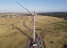
- For the renewable industry South Australia does throw up the challenge that it needs a lot of wind, far more than South Australia has right now, a lot of rooftop PV and some dispatchable renewables if South Australia is to remain a good example of high renewables penetration.
- The existing wind farms in South Australia are statistically highly correlated with total wind output. You would have to build a lot more wind farms in the area to significantly reduce the volatility of output. Almost certainly its better to build new wind in a different State or to build a different form of renewable energy less correlated with wind, or alternatively to store the wind energy and better correlate output with demand. Also wind output and demand are not correlated. In fact the correlation coefficient was negative .18 for the period.
Prices are high in the pool
In our view there is a lot of noise about South Australia and not enough analysis. It’s undeniable that pool prices in South Australia have been high recently. Pool prices have been high across the NEM for months now despite flattish demand, but they have been especially high in South Australia.
Pool prices act mainly as a supply and demand indicator
Higher prices in the pool actually don’t mean very much for consumers in the first instance. Pool prices are basically just the mechanism for determining which generators will run. In ITK’s opinion at least 75% of pool revenues will be covered by hedging contracts of one sort or another. Those hedging contracts will either be baseload contracts for differences. Ie if retailer A and generator B agree to buy and sell electricity for say $50 MWh and the pool price is $200 MWh then retailer pays $200 and recovers $150 from the generator.
Alternatively the generator receives $200 and pays $150 to the retailer. Retailers generally cover the baseload or predictable demand in this way. But demand is neither completely predictable or constant so retailers also buy “caps”. Under these contracts generators and retailers agree that some price typically $300 MWh is the most the retailer will pay for a given number of MW of demand. Typically the supplier of caps is an open cycle gas turbine which may in some cases run on diesel or aviation gas or hydro. This backup generation has low capital costs but high variable costs.
Retailers will typically remain exposed to some small fraction of demand as it may be too expensive to cover hedge cover 24 hours a day 365 days a year for that one or two half hours a year when demand really peaks . A better description can be found at hedging explained .

So the real message from the high pool prices in South Ausralia is that at the moment there is a shortage of supply relative to demand, particularly when wind generator is low.
Higher pool prices have driven up futures prices
And the signal from the pool market is passed through to futures prices. Futures prices do drive the price that consumers will pay in South Australia. This chart is from our weekly note and shows that market participants expect that baseload electricity in South Australia will cost around $100 MWh for the next 2-3 years about $30-$40 MWh more than in other States.

Probably not much can be done about that because it takes 2-3 years to build new supply.
Why are pool and futures prices in South Australia high and why have they risen?
The reason why prices have risen are straightforward. (i) Northern power has stopped producing AND the low cost gas producer Pelican Point has stopped producing. This has made the electricity price in South Australia even more sensitive to the gas price. And the gas price has gone up.

Many of the gas generators in South Australia are very high cost (fuel intensive).
Whereas the closure of Northern Power was done in an orderly and well signalled fashion, we argue that Pelican Point was withdrawn from service in a “beneath the radar” fashion. Still, contrary to what Tony Wood at the Grattan Institute seems to push, it’s a free market and companies can arrange their affairs within the law as best they see fit. No one can compel Engie to buy gas to start up Pelican Point.
The withdrawal of those two generators has meant that when wind is “off” generation has to come from higher cost gas generators.
Gas generators are not profiteering at least not in South Australia
Its worth recalling that AGL recently announced that its gas profits would be down in FY17 as compared to FY16 and one reason is that they have had to pay more for gas to run their power stations in South Australia, TIPS A and TIPS B.
The following Figure shows the gas generation output, revenue and gas costs on a per generator basis in South Australia over the period 1 July to 17 July. Although the table shows “pool profits” in fact some generators will make less because they will have sold futures contracts. Specifically we won’t be surprised if generators such as Quarantine and TIPS and Osborne and Ladbroke Grove actually make less profit than shown below because of hedging and depending on how much their gas costs are also hedged.

Basically, if Pelican Point had operated at full capacity over the period it would have displaced from Snuggery to Hallett and part of Quarantine. Pool electricity prices would likely have been at least $100 MWh lower and possibly even less.
How has wind performed in South Australia
Unsurprisingly the wind farms in South Australia tend to run at the same time. There are 18 operating wind farms, but Hornsdale has only just commissioned. Over the brief Mar 1 – July 18 2016 period the average output was 501 MW with a standard deviation of 375 MW or 75%.

The percentage standard deviation is smaller for the total than it is for any of the individual wind farms as expected. That is the portfolio variance is less than individual wind farm variance, but not by much. The average of the individual wind farms standard deviations is 100%. That is there is a 66% chance that the wind farm ouput is 100% above or below its mean at any point in time.
Another way to look at this is to look at the correlation of the individual wind farms with the total wind farm output as shown in the figure below. In no case is it below 70%. Combined these two statistics tell us that it will take an awful lot of wind farms to reduce the volatility of the wind output in South Australia and that’s another reason why more transmission interconnections are going to be needed.

And wind ouput is not correlated with demand. Electricity demand doesn’t go up when or because the wind is blowing and vice versa. No surprises there.

What could have been done better with hind sight?
As far back as October 2015 it was clear to the AEMO that there was a potential problem in South Australia. They showed this graph in their Oct 2015 Statement of Opportunities update:

The obvious things that could have been done better are:
- Made sure the transmission upgrades were fully complete before the closure of Northern Power.
- The State Govt. could have bought some gas that could have been made available to Pelican Point.
- The State Govt. could actually buy Pelican Point and outsource the running of it to any number of firms that would provide that service.
- In the longer term more transmission could be built.
- Most importantly some renewable energy that is dispatchable whether lithium storage (our preferred choice) or CSP could be built. Obviously not in the time frame to solve this year’s issues but going forward. The fact is that South Australia doesn’t have much coal and gas is going to be tight. Renewables are the answer and South Australia has a great opportunity to use this problem as the spur to move forward.
David Leitch is principal of ITK. He was formerly a Utility Analyst for leading investment banks over the past 30 years. The views expressed are his own. Please note our new section, Energy Markets, which will include analysis from Leitch on the energy markets and broader energy issues. And also note our live generation widget, and the APVI solar contribution.