It’s one of the big questions for market operators, networks, planners and investors as we migrate to a grid dominated by variable renewable energy rather than centralised fossil fuel generation. What exactly is the right mix of wind and solar?
There’s a lot to think about. We’ll focus here on the right mix for efficient investment, and we’ll assume – for the purposes of this exercise – that there was no rooftop solar, no interstate transmission, and we’ll ignore storage and demand too.
If ITK’s assumptions about capital costs are correct, then having about three quarters of your NSW variable renewable energy portfolio made up of wind and about one quarter from solar produces an efficient mix of output relative to cost.
As NSW is embarking on a 12GW supply procurement path – to replace the bulk of its coal generators that are retiring – such considerations seem worth talking about to me.
Of course the general conclusion shown in the graph below is not really news, it’s just been presented a little differently. Being at the efficient point likely means minimizing the cost of the system once the cost of storage is added in.

At this point, we should thanks Harry Markowitz for the work he did in the 1950s when he developed the efficient frontier for investing, which became a key guide for trillions of dollars of investment.
This is basically the idea that there is a tradeoff in investing between return and risk, and that by diversifying your portfolio you can generally get a better tradeoff. i.e. the same return for less risk, or higher returns for the same risk. Note that it’s investors who do the diversifying, not management.

Later on, the mathematical complication of calculating the covariance and returns of multiple asset portfolios was simplified when it was shown that investors would on average only be rewarded for “non diversifiable” risks and it turned out that the efficient portfolio was in fact the entire market.
What’s the relevance for readers of Renew Economy? Well, the idea was to find an “efficient” portfolio of wind and solar that is looking at combinations of total cost and variability of output to see where a good balance might lie.
What is the “best” balance between wind and solar in NSW?
So, in this note only NSW is considered, and imports and assets in other States are ignored. In addition, we also ignore demand.
A summary of the solar farm data used is:
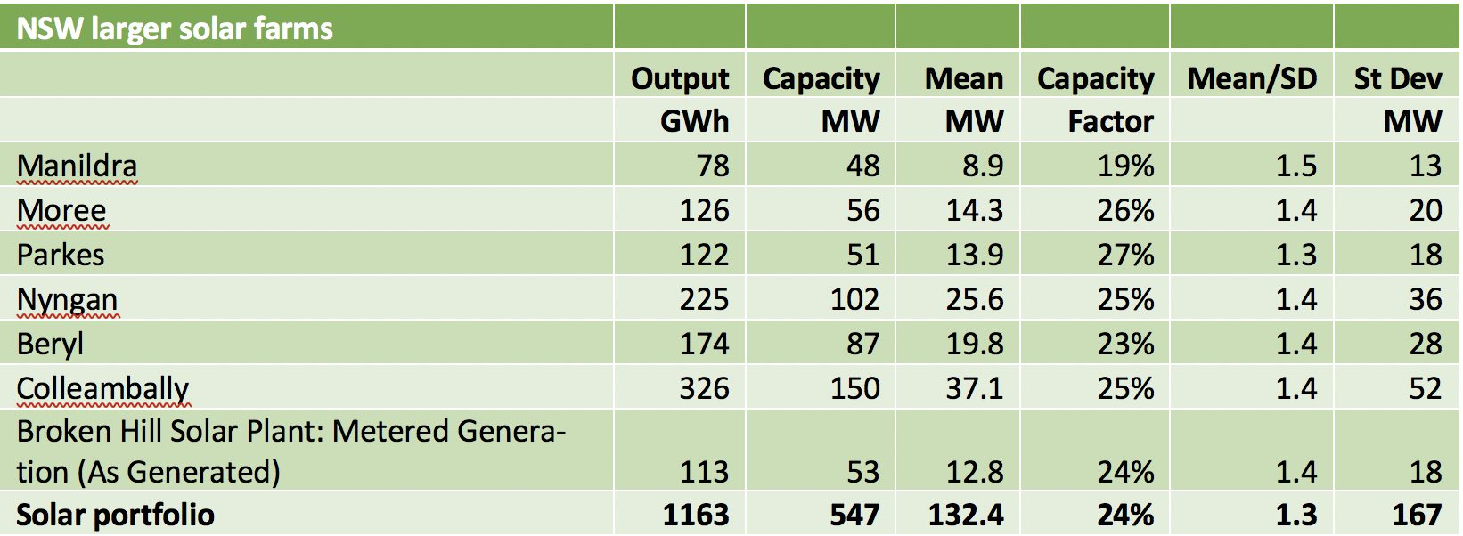
Figure 3 Source: NEM Review, ITK, data to Nov 9, 2021
And for the winds farms it’s been a good year, with two reporting capacity factors of more than 40% for the past 12 months.
Note how much the overall variability declines when the wind farms are considered as a portfolio. There is much better diversification benefit than solar, and it’s why from a system point of view some planning is preferred.

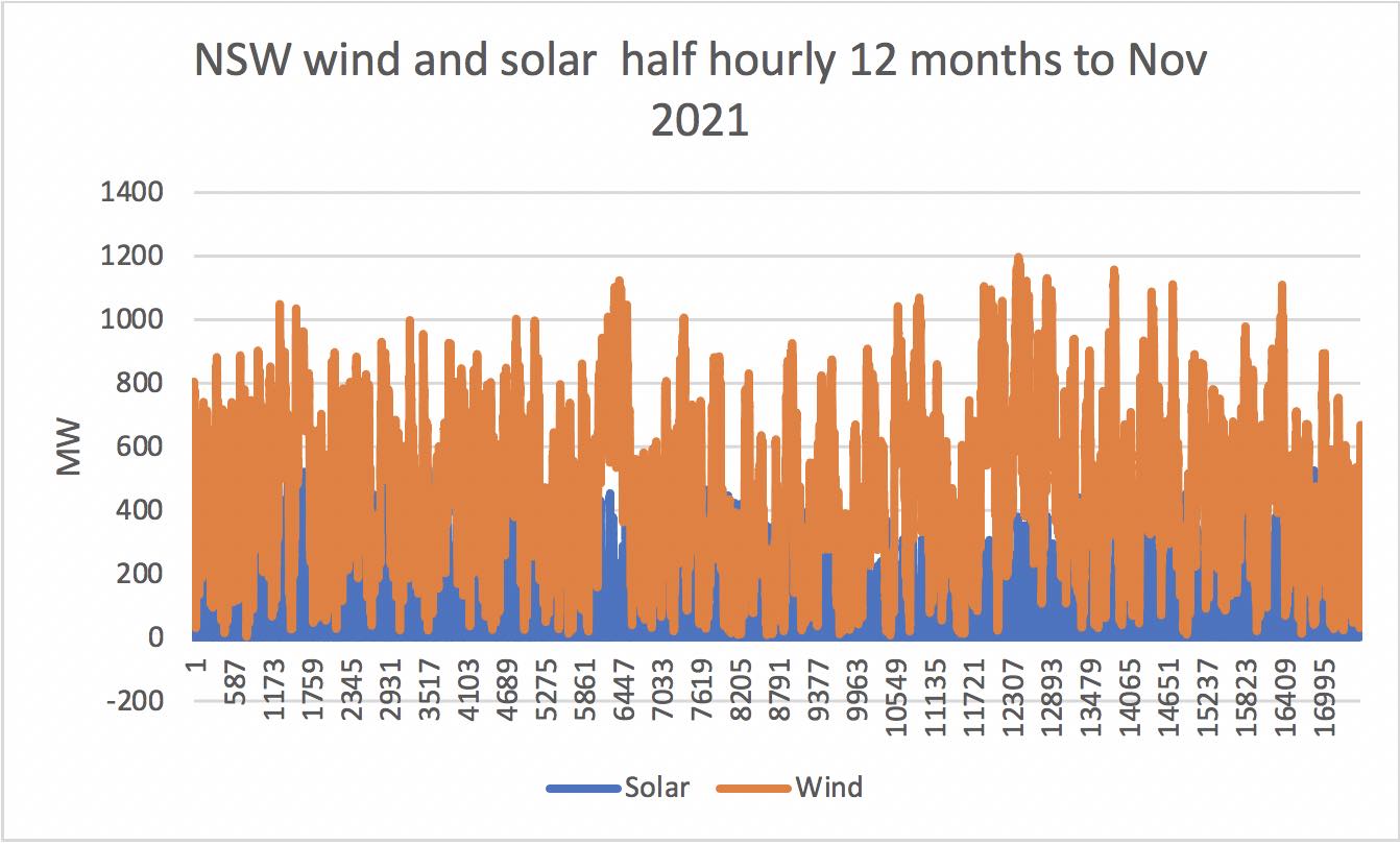
The half yearly output for the past 12 months is shown in the following graph, which isn’t very useful.
So the way we proceeded was to express the wind and solar as an index relative to its average for the year.
So the average output was 1 for both solar and wind but because of capacity factors it takes 4.1MW of solar to produce a through-the-year hourly average of 1MWh of solar and 2.9MW of wind to get an average 1MWh of wind.
Next we assign costs of $1.2m/MW to solar and $1.9m/MW to wind. So the total cost is the MW of wind and solar * the cost of each. As you add more wind relative to solar the total output goes up so to adjust for that we get a metric total cost/average total output.
That’s one axis of the efficient frontier. The other axis is the variance of the combined portfolio, or actually the mean/std deviation.
After that its just a mix of experimenting, or in reality using excel to create a table using various ratios of solar to wind and then plotting an efficient portfolio.
As others have done almost identical work previously we expected to find that about 20% solar and 80% wind was the “sweet spot” and so it proved.