Yesterday I posted some analysis of what happened in a lacklustre Victorian region this summer, in terms of peak demand. This followed from some analysis of broader patterns across the NEM.
Today I recount a similar situation in neighbouring South Australia.
1) What actually eventuated?
To provide an overview of what happened over summer in South Australia, we once again reach for NEM-Review to produce this trend over the four months we defined as “extended summer”:

As noted on this chart, the peak demand in South Australia for summer 2014-15 was 2,784MW – achieved at 15:25 (NEM time) on Wednesday 7th January 2015.
I note that this was actually 2 days prior to entries closing in our competition, so would have thought that this should have informed a number of the entries received in the 2 days following from that!
Given that many businesses (and all schools) were still in holiday mode at that time, it was reasonable to expect that demand would have peaked higher than that level later in the summer – but this was not the case over this summer period, as shown above.
Indeed we note that even moderately high demand was largely non-existent in South Australia this summer – with only 14 days out of 121 seeing scheduled demand even rise above 2,000MW! Non-scheduled wind, and solar operating behind the meter, will both have had an effect, though we suspect that there are other factors that have played a significant role (such as the mild summer weather).
2) How well was this expected?
This summer, in conjunction with our traditional “main prize”, we also offered to give away a “consolation prize” for the closest to the market at guesstimating what the peak demand would be for the South Australian region (this was Competition #5 of a total of 7 competitions this summer).
2a) Was it expected, by our competition entrants?
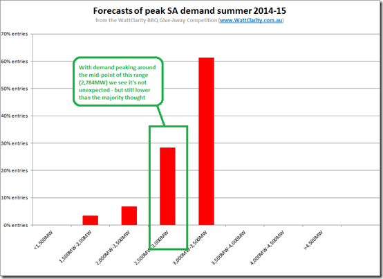
Collating all the entries and plotting a distribution, we see this distribution:

As we can see, the majority of entries landed in the 3,000MW-3,500MW range (above where the peak demand landed this summer).
There was also just less than 30% of entries in the 2,500MW-3,000MW range, within which the actual peak landed. Hence it’s fair to say that the level of peak demand achieved was not entirely unexpected – though below the majority of bids.
SO WHO WINS THE “CONSOLATION” PRIZE FOR COMPETITION #5 (SA PEAK) THIS SUMMER?
This is the second consolation prize we’re giving away for showing some talent (or luck?) – but definitely showing some initiative – and the winner is revealed here…
Finally, we see that there were also a handful of entries well below this level – from the pessimistic sorts?
2b) Was it expected, by AEMO?
Back on 29th December, when I posted these tips for entrants to competition #5, I included a snapshot from NEM-Watch highlighting what the AEMO had said about what peak demand might be under the 3 different economic development scenarios, and the three different weather permutations.
For ease of reference, here’s that image again:

Just eye-balling this chart, it does appear that the actual demand peak of 2,784MW is below what the AEMO forecasted under a 50% POE (probability of exceedence) scenario but above the 90% POE scenario.
Hence, in summary, the actual peak demand equates to what was expected to happen under pretty mild conditions.
3) Looking in more detail?
Firstly (as we did with our analysis of NEM-wide & Victorian demand), we include this trend of the headline stats for South Australia for the “5 hot months” of 2014-15 and the 6 preceding financial years:

Like in the case of Victoria, peak demand this summer was significantly down on what was achieved the prior year.
Like in Victoria, there’s also a big gap between the peak demand and the average demand – indicating a significant degree of weather dependence on the demand at the peak end. We see peak demand is typically more than twice the average demand over these hot month periods.
However what’s perhaps more striking, from this chart, is a massive 140MW (16%) drop in minimum demand over this period!
To provide more detail, we generated the following distribution curve for South Australia:

With respect to this curve, a few key points are evident – again in the 3 areas highlighted:
3a) At the bottom end of the curve (Area 1)
In the “trended stats” chart above we see a significant drop in minimum demand seen from 2013-14 to 2014-15.
In terms of the distribution, however, the most significant shift in the base-load demand a year earlier – with the change being obvious between the “hot months” of 2012-13 and 2013-14.
Hence it seems that there was progressive closure of some continuously operating load in South Australia beginning July 2013, but that the closure did not complete until sometime in 2014-15 (when the minimum demand dropped).
1. I don’t recall the details of the timing of the closure of the various car manufacturing operations in South Australia (and I also wonder how much of the 140MW drop in minimum demand this would amount to, in any case).
2. We wonder if one of our readers can confirm if this is the result of some progressive closure of one (or more) major industrial loads?
3b) With respect to “normal” afternoon demand (Area 2)
As we saw for Victoria, and NEM-wide, there’s also a shift in the curve corresponding to the median afternoon demands – due both to whatever changes have caused the demand at the bottom end of the curve to disappear, and also the injection of solar PV behind the meter, netting off scheduled demand.
With the shift of this part of the curve to the left, we can see why there were few days where demand rose above 2,000MW!
Also of note is that the median incidence of demand (just like the average) has shifted below 1,500MW. This will have been due (at least in part) to the loss of whatever continuous (industrial?) demand was highlighted at the bottom of the curve.
3c) Peak demand (Area 3)
As was the case for Victoria, and NEM-wide, we see that peak demand remains a separate issue – and one which, it seems, might be becoming a more vexed challenge at the same time as the “most hours” demand curve is being hollowed out.
This is strikingly clear in the following chart:

It seems clear, from this chart, that the lacklustre results for 2014-15 at this end of the curve don’t form part of a growing trend, but are more likely to be the result of a milder summer.
As I have noted on this chart, in practical terms the curves for 2008-09 and 2013-14 are very similar – despite being 5 years apart and hence being separated by a significant number of developments in the energy market over this period, including:
1. Increases in retail price for electricity
2. Roll-out of significant volumes of solar PV in South Australia.
3. Continued roll-out of wind farms in South Australia.
We’ve noted at other times (such as here) we’re a big fan – and a keen supporter – of Demand Response, in terms of what it can achieve for helping industrial energy users reduce their average cost of energy (whilst delivering a broader benefit to the energy sector, as well).
However looking at the x-axis here, in relation to the charts above, the scale of the challenge for South Australia seems well beyond what demand response can address on its own. In simple terms we have a region where the average demand is 1,500MW and a median demand being somewhere below that – but a peak demand component of roughly that amount occurring, in most of the past 7 summers, for something like 3-5 days in total only!
Switching off the majority of that “most times” demand in order to cater for an almost doubling of demand that occurs so infrequently some summers is clearly not a practical solution.
Hence there needs to be some physical capacity to supply the bulk of that demand peak – and gas-fired generation has been the tool of choice in South Australia (and elsewhere) to date. However we note issues with this, moving forwards including:
1. An environment where gas prices look set to rise with demand increasing, but the supply-side restricted; and
2. Where gas-fired plant, like this one, are mooted to “possibly” close – though we did not the timing of this “might close” announcement coincided ☺with a spike in the debate about capacity payments (see these previous comments about capacity payments).
Certainly some interesting questions to be pondered, with respect to South Australia, moving forwards.
Source: Watt Clarity. Reproduced with permission.