RenewEconomy is pleased to introduce a weekly update of some key numbers and charts in the NEM. We start this week with a focus on two key variables, the futures curve for base load electricity, and electricity consumption in the NEM.
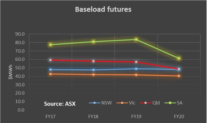
Baseload futures
Futures data have arguably become less useful as the NEM has become more vertically integrated (most generators are now associated with a retailer). Certainly, the futures – particularly in the out years – don’t trade as often as the market manager (the ASX) would like.
Nevertheless its still the best market indicator of sentiment towards the balance between supply and demand that’s readily available. Over time we will show how sentiment changes but this week we simply show the average for each fiscal year (to June) of the four quarter baseload contracts for each State.
Essentially when the futures are pointing upwards, existing players are happy as it indicates that generators can expect to receive more revenue in the future and that demand is expected to increase faster than supply. Those are not the only interpretations of the data but they are the simplest view. When the futures curve points down it indicates basically a market view that prices in the out-years will be less than today, that is demand is not going to increase relative to supply, or that generator costs across the board are going to decline.

We will talk more about this on another day.
Consumption
The second piece of data that matters is consumption. As is fairly well know in the five years ended December, 2015 electricity consumption fell cumulatively about 8-9%. Hugh Outred has examined and explained the fall in some detail, but in summary, energy efficiency has been important, a decline in aluminium smelting, particularly the closure of the Kurri Kurri and Point Henry smelters has also contributed.
But the bigger picture was that consumption per household at the retail level also declined about 9% in total and this was largely due to higher prices (driven by network charges and environmental costs), stimulating household energy efficiency and also partly due to rooftop PV. At the household level efficiency has taken the form of everything from “turn off the lights” through to LED lights, and more efficient appliances. The ending of the carbon tax and lower network costs may partly offset these changes.
In addition we have also seen electricity consumption in Queensland rise sharply due to demand to power the coal seam gas industry. Virtually all of the thousands of wells and virtually all of the upstream csg compression is electrically powered. It may seem ironic that black coal in Queensland is used to make LNG which is then exported to China so that gas can replace coal, but in the long run its arguably better to see it as part of a process where most work is done by electric energy (replacing gas, oil and coal energy) and the electric energy is produced by renewable or non carbon emitting sources. In any event the consumption data now shows that consumption in most States and the NEM is up for the calendar year to date. We specifically note that consumption in NSW is up a fraction in NSW.

Again there is more to say on this topic but enough for now.
David Leitch was a Utility Analyst for leading investment banks over the past 30 years. The views expressed are his own.
Please note our new section, Energy Markets, which will include analysis from Leitch on the energy markets and broader energy issues. And also note our live generation widget, and the APVI solar contribution.