“Calling out around the world
Are you ready for a brand new beat
Summer’s here and the time is right
For dancing in the streets.” Bowie Jagger version 1985
Election season scores Wentworth (Climate change 1 – No action team 0)
All over the country climate change and renewable energy are showing up as influencing election results. Public opinion polls consistently show that the public supports doing more for climate change and this is now going from passive support to some voting intentions.
The scare campaign that was run just before and just after the South Australian blackout has, for the time being, run its course.
The No Action team has not been able to link high renewable penetration to either high prices or low reliability.
But a black out or major price spike this summer could change that in an instant, even if – as is most likely – it’s caused by a major and prolonged outage at one of the 8 remaining coal stations south of Queensland.
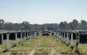
Renewable share grows, due to utility solar


The figure below shows that a short duration morning and evening price spike is a price signal for a one or two-hour battery. The question is whether the price spike will persist for long enough to earn a return on investment.
New transmission will both let more solar power get out of Queensland into New South Wales, and eventually let NSW thermal power get into South Australia.
Even so, we still think the super-fast deployment of batteries, the fact that they can be DC coupled, makes putting say even 10-20MW into a Queensland or South Australian solar farm worth investigating. These price curves will get bigger before they get smaller.

The market action
Despite the excitement of negative price intervals in Queensland, average prices for the week were higher than the prior week, and for the same week a year ago.
And in fact this was generally true across the NEM. If there is a reduction in Queensland export limits, that just shows how the interconnectors are one obvious way to reducing NEM-wide price volatility caused by the increase in “as available” generation, compared to “as required” generation.
Prices were higher even though in front of the meter demand was lower than last year, and seasonally low.
It’s also worth a reminder that REC prices, even though they are falling, make it worthwhile for a solar plant to produce down to say -$50/MWh or -$60/MWh. We note that the falling REC price was one factor behind Tilt writing down the value of some of its wind farms.
This is a clear reminder that the electricity market in Australia is not for the faint-hearted. Even before all the complexities that the surge in variable new supply brings, it was always a very difficult market to make money in. Most generators in Australia have historically not earned a return on capital.
There was a noticeable jump in NSW futures in FY20 but FY21 futures in South Australia are down to $68/MWh, a big improvement.
REC prices fell again.
Gas prices remained high.


Oil prices are up and down, but it was interesting to note Haliburton/Schlumberger’s recent comments to analysts that shale productivity in the USA was not improving, and may even be declining, as infill drilling becomes a bigger share. If confirmed, oil prices will go up over the next few years.
China’s GDP has slowed a touch and, if it continues to slow, coal prices may fall, eventually…. Meanwhile US 10-year bond rates continue to be strong.
Share Prices


Volumes

Base Load Futures, $MWH

REC Prices

Gas Prices


David Leitch is principal of ITK. He was formerly a Utility Analyst for leading investment banks over the past 30 years. The views expressed are his own. Please note our new section, Energy Markets, which will include analysis from Leitch on the energy markets and broader energy issues. And also note our live generation widget, and the APVI solar contribution.