The latest world energy outlook from the IEA, Redrawing the Energy-Climate Map, not only maps out what the energy sector needs to do – quickly and effectively and at no net economic cost – to help keep the 2°C global warming target alive, it also offers some insight into what could happen if the energy sector doesn’t take this advice and leave thermal coal reserves in the ground.
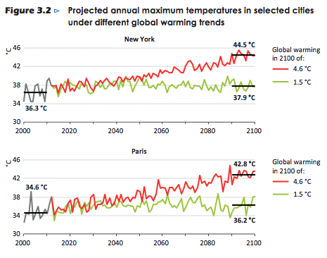
Below are four graphs projecting the annual maximum temperatures in four major capital cities around the world under different global warming trends. Under a scenario where the planet warms by 4.6°C, average annual highs ranging from 37.9°C (Moscow) to 51.6°C (Moscow) are predicted. Even under a 1.5°C scenario, annual maximum temperatures are still predicted to rise by between 1-2°C.