For us at ITK, the beginning of the year means two main things: a flurry of activity to get our forecast updates out the door, and finding some time to reflect on the prior year.
When figuring out what’s happened in the electricity market, nothing beats hard data. So my task became that much easier with a copy of the (newly released) Generator Statistical Digest 2020 (GSD2020) from the teams at Global-Roam and Greenview Strategic Consulting.
With a staggering volume and breadth of data, it’s easy to get sidetracked by the wealth of insights available in the report. But in an attempt to stay focused on the day job, I approached this year’s edition asking:
What can the GSD2020 tell us about price drivers in the NEM?
How much wind and solar?
We spend a lot of time thinking about production from variable renewable energy (VRE) in the NEM over the coming years. In practically every report we write, we highlight this as a key price driver:
More wind and solar volumes displace higher cost fuels, and force greater competition within the thermal generation sector.
So this has to be a good news story, as 2020 was a stellar year for utility scale wind and solar in the NEM: by our estimates fully operational capacity passed 10 GW for the first time, and 3.5 GW of new projects connected to the grid, making it easily the biggest year for utility scale VRE in Australia.
But what jumps out from the GSD is that the volume of energy from these assets is lower than we might have expected a few years ago. In some cases, much lower.
An easy measure of this is the annual average capacity factor. This expresses the amount of energy produced by generator as a percentage of its total potential, i.e. if it operated at full capacity, every hour of every day. Back in 2017/18, with little historical data to go on for utility solar, and the promise of bigger and better technology for wind, it was common (for me at least) to assume solar capacity factors around 30% for Queensland and 26-28% elsewhere, and wind capacity factors around 40%.
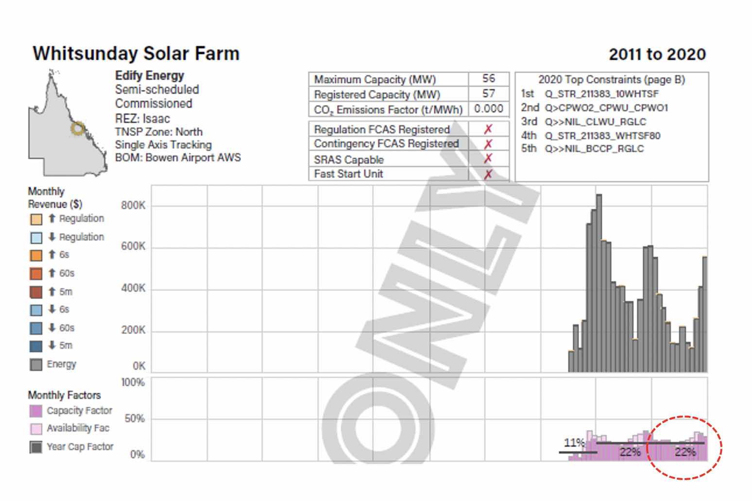
Scanning the GSD2020, it’s clear this hasn’t happened. Take for example the Whitsunday solar farm, which produced 110,000 MWh from 56 MW AC of capacity, giving it a 22% capacity factor in 2020. That’s some 7 to 8 percentage points lower than I would have expected prior to operation. And I’m not picking specifically on Whitsunday here, there are lots of examples.
Using the GSD2020 data, and looking only at those assets fully operational for the year, on average NEM solar farms achieved a 23% capacity factor.
Solar in New South Wales achieved 24%; 3 to 4 percentage points lower than my notional benchmark but, remarkably, higher than for Queensland, at 23%.
Victoria and South Australia achieved 21 and 23% respectively.
For wind, NEM capacity factors averaged 32%.
Tasmania leads the pack with a more than respectable 38.5%. But New South Wales, Victoria and South Australia all come in under 35%.
This is neither good nor bad, just an important fact for prices. Lower capacity factors mean lower than expected production which, if it remains true on a sustained basis, could mean higher prices all else equal.
As an illustration, Queensland currently has approximately 1.5 GW of fully operational utility scale solar. The difference between a 23% and a 30% capacity factor is almost 1 TWh per year, or the equivalent of a 450 MW solar project.
That’s an entire Western Downs Solar Farm that’s gone missing.
Lower capacity factors also lend support to another type of price: large scale generation certificates (LGCs).
Many of us assumed the volume of capacity installed in 2020 would be enough to satisfy the federal renewable energy target (RET), but lower than expected production from that capacity has left the LGC market pretty tight.
We are lucky enough to use Global-Roam’s NEMReview data in our analysis, so our representative production profiles in our modelling reflect historical performances.
But we wonder how many market participants have been left wondering why the real world is looking so different to the spreadsheet.
There are a variety of reasons.
One is economic curtailment – for many plants, it can be important to get out of the way of zero or strongly negative price intervals. With more instances of negative prices in 2020 than in previous years, more assets will have deliberately reduced output.
While we cannot tease out of the annual data exactly when this has happened, the solar farm pages in the GSD show how low solar dispatch/volume weighted average (VWA) prices have got.
Looking again at Whitsunday, we see that it’s VWA is a sad looking A$37/MWh for the year.
This is actually higher than many other Queensland solar farms, and the Daily Factors chart shows us that the plant’s output was well below availability for several months where prices were particularly low.
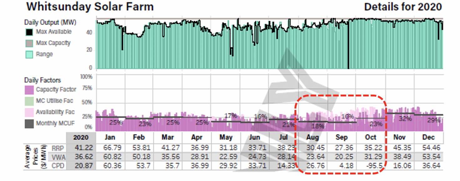
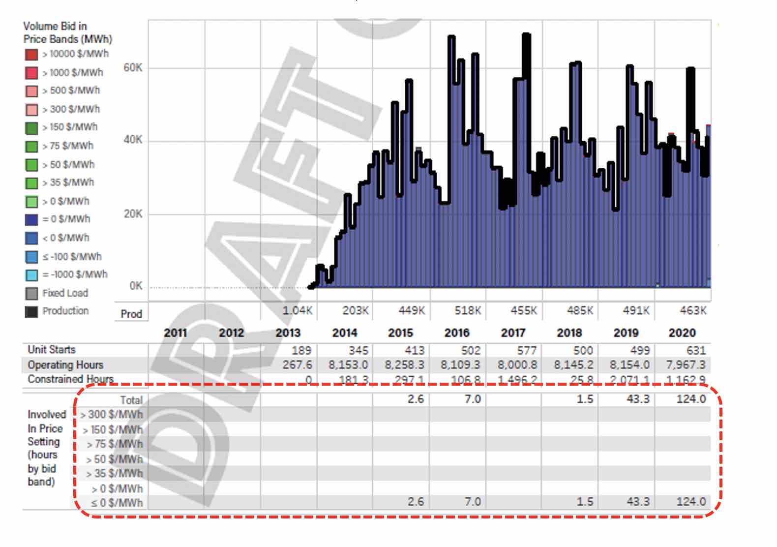
And we can also see that the number of constrained hours for the plant is relatively low, and – unusually for a solar farm – a decent chunk of output during the year was bid above A$300/MWh.

We can therefore make an educated guess that one reason for the low annual capacity factor was low daytime prices, and an active strategy for avoiding these.
Another influence on capacity factors is technical constraints, where output is restricted below availability by the market operator’s dispatch rules. Mt Emerald wind farm in Queensland is a great example of this.

Mt Emerald had a capacity factor of 22% for the year, and the impact of constraints show up in the Daily Output and Daily Factors charts, with production well below availability for long periods.
It also shows up in the Constraints table, where 2,410 hours in 2020 featured binding constraints for this asset which may have impacted output. That’s more than one quarter of the year.
To be balanced, we should also note those assets which performed on par or better, and there are a few. Kiata wind farm in Victoria hit a capacity factor of 45%, easily the highest of all VRE assets in the NEM.
Kidston solar farm in Queensland achieved 30%, and some New South Wales solar farms surprised on the upside, with Griffith and Parkes recording 29% and 28% respectively.
We don’t know what the future holds for asset yields. We expect system constraints to ease over time, as transmission investments are made. But economic curtailment may become more prevalent, as the number of negative price intervals increase, at least over the near term.
This will hit solar farms disproportionately. Widespread storage is likely to help with both issues.
But until we see significant storage volumes in the NEM, we may need to stick with a more conservative set of capacity factor assumptions.
Who’s setting the price?
A big part of the price forecasting puzzle is attempting to estimate which fuel or generator sits at the margin in any given interval.
Coal plants still dominate price setting in the NEM. And while wind and solar generation has grown enormously, our view has been that for most states and most intervals, this will influence prices indirectly by driving greater competition.
It is likely to be a few years yet before we see VRE regularly setting the price.
However, the GSD2020 shows us a clear trend towards wind and solar having a more active influence.
The ‘Involved in price setting’ table in the GSD tells us how many hours per year each asset was part of the marginal price calculation. (I warn you now that the price setting process gets complicated, and I’m avoiding that complexity here, but WattClarity provides some great explainers).
All states with the exception of South Australia saw a marked increase in the role of wind and solar assets in the price setting process through 2020.
Across the NEM, VRE was involved in setting the price for 2,213 hours. The most dramatic increases were in New South Wales, up more than 250% on the year before; and in Victoria, up by more than 500%.
Granted these are not huge numbers.
There are 8760 hours in a standard year and multiple assets can be involved in setting the price at any time, so it may be no surprise that several coal units have more price setting hours than all of wind and solar put together. But it’s a sign of things to come.
The most prolific VRE price setting unit was the Gullen Range wind farm in New South Wales, and the GSD2020 shows that it was involved in the price setting process for 124 hours.
Unsurprisingly all intervals featured prices less than zero.
Storage for time shifting?
We believe the long-term future of the NEM is firmly linked to storage.
From 2030 onwards our price forecasts are driven in no small part by the cost of building storage facilities, and our assumptions around how they are operated.
This is largely an energy dynamic: the storage plants shift energy from daytime to evening and morning peak periods.
But our assumptions on how these plants will work are hard to validate, as there are few batteries and pumped hydro plants currently in the market, and those that do exist often make most revenue from the frequency and ancillary services (FCAS) markets.
So to understand how energy-focused storage plants currently work, we can use the GSD to focus on two specific examples.
First, we take a look at the Wivenhoe pumped hydro plant in Queensland.
For a long time, under CS Energy ownership, this appeared to be the forgotten generator of the NEM, with very low levels of output.
But with CleanCo taking ownership of the asset and commencing trading towards the end of 2019, there has been a distinct shift in usage.
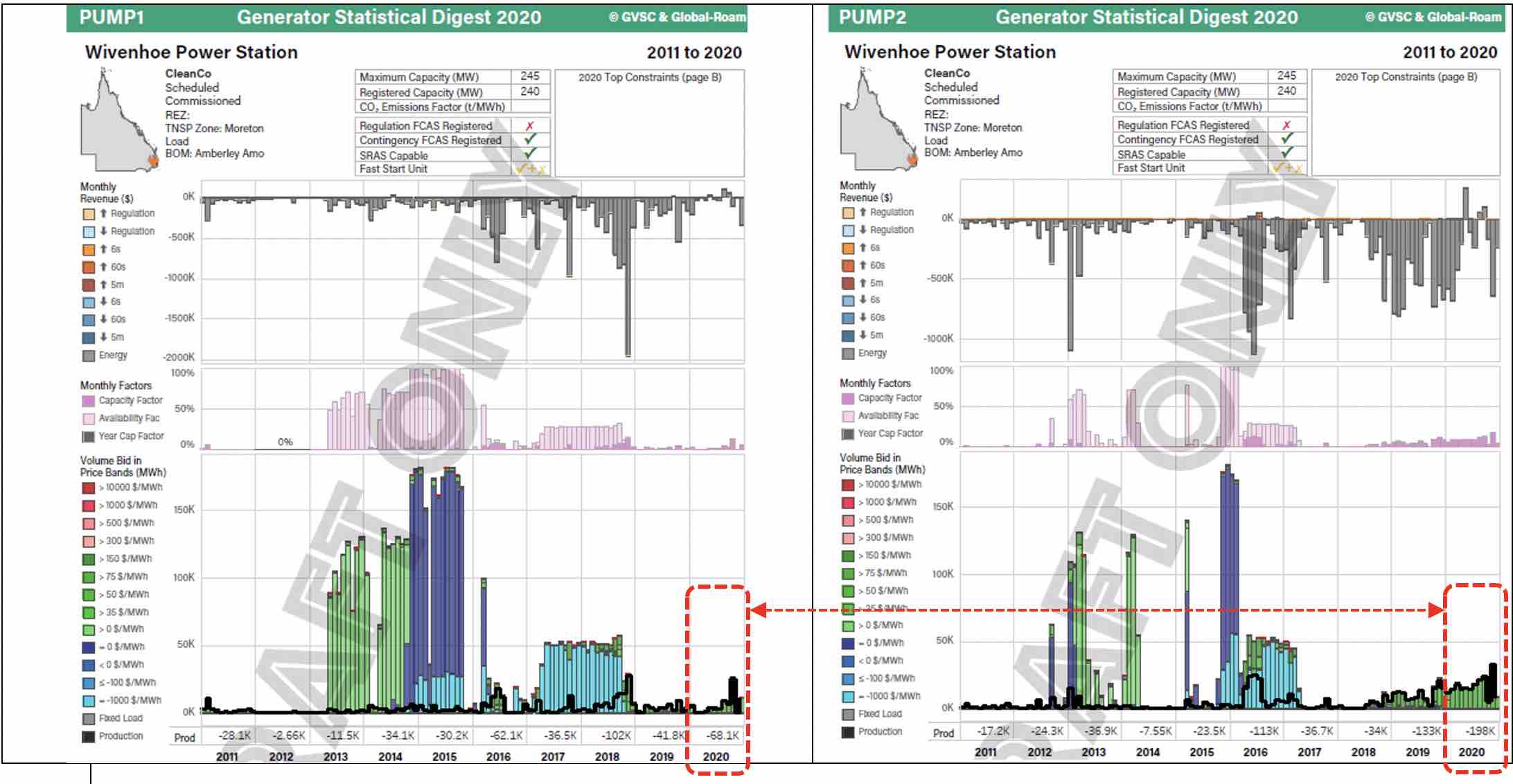
The two pumping units have seen significantly more action in 2020 than any year over the past decade.
Together, they pumped 266,000 MWh last year, the equivalent of pumping for almost two hours per day on average. And generation from this stored energy was also the highest since at least 2011, at 178,000 MWh.
On the surface these stats imply a round trip efficiency of 67%, roughly what we expect from pumped hydro, although without knowing the starting and finishing values for storage volumes, we cannot make a solid conclusion.
Wivenhoe makes relatively little from the FCAS markets, as we can see in the revenue breakdown (here showing only one generating unit):
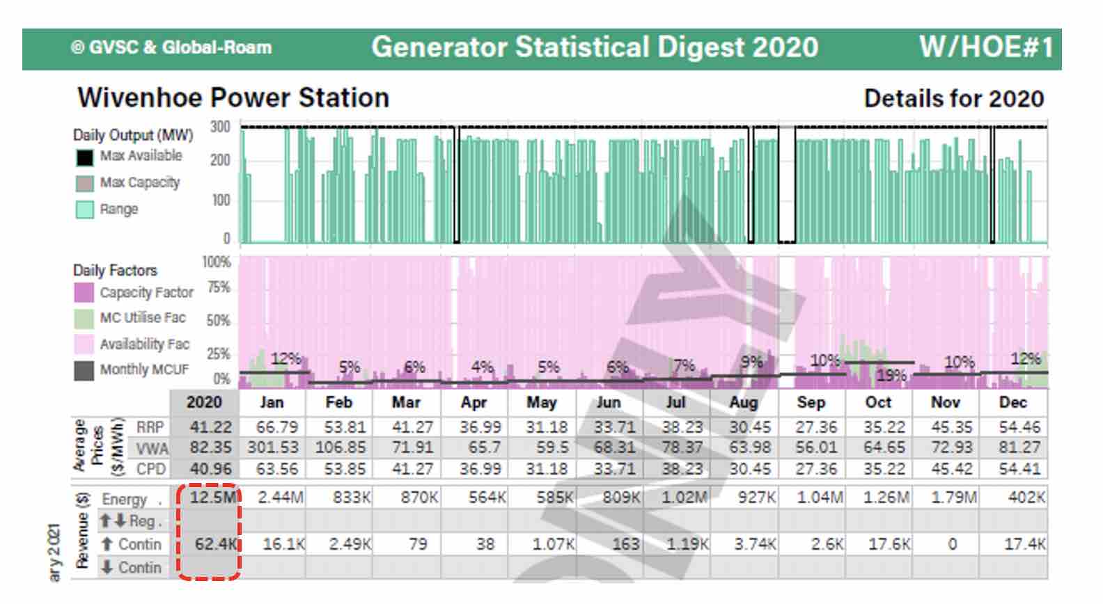
So we can use the VWA Price data to draw some conclusions around profitability for energy time shifting.
The GSD2020 shows us that across both pumping units and both generation units, the VWA cost was A$13.8/MWh, and the VWA generation price was A$81.6/MWh, producing a spread of A$67.9/MWh for the year.
This seems like a respectable result to us, and the spread certainly represents a higher realized ‘price’ than achieved by wind or solar.
For a fully depreciated asset, it feels like a successful year, and it will probably only get more so as time goes on.
But we don’t think this spread would be sufficient for a new storage asset, of any technology, given the need to cover the cost of capital.
So to understand how newer assets are doing it, we look at the Gannawarra BESS in Victoria.
This is by no means a perfect comparison.
While the Gannawarra battery earns a higher proportion of revenue from time shifting than other batteries in the NEM, its revenue is still predominantly from FCAS. But it is as good as we can get for battery time shifting for now.

It cost A$33/MWh on average to charge the Gannawarra BESS during 2020, and the battery made A$98/MWh on average from generation. This gives an average spread of A$65/MWh for energy, slightly less than Wivenhoe.
This doesn’t seem enough either – why so low?
Well, as is so often the case, this sort of isolated number crunching may not help us very much – the funding arrangement for each specific asset will determine the spread it requires to be a success.
And the fact is that Gannawarra’s FCAS revenue was almost double that of its energy earnings, making time shifting a less important part of the business case.
But we remain convinced by two things: new storage assets will need to increasingly target time shifting, as the FCAS markets simply aren’t big enough for everyone.
And new energy-focused storage will need a higher spread than we have seen in 2020.
That spread will come – the retirement of thermal capacity ensures it. And some storage proponents will be betting on early retirements to bring forward the price spikes.
But at ITK Services we track over 850 MW of committed battery storage facilities, with a number of pumped hydro plants not far off, and of course the 2 GW Snowy 2.0. It’s going to be quite a while before we need them all.
Ben Willacy is a senior analyst at ITK Services. A version of this article was first published at Watt Clarity, and reproduced with permission.