Complex energy models are usually wrong in the medium- and long-term and are rarely useful because they are narrow and slow.
For example, war in the Middle East or social constraints on transmission can cause rapid and substantial diversion from an “optimum path.” It’s better to use a high-speed simple model to scan a very wide range of possible energy futures to find thousands of “good enough” energy system designs.
The Australian Energy Market Operator’s (AEMO) Integrated System Plan (ISP) model is an example of a complex and slow model. It doesn’t map a broad optimum landscape of “good enough” solutions. Wind is being deployed more slowly than the model suggests is optimum.
A high-speed simple model can map alternatives that are just as good once uncertainty is included (such as more solar and more long duration storage).
Suppose this is the year 2000 and you are using a complex model to determine a detailed optimal energy pathway out to the year 2025. Your model might include a lot carbon capture and storage (CCS), gas, nuclear and some wind. And not much solar, batteries, EVs or data centres. Your model would be useless.
Likewise, it is pointless to model an optimal pathway to net zero emissions in 2050. Uncertainties include the future cost of technology; the rise of new technologies; future electricity consumption; whether politics accelerates or retards our response to global warming; future wars, trade wars and pandemics; and events that are not anticipated.
Hundreds of peer-reviewed papers purport to map the best path to reach net zero emissions in 2050. National energy plans are published that are rarely adhered to.
Consulting companies produce reports that might depend quite a lot upon who is paying for the work. Complex models are wielded with precise outputs of two, three or even four significant figures, more accurate than knowledge of the input data. And some people actually believe these models.
Complex models of complex systems that are buffeted by complex physical, technical, economic, political, environmental and social factors have little predictive power. There is no opportunity to repeatedly run the model against the real-world to tune it (as happens with weather forecasts).
Models delivering absurdly precise outputs can be used to deceive people into believing that they actually provide useful information. Is this much different from priests diligently examining horoscopes to determine a propitious time to plant crops or the likely outcome of a war?
It is known that the speed of light and gravitational waves are the same to within a few parts in 1015. This is precision modelling (general relativity) validated by repeatable observations (neutron star mergers). In the education of scientists, error bars are emphasised from the start: the correct answer is 42 +/- 5.
But somehow economic and energy models skip the error bars despite being much less precise than physical models. The size of the error bars is often similar to the magnitude of the purported answer which spoils the story of certainty and precision.
Complex models are slow to run, which means that it isn’t possible to explore a wide landscape of possible energy futures. They produce narrow allegedly “optimum“ pathways that are quite unlikely to come true alongside thousands of similarly probable energy futures.
In contrast, a simple but high-speed model can calculate millions of solutions using wide variations of hundreds of input parameters and hundreds of scenarios.
High-speed and comprehensible simple models do not pretend precision which is unobtainable in the real world. Instead, they paint landscapes of energy futures that show regions that are “good-enough” under a wide range of inputs and scenarios.
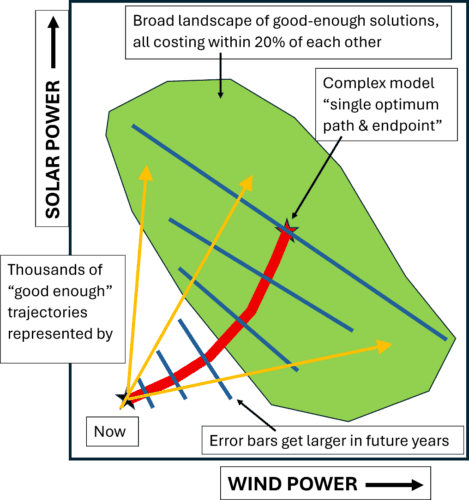
The figure illustrates an electricity system in which solar and wind become dominant in the 2030s, and demand doubles and trebles during the 2040s to accommodate “electrification of everything”. The “optimum pathway” to zero emissions as calculated by a complex model (red line) is narrow and purports to reach a “lowest cost” point (red star).
The green shape is a broad optimum landscape as calculated by a high-speed simple model. All the points within the green region have the same cost to within the margin of error.
Once some (albeit imprecise) errors bars are added to “the optimum pathway”, it turns into the broad optimum landscape. The green area is a much larger target than the small red star in the middle. It provides energy planners with wide flexibility to cope with a myriad of unexpected events.
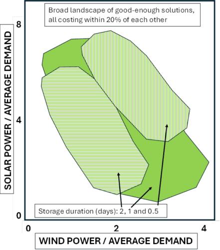
Even better is to present data in normalised format as in the example below: (i) solar power, wind power and storage power (GW) divided by average power demand (GW); and (ii) energy storage (GWh) divided by average daily energy demand (GWh/day).
The cost axis has been eliminated, allowing a third dimension to be plotted (storage duration in this case). This generic graph is generally applicable across many similar regions and times regardless of scale.