The recent discussion around three free hours of electricity has been framed as a question of generosity and cost. Yet the market conditions underneath it suggest a different reading.
These hours often coincide with a part of the day when electricity is already abundant, difficult to absorb, and frequently priced at very low or negative levels. That does not answer every retail question, but it does change where the conversation begins.
A recent LinkedIn post by Kanav Verma – Three Hours Electricity Free… But Who’s Paying? – raised that tension directly. Its argument was simple and provocative: the market is already signalling that it does not especially want extra electricity during the middle of the day, so a tariff offering free power in that same window may be less a gift than a response to oversupply.
Our review through GPE NEMLog broadly supports that direction, while also adding a more careful regional and curtailment-based reading.
Post reference:
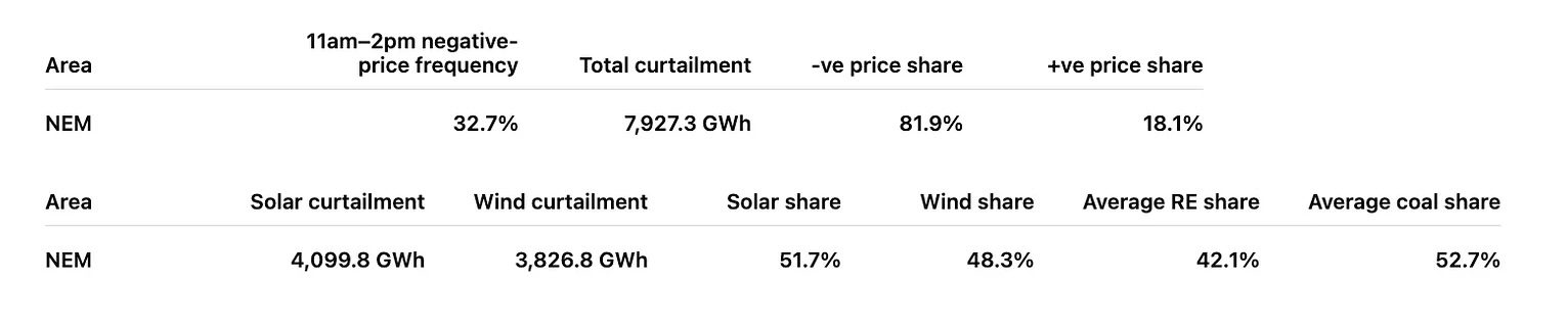
At NEM level, that broader pattern is already visible. Across the 365-day period (to Fri 10 April 2026), reviewed, the 11am to 2pm window recorded negative prices in 32.7 per cent of intervals. Over the same period, total curtailment was about 7.89 TWh, of which about 6.48 TWh, or 82.2 per cent, occurred during negative-price conditions. In aggregate, curtailment was split broadly between solar at 4.10 TWh and wind at 3.79 TWh.
There is, however, an important distinction to keep in view. The price figures below refer specifically to the 11am to 2pm tariff window, while the curtailment figures refer to full-period totals across the same 365-day range.
Set beside each other, they do not describe the same slice of time. What they do show is a consistent relationship between midday price weakness and a much larger burden of curtailed energy across the system.
What does it mean when an offer appears consumer-friendly but is also system-convenient? And what becomes visible when price is placed beside curtailment rather than read in isolation?
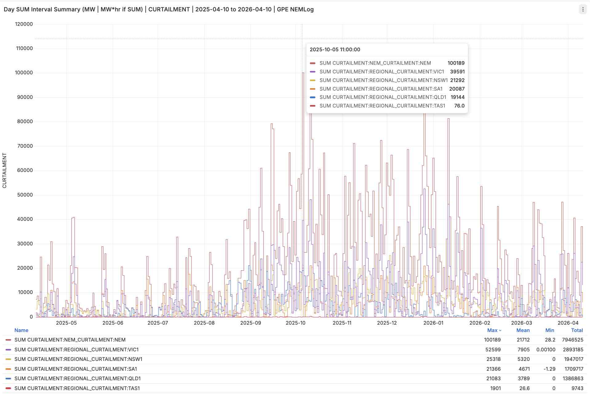
NEM and Regional Utility Wind and Solar Curtailment for 10 April 2025 to 10 April 2026 | GPE NEMLog
Graph Note: The last 365 days of daily curtailment show a market increasingly shaped by surplus renewable energy, but not in the same way everywhere. VIC1 and SA1 dominate many of the largest events, while NSW1 and QLD1 reveal a different balance of solar, network, and price-driven pressure. Link to GPE NEMLog Dashboard
In brief
Sometimes the clearest way into complexity is through a few plain facts.
Before looking more closely, it helps to hold the main findings in one place.
Three points anchor the rest of the discussion:
– Midday negative pricing is common: It was especially frequent in SA1, QLD1, and VIC1, though less so in NSW1.
– Curtailment is heavily concentrated in negative-price conditions: At NEM level, about 6.48 TWh of the 7.89 TWh total occurred in negative-price conditions.
– The regional story differs by resource mix and network conditions: NSW1 and QLD1 are mostly solar-curtailment stories, while VIC1 and SA1 are mostly wind-curtailment stories. NSW1 also appears to carry a stronger network-curtailment component than the others.
Those points do not settle every question. They do, however, suggest that the tariff is responding to something more structural than a simple retail promotion.
What the original claim gets right
A surface explanation can still point toward a deeper truth.
The original post was useful because it directed attention to a real structural feature of the market. Midday electricity can be abundant, difficult to absorb, and sometimes negatively priced. That already shifts the discussion away from retail generosity and towards system balancing.
A closer reading shows why the core argument holds:
– The market signal is real: Across the 365-day period reviewed, negative-price frequency in the 11am to 2pm window was high in several mainland regions, with SA1 at 64.4 per cent, QLD1 at 57.6 per cent, VIC1 at 53.6 per cent, and NSW1 lower at 38.8 per cent.
– The pattern is regional rather than uniform: The broad framing stands, but its intensity differs by region. South Australia and Victoria align most closely with a midday oversupply story, while New South Wales is less cleanly explained by midday negative pricing alone.
– The tariff window is not arbitrary: The chosen period overlaps with the part of the day when solar-heavy conditions are often strongest and when the market most often appears to be asking for additional demand.
Seen in this light, the tariff may be less an act of generosity than an economically rational way of shifting demand into hours when the system is already signalling surplus. That does not settle every retail question, but it gives the offer a more intelligible market context.
Price alone is not the whole story
A number can describe a condition without yet explaining it.
Negative pricing is a useful marker, but it is not a full explanation. Prices tell us that the market is struggling to value incremental supply at a point in time. They do not, by themselves, show the physical burden sitting behind that signal.
The curtailment data gives that burden a clearer shape:
– The curtailed volume is large: Over the same 365-day period, NEM curtailment totalled about 7.89 TWh.
– Most curtailment sits in negative-price conditions: Of that total, about 6.48 TWh occurred at negative prices and about 1.40 TWh at positive prices.
– The technology mix is broad rather than narrow: At NEM level, curtailment was substantial in both solar and wind, with about 4.10 TWh of solar curtailment and 3.79 TWh of wind curtailment.
– This changes the meaning of the tariff: The issue is not simply that energy is cheap at midday. It is that a large share of curtailed energy is showing up when the market is already signalling surplus most strongly.
That is an important shift in emphasis. It suggests the tariff is not only meeting household behaviour. It is also meeting a system that is often trying to make room for itself.
NEM-wide context
Period: 2025-04-10 to 2026-04-10
Negative-price frequency: 11am–2pm AEST window
Curtailment values: GWh
What is true in aggregate is not always true in the same way everywhere.
The NEM-wide figures suggest that the tariff window is not a marginal curiosity. Across the 365-day period reviewed, 32.7 per cent of 11am to 2pm intervals were negative-priced at NEM level. Average generation shares over the same period were 42.1 per cent renewable and 52.7 per cent coal, which helps show that these pricing and curtailment effects are emerging within a system that is still materially shaped by thermal generation.
The regional detail then sharpens that whole-system picture.
Regional picture

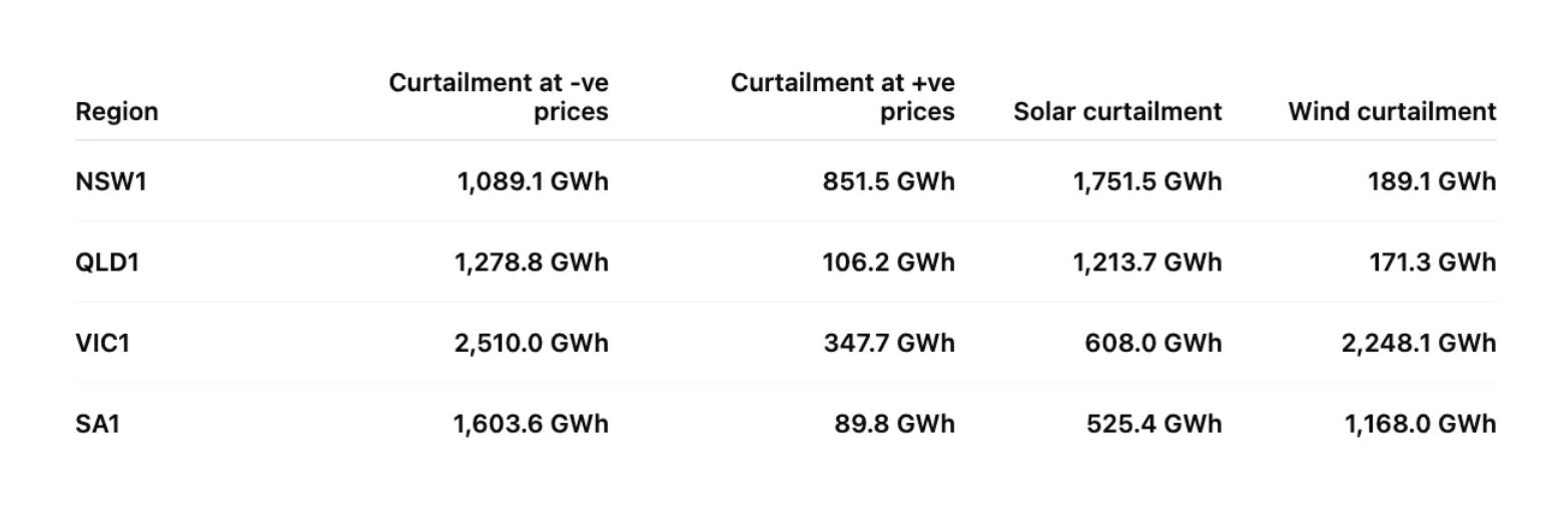
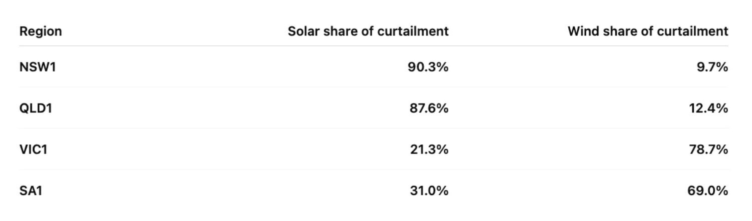
NSW1 stands apart. Midday negative-price frequency was 38.8 per cent, lower than in the other mainland regions reviewed, and only 56.1 per cent of curtailment occurred at negative prices. Total curtailment was about 1.94 TWh, of which about 1.75 TWh was solar and only 0.19 TWh was wind.
The average generation mix over the period was 34.5 per cent renewable and 55.4 per cent coal. That leaves NSW1 looking less like a clean midday oversupply case and more like a mixed solar and network-curtailment story.
QLD1 shows a much tighter alignment between midday price weakness and curtailment. Negative-price frequency reached 57.6 per cent, while 92.3 per cent of curtailment occurred at negative prices. Total curtailment was about 1.39 TWh, with about 1.21 TWh from solar and 0.17 TWh from wind.
The average generation mix was 32.6 per cent renewable and 65.4 per cent coal. That combination suggests a region where midday solar pressure is producing very strong local pricing and curtailment effects even within a coal-heavy average mix.
VIC1 combined a negative-price frequency of 53.6 per cent with the largest curtailed volume of the regions reviewed at about 2.86 TWh. Around 2.51 TWh occurred at negative prices, and the technology split was strongly wind-led, with about 2.25 TWh of wind curtailment and 0.61 TWh of solar curtailment.
Average shares over the period were 46.2 per cent renewable and 59.3 per cent coal. This makes Victoria look less like a solar-curtailment story and more like a high-volume wind-curtailment system under sustained pressure.
SA1 was the clearest oversupply case. Midday negative-price frequency reached 64.4 per cent, and 94.7 per cent of curtailment occurred at negative prices. Total curtailment was about 1.69 TWh, of which about 1.17 TWh was wind and 0.53 TWh was solar.
The average generation mix over the year was 73.0 per cent renewable and 0.0 per cent coal. South Australia therefore looks like the strongest example of a region where the tariff window is closely aligned with a high-renewable, negative-price-curtailment dynamic.
The NEM-wide row matters because it shows this is not just a regional oddity. Even after regional differences are accounted for, the broader system still shows a strong relationship between curtailment and negative-price conditions. But the regional differences are what make the story useful rather than merely general.
NSW1 and the limits of a simple price story
An outlier is often where the hidden structure begins to show itself.
NSW1 deserves separate attention because it does not fit the cleaner pattern visible elsewhere. Its lower midday negative-price frequency and much larger positive-price curtailment component suggest that curtailment there is not only a midday oversupply story.
A more careful interpretation points to a network dimension:
– Price does not explain everything in NSW1: Only about 1.09 TWh of NSW1’s 1.94 TWh curtailment total occurred at negative prices, leaving a much larger positive-price component than in the other mainland regions.
– Some curtailment appears to be network-led: A meaningful part of the NSW1 burden appears to reflect network curtailment rather than price alone.
– Location matters: Some earlier solar farms are connected in weaker parts of the network, where additional new units can further reduce their ability to dispatch while the system is kept within secure operating limits.
That makes NSW1 a useful reminder. Curtailment is not always explained by surplus and price alone. Sometimes it is also a story about where projects connected, what came later, and how securely the network can carry growing volumes of renewable output.
That, in turn, helps explain why technology mix matters so much.
What is being curtailed matters as much as how much
Quantity tells us scale but composition tells us character.
Curtailment can sound abstract until it is broken into what is actually being held back. Once that is done, the regional differences become clearer again. The same tariff window is interacting with different resource mixes and different physical constraints.
Regional curtailment split
Regional technology mix of curtailment
The technology split adds a second layer of meaning:
– NSW1 and QLD1 are mostly solar-curtailment stories: NSW1 and QLD1 both show strongly solar-weighted curtailment. In NSW1, however, that burden appears to be shaped not only by midday surplus but also by network weakness and locational congestion affecting some earlier projects.
– VIC1 and SA1 are mostly wind-curtailment stories: Victoria and South Australia show much stronger wind-led curtailment signatures.
– The NEM-wide picture is more balanced: At whole-system level, curtailment was about 4.10 TWh solar and 3.79 TWh wind, much more even than the regional patterns might suggest.
This matters because it tempers any simple national explanation. The tariff may be described in one sentence, but it is operating inside several different regional systems at once. That makes the next question more delicate.
What the phrase ‘who is paying’ leaves out
A sharp question can still hide a broader one.
The phrase who is paying is rhetorically effective because it draws attention to cost transfer. But wholesale price and curtailment data do not fully answer that question. They answer a different, earlier one. They tell us when and where the system is under strain from surplus low-value energy.
That distinction is worth holding onto:
– Wholesale conditions can be observed directly: We can see when midday prices are frequently negative and when curtailment is concentrated in those periods.
– Retail incidence is another layer: Hedge costs, tariff design, customer mix, network charging, and retailer strategy all sit beyond what wholesale and curtailment data alone can settle.
– The better question may be narrower and more useful: Not who is paying in the abstract, but what kind of system condition makes this tariff commercially plausible in the first place.
These figures show when the wholesale system is under strain from surplus low-value energy. They do not, on their own, settle how retail costs are allocated across customer groups.
This does not weaken the original concern. It clarifies it. The tariff can still involve redistribution or commercial trade-offs. But the market evidence first suggests a more basic point: these are hours the system often wants help with.
What this suggests about the transition
A system reveals its priorities in the moments it struggles to absorb its own success.
The wider significance of this lies beyond one tariff. The energy transition is not only producing more clean generation. It is also producing more periods in which value, timing, location, and usability no longer line up neatly. That is where market design begins to matter more than slogans.
A more careful reading of the evidence points toward three broader reflections:
– Abundance can be as difficult as scarcity: The challenge is not always insufficient supply. At times it is surplus supply arriving where demand and flexibility are not yet aligned.
– Demand shifting is becoming a system function: These offers are not just retail products. They are part of a broader attempt to move consumption into periods where the grid is asking for relief.
– Judgement matters more than reaction: It is easy to read negative prices as dysfunction or free power as generosity. The more useful reading is that both may be symptoms of a system still learning how to coordinate itself.
As more renewable supply enters the system, questions like this are likely to become more common rather than less. That makes it worth paying attention not just to the offer itself, but to the system conditions that make the offer appear sensible.
Current year-to-date marker
As of 11:20 AEST, Friday 10 April 2026 | GPE NEMLog

Conclusion
What began as a simple question about three free hours of electricity turns out to be a useful entry point into something larger. The market data does support the view that these hours are often low-value and frequently negative-priced, especially in SA1, QLD1, and VIC1. But the curtailment data adds a more important layer. It shows that the issue is not only weak pricing. It is also a large and regionally varied burden of curtailed renewable energy, much of it occurring in negative-price conditions.
At NEM level, that whole-system picture is already clear. Across the last 365 days, about 7.89 TWh of curtailment was recorded on this energy-equivalent basis, with about 6.48 TWh occurring in negative-price conditions.
That does not make every regional story the same, but it does show that the broader coordination problem is not marginal. NSW1 then adds an important complication by showing that some curtailment pressure is not simply price-led, but also network-led.
That changes the tone of the discussion. The tariff is not best understood as a neat consumer gift or a complete explanation of retail cost transfer. It looks more like a practical response to a system that increasingly needs demand to arrive where surplus supply already exists. Seen that way, the offer becomes less mysterious and more revealing.
If that matters more broadly, it is because similar debates will keep returning in different forms. As the system changes, more policy and retail decisions will sit at the intersection of consumer experience, market design, and physical grid conditions. The task is not to reduce that complexity too quickly. It is to become a little better at reading it.
When a system starts speaking in odd signals the first task is not to answer too quickly but to listen more carefully.
Geoff Eldridge is an energy transition observer at Global Power Energy. This article was originally published on Geoff’s Substack, here. Republished here with the author’s permission.