A major component of Australia’s efforts to paper over its serious climate inaction on the world stage has been spurious comparisons of historical emissions and climate targets with other comparable countries. Generally, this has taken the form of ‘per capita’ comparisons. But the current form is even more baffling and weird, and it’s being repeated endlessly through media outlets with almost no scrutiny of the claim.
What they claim
At Monday’s ‘Business Council of Australia’ (BCA) dinner, the inner city dinner party at which he announced ‘net zero won’t be solved at inner city dinner parties’, PM Scott Morrison said this:
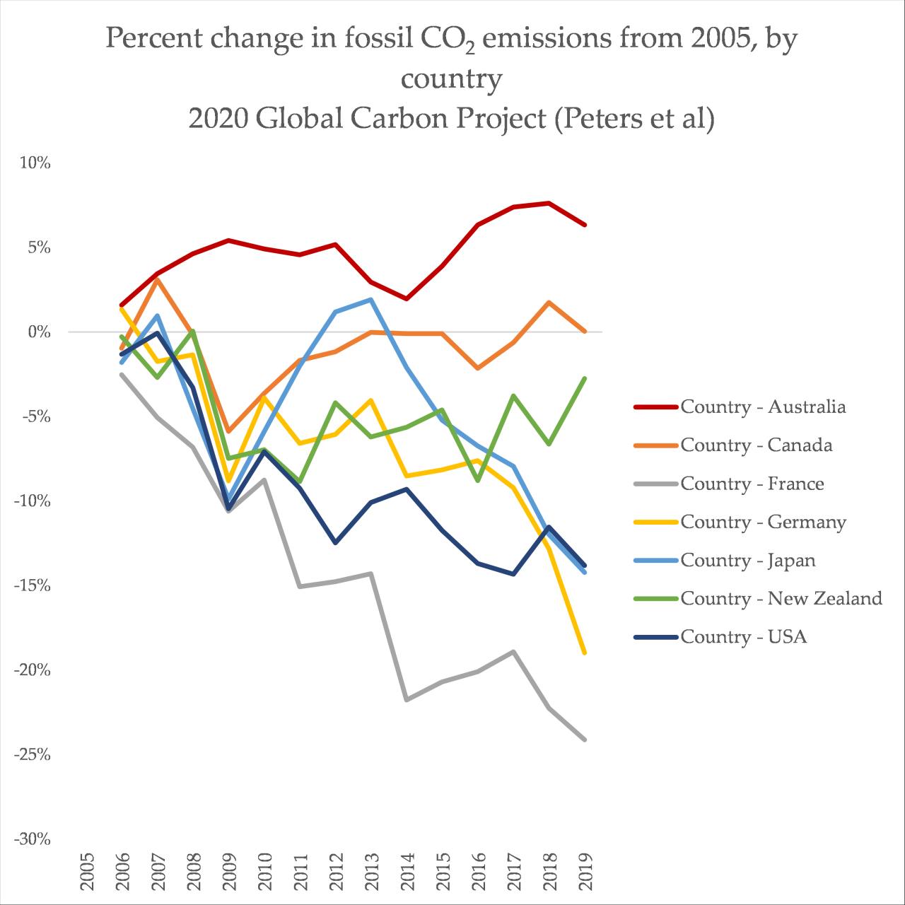
“Already total emissions in Australia are 19 per cent lower at the end of 2020 than they were in 2005. 19 per cent. That’s a further improvement on the 13 per cent reduction by 2018. How does that compare? Well in Canada it was zero, in New Zealand it was eight (sic: 1%) per cent, and Germany, Japan and the United States it was 10 per cent over that same period. So don’t let it be said by those who want to talk Australia down in what we’re doing on emissions that we’re not carrying our load. We are, and we are leading the way. Our domestic emissions have already fallen by 36% from 2005 levels. That sounds to me like Australia doing its heavy lifting in our part of the world”
It’s so confusing. Has Australia reduced emissions by 19% or 36%? (It’s neither, but we’ll get to that). This line has popped up in a variety of forms. On Sky News Australia, Energy and Emissions Reductions Minister Angus Taylor said it again:
“What we’re seeing is developed countries like Australia and the US bringing down their emissions. Us, faster than the US or Canada or New Zealand or Germany or many other countries”
On the ABC, with Fran Kelly:
“You’ve got to deliver the outcomes. Now on that, Australia is a world beater. We are seeing Australia has beaten New Zealand, Canada, France, the United States, and many other countries”
And at Morrison’s press conference, bragging about Australia’s supposed ‘transparency’ on emissions, Morrison said:
“The reason I can only tell you that we’re doing better than Canada, New Zealand, Japan and the United States from 2018 is because other countries don’t update their figures like Australia does”
Stunningly, the only real pushback Taylor received on this list of countries Australia has ‘beaten’ was from none other than Sunrise’s David Koch:
ANGUS TAYLOR: Well, that’s not right. When you look at the scoreboard, Australia’s performance is strong. We have done-
DAVID KOCH: It is half of the UK’s.
ANGUS TAYLOR: We have done better. Let’s look at the scoreboard, Kochie-
DAVID KOCH: Yeah, yeah, well the scoreboard says we’re half.
ANGUS TAYLOR: We’ve done better than New Zealand, than Canada, than France, than Germany-
DAVID KOCH: You’re cherry picking.
ANGUS TAYLOR: And the United States.
DAVID KOCH: Okay, UK is reducing emissions by 68 per cent by 2030, 78 per cent by 2035. We’re 26 to 28 per cent. That’s the scoreboard.
So what’s the reality?
There are many, many different ways of measuring emissions, and many different ways of defining ‘change’. You can count some greenhouse gases, or all of them. You can include the unreliable and shaky measurements of land use change, or not. You can define emissions as absolute, or per person (the current preferred fudging tactic for the Australian government).
Putting the mystery of how Taylor and Morrison’s staffers have done their sums, the core message is simply wrong.
A simple metric – we can look at what’s known as ‘fossil CO2’ emissions. That’s carbon dioxide released from human activities, like burning coal, oil and gas for energy. It excludes methane leaks from mining, or methane from cow burps, and land use change. But it’s the bulk of the climate problem, and the one with the most potential for reductions, so it’s a meaningful and simple metric (used by Our World in Data, for instance).
So where does Australia sit, in comparison to those cited countries, in terms of how emissions have changed since 2005?
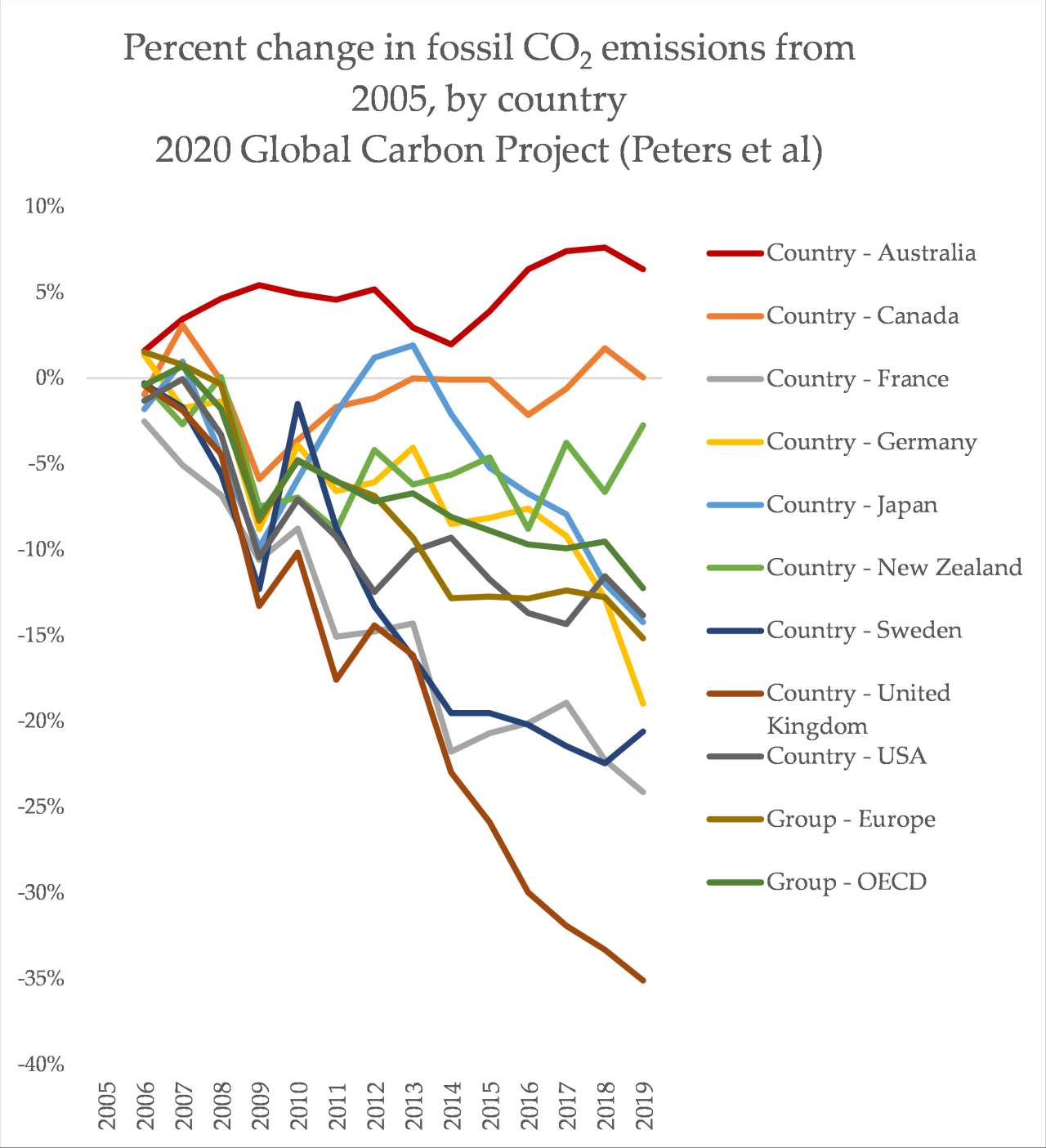
In fact, if you add in a few more countries and regions, such as Europe or the OECD, Australia remains far behind:
Okay – but what if we include other emissions? Methane, nitrous oxides are converting into a ‘co2 equivalent’ (CO2-e). The OECD’s data only go up to 2018, but the picture is pretty much the same:

So how can Australia claim that it’s beating all the countries that we can confirm it is absolutely not beating?
There are two possibilities, potentially in combination. First, the claim could be calculated to include changes in land use. Australia’s historical land-use emissions are, controversially, included in its climate targets. These change wildly almost every year, including massive variations in historical data. Generally, they are excluded from emissions metric globally due to this unreliability but also due to the fact that it is human-caused greenhouse gases that are the vast bulk of the climate problem. That is why Australia’s domestic emissions accounts show a 17% drop since 2005 in the year 2020, but the OECD and Global Carbon Project data show a clear increase in emissions – the land use fudge plays a major role in Australia’s climate ambitions. There is also no global data set I know of that includes this in comparisons.
Second, the calculation may be done as – you guessed it – a “per capita” estimate. Australia already has the highest per capita emissions in the OECD, and among the highest in the world. But it isn’t a metric I’m a huge fan of, partly because so much of Australia’s emissions don’t relate to individual decisions made by citizens. How much sway do you have over Santos adding millions of tonnes of fugitive emissions to the accounts?
It’s galling – truly galling – to see Morrison bragging of transparency, when trying to decode these claims takes you down a weird and ludicrous rabbit hole. Morrison is now even arbitrarily excluding domestic emissions from gas mining from the percentage change since 2005, in an effort to inflate the percentage reductions since 2005.
The spurious math behind these percentages is deeply frustrating. They hark back to the government’s worst habit: achieving emissions reductions by twisting spreadsheets into knots, instead of actually reducing emissions. It was the core philosophy behind using “carryover credits” for the Paris 2030 target, and it’s the same attitude at play here.
And in a week where Japan, the US and the UK all announce stronger climate ambitions, hopefully it doesn’t pass on the global stage.