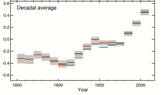
Here is the key graph from the 5th assessment report from the IPCC. It shows the story on global warming and temperature rises. If you want to cherry pick data, then pick your starting point in the top graph and work from there.
But the second graph tells the story. It’s in decades. Can anyone now really tell us that the world has stopped warming?