Graph of the Day: Can high-speed rail cut air travel emissions?

Australia’s domestic air travel (and its associated greenhouse emissions) has grown markedly – especially in the last 10 years, as this graph illustrates.

Air travel & emissions growth

Air travel (passenger km) data from the Bureau of Infrastructure, Transport and Regional Economics

We have calculated emissions using the short-haul average emissions per passenger-kilometre as used by the UK government. This takes into account radiative forcing effects of combustion at altitude, nearly doubling the climate impact of the emissions compared to Australian government estimates.

What emissions reductions are possible, just from building high-speed rail (HSR) in the Melbourne corridor? The following graph illustrates the proportion of 2011 air travel from trips that lie within the HSR corridor that is proposed in the Federal Government/AECOM modeling of the HSR route.

air-HSR mode share

This is based on the observed mode share on European routes where air travel competes with high-speed rail. For a three-hour trip such as Sydney-Melbourne, this equates to about 60 per cent of trips by rail. For Brisbane-Melbourne, the roughly six-hour train journey attracts around 10 per cent of trips.

If this typical mode share were followed, roughly 18.3 per cent of domestic air travel emissions would be avoided. If more trips moved to high speed rail, up to 33.1 per cent of air travel emissions could be avoided in the case where 100 per cent of trips on the HSR corridor were taken by rail.

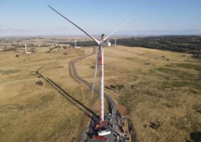
The radiative forcings from high-altitude combustion mean that air travel can never reach zero emissions, even when burning scarce biofuels. Several studies have now shown how 100 per cent renewable electricity could be supplied to the grid that would run the bullet trains.

Ben Courtice is media co-ordinator at Beyond Zero Emissions. Thanks to Petar Pantic and Gerard Drew from Beyond Zero Emissions for putting together much of the background data that informed this article.

Comments

6 responses to “Graph of the Day: Can high-speed rail cut air travel emissions?”

  1. Gnoll110 Avatar
    Gnoll110

    Isn’t that graph missing ‘Rail travel outside the HSR corridor’?

    1. Ben Courtice Avatar
      Ben Courtice

      Not really. That is somewhat outside the scope of this which just looks at replacing existing air traffic with the proposed high-speed rail from Brisbane to Melbourne.

      1. Julien Benney Avatar
        Julien Benney

        If one understands how sensitive Australia’s ecology is to climate change, as shown by Tom McMahon in such works as “Global Runoff: Continental Comparisons of Annual Flows and Peak Discharges” and more recently “Precipitation elasticity of streamflow in catchments across the world”, Australia has every right to be required to replace high-greenhouse car and air transport 100 percent with high-speed rail.

        For political reasons related to the power of the mineral industries, in the development of high speed rail Australia disastrously lags fifty or more years behind Europe and Japan. In ecological terms, it ought to be as far ahead of those nations as it is behind – then we might not have the ecological problems we fact today or the lowest-low fertility of the Enriched World which is ecologically easily manipulated at very low cost to support large populations.

  2. Aidan Stanger Avatar
    Aidan Stanger

    If you look at the actual emissions figures rather than estimating them from passenger kilometres, you’ll find they’ve hardly changed – the growth in demand is matched by an increase in efficiency.

    I’ve seen a graph that illustrates this well, but unfortunately I can’t find it. However the graph at…
    http://www.climate-connect.co.uk/Home/?q=Australia%20releases%20Aviation%20Action%20Plan%2C%20favours%20market-based%20mechanisms%20to%20cut%20emissions%20
    ..also shows relatively constant emissions.

    1. Ben Courtice Avatar
      Ben Courtice

      What efficiency measures are you talking about? Cramming in more passengers? Less circling before landing? Newer, better aircraft?

      If you look at flight departures instead of passenger km, you get a
      similar picture to the graph I provided here. The DEFRA figures for
      making the calculations are fairly recent.

      Even the Australian government’s official figures show a significant increase, albeit not as steep as the calculation in my graph.

      The other important factor, of course, is the RFI used for emissions at altitude – which appears to be missing from the Australian government figures, meaning they understate the warming effect of those emissions.

      1. Aidan Stanger Avatar
        Aidan Stanger

        What efficiency measures? Probably all of the above plus better matching of aircraft size to demand.

        If your graph looks like something else then maybe you should claim that something else rather than making a false claim about a huge increase in emissions.

        And the Australian government figures may well ignore the RFI – but if it’s consistently ignored then it’s irrelevant to whether or not there’s an increase.

        Unfortunately I’ve still not been able to find the graph that I’d hoped to link to.

Get up to 3 quotes from pre-vetted solar (and battery) installers.