
Sometimes, I stumble onto web sites and just end up siting there, staring at the screen, gob-smacked at the innovation and cleverness of people in the Australian PV industry.
While I was doing some fact checking today, I went to the Australian PV Institute’s flash new web site (formerly the Australian PV Association) and blow me down, those clever little munchkins have just innovated the pants off the rest of the world and created a Live PV Map.
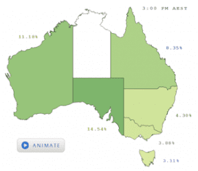
When I logged on around 3.50pm this afternoon for example, I could see that almost 19% of South Australia’s demand was being met by PV, 11% in WA, almost 6% in QLD, 3% in NSW. 4.2% in VIC and even Tasmania has close to 4% contribution. If ever there was a tool that showed how real PV’s contribution is, it’s this one.
I knew this project was underway and have seen similar things in other countries, but for such a small country, geeze we do some good stuff, don’t we? The map takes data from a variety of live sources, normalizes it, scales it to match installed capacity and then allows you to compare it to actual demand; and it’s live. This simple description belies the complexity of creating such a tool and even more importantly, doesn’t begin to define the potential power of such a tool.
When I was working on a network integration project a year or so ago, the need for accurate tools that can predict solar generation in real-time came up as a crucial issue for our industry as we grow ever larger. If our industry is to truly become a major part of Australia’s energy mix we need to be able to work with other generators, allowing scheduled and non scheduled generation to ramp up and down, thus optimizing and balancing the energy mix. It happens now for conventional energy and large-scale wind and this tool is the first stage of us being able to do the same thing with PV.
In its full glory this tool will theoretically enable you to see “waves of sunshine” travelling across geographic area’s and predict when it will arrive at load centres. It will include 3D imaging of solar sites, and links to individual performance statistics. It will allow us to be able demonstrate in real-time, how close proximity geographic diversity really does overcome the perception of PV peaky-ness. And for those with an appetite for innovation in energy markets, it will give them a tool to play the energy market and extract extra revenue for their PV capacity in very tight intervals – just like the rest of the market.
Looking ahead, utilities will have feeds into their control rooms and will be able to predicatively and dynamically use PV to manage voltage in a more sophisticated way. Energy futures traders will use it to try to make more money off trades based on sunshine forecasts. Think its all fanciful? Well it’s not, it already happens in other markets and we are just catching up.
Frankly, it has such profound implications I’m surprised Grant King hasn’t come out and blamed it for rising electricity costs and suggested it should be shut down already.
What is totally cool and got me all worked up was the fact that Australia is a little different and needed a typically innovative Aussie solution. Unlike most other countries who have masses of large-scale solar, we are endowed with around 1.3Million small systems on the roofs of the people power station. This tool allows us to finally measure and aggregate all those systems together into a meaningful 3GW lump.
As time passes and access to live, on-line data improves (the NBN would have helped there…) the accuracy and resolution will undoubtedly improve and the boffins at the energy market modelling studio’s will develop all sorts of clever tools for using it in new ways.
It’s an absolute credit to the everyone involved at the APVI (particularly Dr Anna Bruce) and was funded by the Australian Renewable Energy Agency (ARENA). The project is a great example of the huge value that ARENA was just starting to provide; I don’t think you could find a better example of Direct Action than a live feed. Despite this, ARENA are one of a number of clean energy agencies in Canberra who have had their funding cut, in this case by almost half a billion dollars obstensively because they cost too much and offered insufficient value.
Well, ARENA and the APVI have demonstrated that Australia can develop world-class, innovative tools and be at the forefront of “the new normal”; where renewables are part of the global energy mix. The irony is, much of the best work in Australia is done by volunteer’s like many of the APVI’s members and represents astoundingly good value for the entire country, rather than just cost as the fiscal hatchet masters would have you believe.
Yep, better cut that budget.
Footnote: The Australian PV Institute relies on very affordable memberships to conduct work like this – go on, support them.
This article was originally published by SolarBusinessServices. Reproduced with permission