In 2010 human activity caused 50 Gt CO2e of greenhouse gas emissions.
These emissions were 76% carbon dioxide (CO2), 16% methane (CH4), 8% nitrous oxide (N20) and 2% F-gases.
The big terrestrial emitters were China (23%), the USA (14%), Europe (10%), India (5%) and Russia (5%).
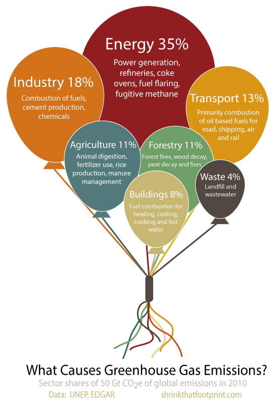
And the primary sources of emissions were energy (35%), industry (18%), transport (13%), agriculture (11%), forestry (11%), buildings (8%) and waste (4%).
The sources are explained in more detail in the balloons above, which technically shouldn’t float so well ![]() . These balloons don’t look very threatening, but they represent the large majority of positive climate forcings.
. These balloons don’t look very threatening, but they represent the large majority of positive climate forcings.
Which in English means they are major causes of climate change.
Check out our new eBook for ideas that will deflate your balloon.
This article was originally published on Shrink That Footprint. Reproduced with permission


