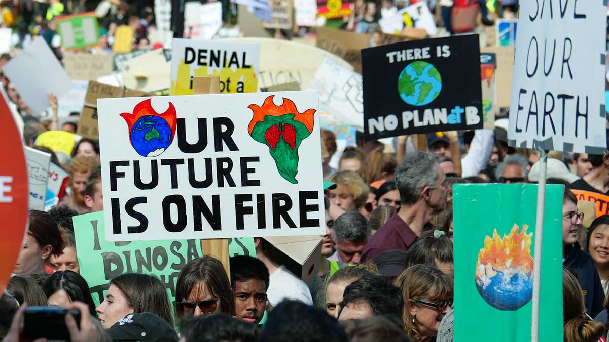
The debate over climate change and the energy transition never goes away, and right now it’s at a rolling boil.
David Suzuki says “It’s too late, we’ve lost.” James Dyke says “action on phasing out fossil fuels is slowing down or even stalling.”
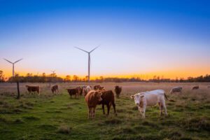
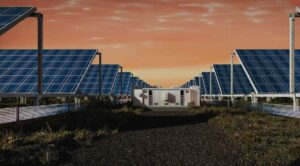
Optimists love solar’s incredible run and bright future, pessimists point out that it still only provides 1% of primary energy, we’re staring down the barrel of 1.5 ºC, and question whether a transition is even happening. Degrowthers argue that even solar is not truly renewable, only “rebuildable” as the panels still require mining ever-poorer ores.
Clearly there are many ways to slice the data. Here I’ll look at renewable energy as a proportion of final energy demand.
It’s a particularly challenging measure as it is stubbornly low, having increased only from 10% to 15% in the past decade, and the target is so far away – it has to get close to 100% in the second half of this century just to limit warming to 2ºC.
This metric takes into account both positive effects like rising renewables and also negative effects like increasing population, increasing economic activity, and a failure to phase out fossil fuels.
I’ll use data from Our World in Data, which inflates renewable energy using the ‘substitution’ method; if you stick to proportions (and not absolute amounts), that gives a reasonable approximation to renewable energy as a proportion of final energy demand.
On this measure, is progress stalling?
Annual data is noisy, moreso as wind, solar, and hydro increase, so I’ve taken a linear fit to 11 years of data from 2013 to 2023 to rank countries by their average rate of increase.
Globally, progress is not stalling, it’s accelerating – although it is still too slow. But some countries are doing much, much better than others.
The average increase for 2013-2018 was 0.4 percentage points per year (top 10 countries, 1.3%); for 2018-2023, 0.6 percentage points per year (top 10, 1.8%). At that rate getting to 100% will take 150 years. The rate needs to triple – that is, it needs to match the current best countries – for a safe future.
The top countries are shown in the figure. I’ve extended the top 10 to the top 13 so that Australia is included. Note that the top countries are all very different to one another: they are large and small, rich and poor, coming off a low or a high base.
They all have very different energy resources and energy mixes. However, Denmark is a standout by any measure, being far ahead even of the 2nd and 3rd place-getters, Ecuador and Sweden.
There’s a limit to what can be concluded from this kind of broad overview. Every country has a different emissions profile and different climate politics.
Each faces different challenges. But my takeaway is that an accelerating energy transition is possible and is happening, even in highly diverse countries. It is easy to be discouraged looking at the scale of the task, but progress is possible.

Robert McLachlan is a mathematician at Massey University, New Zealand, and writes on climate and the environment at planetaryecology.org. His most recent post looks at the best-performing countries in the coal and transport sectors.