Ramping and duck curves

Figure 3 Electricity supply California, 12 Months to March 2016. Source: http://euanmearns.com/a-more-detailed-look-at-the-california-grid-data/

Dispatchable generation is much in the electricity news these days. Increasingly, we are debating what are the requirements for a “reliable” electricity supply as the variable renewable share increases.

The general public are always concerned with what happens “when the sun doesn’t shine and the wind doesn’t blow” As we’ve remarked, the intermittent nature of wind and PV has been of concern to system operators and the general public since the first wind turbine.

So far electricity grids have shown that the can cope with wind and PV levels of say 20 per cent without any drama. Central Europe (Germany, France, Italy, Spain and the Nordic countries), California and Texas are all examples we regularly point to.

Those regions are all ahead of Australia’s National Electricity Market (NEM) in terms of the current level of wind & PV penetration, but it’s fair to say they all have better levels of gas and or hydro than the NEM. So there is a particular risk in the NEM.

However, we’ve also shown that in the NEM demand on average swings around by more than 30 per cent from peak to trough, and on some days by much more than that. So far, the NEM’s mostly coal based system has coped with that as a matter of course.

So for us we don’t think grid reliability and flexibility in the NEM would be much of an issue for the next few years except for the fact that the coal generation fleet is getting very old, and the number of coal generators is reducing.

The main risk in the next few years is the physical reliability of the coal generators in Victoria and NSW. There are only 8 coal generation stations, two of which share one coal supply. However, each station does have more than one unit.

So for the past decade the question has been what to replace these coal generators with and how fast to do it?

Everyone knows they need to be replaced, but partly because of ideology and perhaps partly because of fear of the unknown there has been a reluctance to get on and design a system that phases these generators out in an orderly manner and replaces them with a largely VRE system backed up by dispatchable renewables and perhaps a bit of gas.

A couple of ramping examples

If we look at South Australia since Hazelwood closed it breaks into a  high wind phase and a low wind phase:

Figure 1 South Australian supply. Source: NEM Review

The thing that jumps out is that on average South Australia has since July been a net exporter of electricity.

That’s possible because Victoria’s prices are high because gas and hydro are the price setters in the State these days. Victoria is the new South Australia, and actually it’s the new South Australia but without, yet, the low variable cost renewables.

So if we look at what’s happened since July (the high wind period) even into November (lower wind again) what we see is that Pelican Point has been a huge beneficiary of the Victorian prices, and at the same time the ramping required in South Australia is now being managed by Tips B (Torrens Insland unit B) and by exports.

Exports go up in the middle of the day and Tips B output goes up and down. Pelican Point, a mid merit, not particularly flexible, combined cycle generator has been holding its output relatively steady.

Tips B, being a steam fired gas generator, is we think more flexible and suited to ramping than Pelican Point. At the same time Pelican Point’s heat rate is lower than Tips B minimizing gas use.

Figure 2 Ramping in South Australia. Time of day average . Source: NEM Review

We’ve also noted, as have others, that South Australia’s hot water tariff should be adjusted to the middle of the day from midnight. This requires as we understand it replacing a bunch of meters, but meter replacement is all the go now anyway.

On average gas goes from 660 MW minimum to about 1100  MW max. This doesn’t seem to challenging now that Pelican Point is operating.

We’d add it’s Origin Energy that supplies some of the Pelican Point gas and it’s Origin Energy that benefits from South Australia’s exports to Victoria as Origin doesn’t have the generation in Victoria to cover its load.

Its only power station there, Mortlake, is open cycle, and quite a bit of gas has to be burnt there to defend its position.

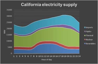
California and its duck curve

We don’t usually admit defeat in working our way around electricity data bases but in the case  of  CAISO’s Oasis system we admit we need some help. Despite  couple of hours of effort we can find that part of the data base that shows generation by fuel by hour of day.

So we had to reply on one file we could obtain that only goes up to March 2016. The duck curve (generation other than by solar) will have become more pronounced over the past 18 months, and will be more again in another couple of years. Still as of the 12 months ended March 2016 the gas, hydro and exports seem to be coping with it reasonably well.

Most of the 5 GW, probably over 6 GW today, ramp requirement is carried by gas, with small adjustments to imports. The gas generation has, on average,  about 10 hours to increase output by about 5 GW, so it seems that most of the time gas is well suited to this role.

What it shows is the advantage of a larger grid where multiple gas units can gradually come on an off line.

There are plans to phase out the  California nuclear supply. As  California moves on towards its 50% renewable target (including renewables share of imports) and because electricity demand in California is not growing it will be gas that is forced out of the system.

Demand management may have some impact as well. So even in California there is going to have to be some thinking about dispatchable renewables to replace gas. If anyone can point to some more up-to-date data on California I’d be grateful.

Figure 3 Electricity supply California, 12 Months to March 2016. Source: http://euanmearns.com/a-more-detailed-look-at-the-california-grid-data/


Figure 4 Dispatchable generation California 12 moths to March 2016. Source http://euanmearns.com/a-more-detailed-look-at-the-california-grid-data/

David Leitch is principal of ITK. He was formerly a Utility Analyst for leading investment banks over the past 30 years. The views expressed are his own. Please note our new section, Energy Markets, which will include analysis from Leitch on the energy markets and broader energy issues. And also note our live generation widget, and the APVI solar contribution.

David Leitch is a regular contributor to Renew Economy and co-host of the weekly Energy Insiders Podcast. He is principal at ITK, specialising in analysis of electricity, gas and decarbonisation drawn from 33 years experience in stockbroking research & analysis for UBS, JPMorgan and predecessor firms.

Comments

8 responses to “Ramping and duck curves”

  1. Peter F Avatar
    Peter F

    I haven’t checked the figures for other regions but peak generation in Germany is about 85 GW Flexible capacity – Gas, diesel hydro and biomass is around 55% of peak generation. Australian gas, diesel, biomass and hydro is about 20 GW vs a peak of 35 GW (57%) Germany never imports power at peak it exports, while it imports cheap off peak power while ramping down hydro, black coal and biomass so the availability of imports is not a significant contributor to system stability.
    Further much of their hydro is run of the river and neither CC gas nor biomass are perfectly free to ramp so one can argue that Australia’s flexible capacity is in fact more flexible than Germany’s.
    The wider dispersion of Australian renewables, the higher capacity factor of our wind and solar farms and peak demand occurring when the sun is shining and wind is blowing as opposed to dark windless peak demand in January in Germany also suggest we can have a stable grid with a higher renewable share than Germany’s 38.2% YTD.

    Briefly the ERCOT grid in Texas by the end of 2018 will have 24 GW of wind in a much smaller area than the NEM vs 18 GW of coal and nuclear and 71 GW peak demand so they are happy with a wind share of 33% of peak demand which is the equivalent of 11 GW on the NEM. Already on some days wind has reached 52% of total generation. We have a long way to go before we need to worry about over penetration of wind. By the way hydro in Texas represents about 1% of installed capacity, in Australia it is about 18%

  2. Peter Avatar
    Peter

    Hi David, thanks for all your informative posts this year, you’ve made Monday afternoons much more enjoyable. I am curious about the evidence behind why you think South Australia should change its “offpeak” meter timing to the middle of the day. I’m not suggesting its a bad idea, but I’m interested to see how the numbers would stack up against the wholesale spot price say between 11:30 AM to 2:00 PM compared with the 11:30 PM to 2:00 AM spot price (or a better way that you know of). What would the saving be and how might that compare to the cost of switching the meter? Bonus points if you can calculate the difference in carbon footprint based on average generation mix to! 😉 Thanks again.

    1. David leitch Avatar
      David leitch

      Because it would allow the hot water systems to be charged when grid demand is low because of behind the meter pv.

      Thanks for your kind words Peter.

      1. Mike Westerman Avatar
        Mike Westerman

        I’m hoping that consumers realise the benefits of installing load management (either as in Fronius inverters or the stand alone gadget from Paladin or make your own with a Raspberry Pi – my current project) to shift either their HW or AC load to maximise self use.

      2. Peter Avatar
        Peter

        No worries, the kind words a genuine, you;re consistently the most objective author.
        I’m going to remain sceptical on the benefits of shifting the offpeak timing to midday. Looking at the graph above the most inefficient gas plants (TIPS A & B) are running more often during the day. I interpret the graph as indicating that the hotwater services would be better off switching on at 2:00 AM. I have read that record low grid demand has been observed on recent Sunday’s at midday, yet your graph shows that consistently the lowest demand is still during the night, at the same time when the wind farms quite consistently perform and therefore the carbon footprint per kWh is probably(?) lowest. The day may come that solar completely reverses that, but are we really there yet?

  3. Jonathan Prendergast Avatar
    Jonathan Prendergast

    Thanks for your analysis this year David!
    It’s an important point that while solar and wind may be variable, they are no more variable than demand which can change so much.
    When studying generation for the NEM and issues like ramping, I am always hesitant about average day curves shown for 24 hours. Each day is so different, as is each week or month. 12 month interval analysis is essential to see real extremes in terms of ramping, pricing and other elements. But is certainly hard to show in a web article that is engaging! An average day 24 hour graph can however be misleading at times.

    1. David leitch Avatar
      David leitch

      Your points are well made. I do see the average day curves as providing quite a bit of insight. Price and load duration curves are also helpful.

      The essential truth about recent South Australian experience is that pelican point is up and running steadily. This is basically a good thing as I see it at least from the point of view of reliability and facilitating the export of surplus South Australian wind to Victoria.

      At least that’s what I take from the graph.

  4. Clee Avatar
    Clee

    David, you can find the hourly generation by fuel for each day in the Daily Renewables output data files at

    http://www.caiso.com/market/Pages/ReportsBulletins/DailyRenewablesWatch.aspx

    At the bottom of that page, you can also find there the hourly wind and solar curtailment reports for each day since January 01, 2017

    I don’t know if there is a better way to get the data.

Get up to 3 quotes from pre-vetted solar (and battery) installers.