High prices, particularly in the evening, have become a feature and a blight on the National Electricity Market in recent weeks and months, and coal capacity utilisation tells an interesting story.
Overall, it is looking bad, except in Victoria. And Victoria is going to look a bit worse with the latest outage of a unit at Loy Yang A. This note basically covers what was happening recently to prices and coal generation prior to the LYA outage.
Right now we are in a seasonally soft, early autumn time of the year for electricity demand, a period when it is not too hot and not too cold (see graph below).

But any day, as the chart above shows, operational demand moves up. And we also move into the time of the year when wind and solar output drops. (See graph below).

So the potential for prices to go up remains high, even though electricity futures dropped a bit last week. However, the main point of this note is to show that the more exposed to high coal prices you might be, the harder you are ramping and lowering overall capacity utilisation.
NSW is more exposed to spot coal prices than Queensland, and Victoria has zero exposure to spot coal prices.
Most, if not all generators, claim they have contract cover and are not particularly exposed to spot prices in the short term.
Nevertheless, capacity utilisation at NSW generators is lower than those in Queensland, and in turn Victorian generators have the highest utilisation, at least up until the LYA outage.
| Capacity and average output past 30 days | |||
| MW | NSW | Queensland | Victoria |
| Output | 4400 | 5067 | 3823 |
| Capacity | 8580 | 8126 | 4820 |
| Utilisation | 51% | 62% | 79% |
Figure 3. Coal generation last 30 days. Source: NEM Review, AEMO
The following figure shows the average coal capacity output in MW over the past 30 days compared to maximum capacity of the generator.

What does surprise is the low capacity utilisation at Bayswater and Mt Piper.
These two charts below, no longer a surprise to anyone, show why any generator exposed to spot prices would like to find a reason to have many break downs.

It takes about 0.35 tonnes of coal for every megawatt hour (MWh) produced, so if you had to pay $450/t for coal – and, yes, that’s Japan spec coal not the garbage we burn in NSW – if you had to pay that, you’d need over $150/MWh just to cover fuel, never mind all the other costs.
Equally, if you are paying $15/GJ for gas then your open cycle gas generator needs around $165/MWh to break even, which is about the same as spot coal and very expensive.

The following couple of graphs show that:
NSW coal generation exhibits more ramping than Queensland, and Queensland shows more than Victoria. The data is expressed as index with 12:00 am expressed as 100 and every other half hour relative to that.

NSW ramps down harder in the early morning and peaks higher.
Secondly, even within NSW the heavy ramping is being done by Vales Point and particularly by Eraring.
Eraring ramps a lot, firstly because it can and secondly because it needs higher prices due to less contracted coal access. The same is probably true to a lesser extent for Vales Point.

To put Eraring in context, its minimum daily average generation is 984 MW and its peak daily average is 1684 MW, and its doing two cycles a day. That’s a pretty good effort for an old coal generator.
Finally, we show the NSW and Queensland price and what this shows is that the Queensland price is on average much peakier than that of NSW.
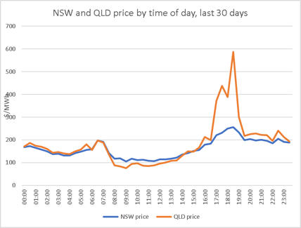
To be clear, the NSW price average over that period was $162/MWh and only $20 more for Queensland at $182/MWh, but the peak price is much higher.
This likely reflects the lack of storage in Queensland, not that there’s much in NSW, and the lack of hydro access, and the lack of access to Victorian power.
Queensland has a poorly diversified power generation system and the coal generation can’t or doesn’t ramp high enough in the evening peak, but the extra solar forces prices down a bit in the middle of the day.
There are many days when I think the way Queensland is running its generation is building up the same sort of problems China is running into.
A lack of faith in markets and over reliance on central control. If the State owned generators want to do something, they first have to go cap in hand to the state Government.
I suspect the Government then consults the unions, and maybe some other stakeholders on what is politically acceptable and then a decision is made. No discussion can be entered into.
In my view this is different to setting a centrally determined target and then letting market participants compete to meet the target.
But perhaps I have it all wrong. It’s easy to get the wrong end of the stick. And no doubt there is more than one way to achieve an objective. If only we knew what the objective was.
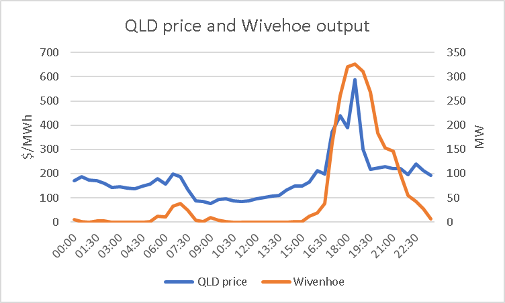
Looking at those peak prices naturally leads to wondering how the Wivenhoe pumped hydro facility has been going.
And the short answer is: It’s been capturing price peaks (good for generators), and helping to meet demand at peak (good for customers).
However, on average, it’s only doing 300MW at peak when capacity is notionally 500MW. Also on average it’s not suppling the later evening when prices in Queensland are still above $200/MWh.
Possibly this is because it’s held in reserve. The other problem is that prices only ever drop down to $100/MWh for a few hours in the middle of the day, so the pumping opportunities seem a bit limited.
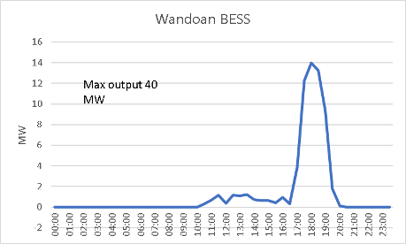
Although Batteries [BESS] have a great reputation for fast build and fast commissioning the Wandoan BESS in Queensland is either an exception to the rule or has better things to do than earn $600/MWh in the evening peak.
Its maximum output in the past 30 days is around 40MW compared to a capacity of 100MW/1.5 hours. Even over the peak 90 minutes its output is way less than capacity.
This could be due to operating for FCAS rather than trading. Yet it serves to show once again the inadequate diversification of the QLD portfolio and the fact that coal generation is very poorly suited to a region with a high solar resource.
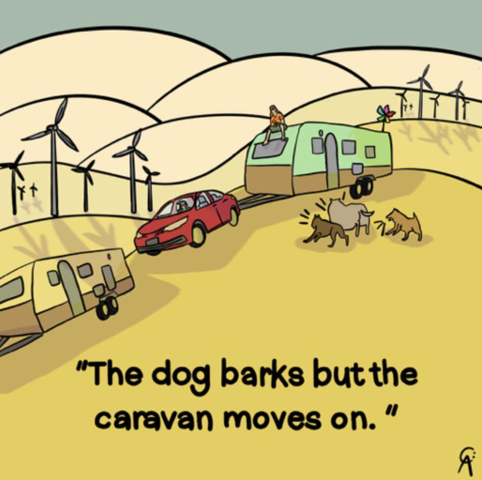
Much better off with more short term daily firming storage and some wind to run the overnight loads. One the Queensland Govt will work that out and the caravan will move on.