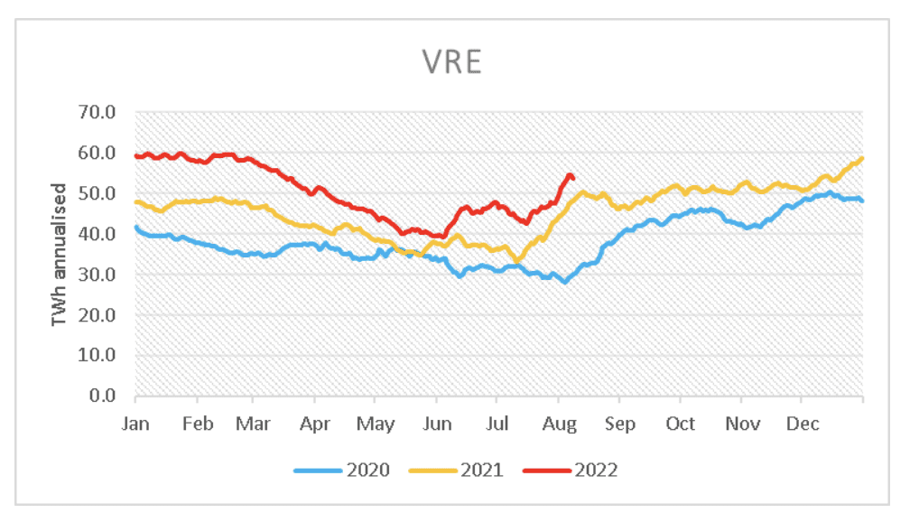
Production of variable renewable energy – wind and solar – has recently been running at an annualised rate of more than 50 terrawatt hours (TWh), which is more than 24 per cent of demand on Australia’s main grid.
And this is still at a time of the year when all three components – wind, rooftop PV and utility scale solar – are past their seasonal nadir, and with solar still nowhere near its zenith.
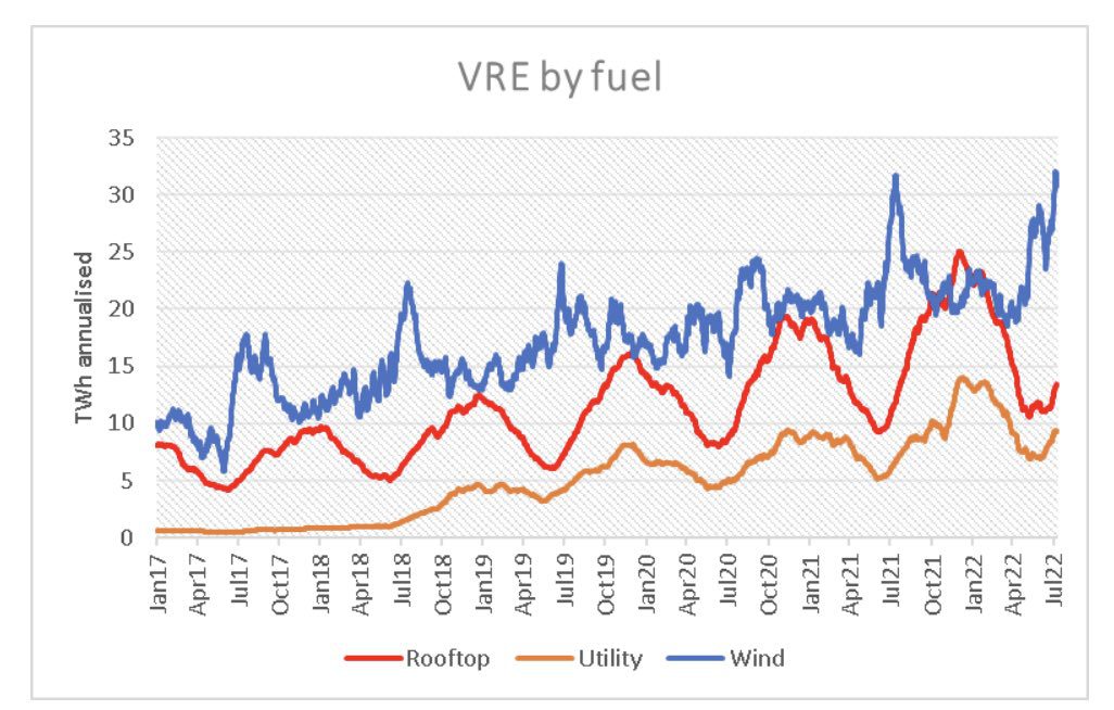
This first graph shows the growth in raw output of all three VRE components over the last five and a half years. The total has more than trebled in that time.
This second graph (below) shows the “annualised” output of wind and solar (small and large) over the last three years. There is growth in every month, even with the seasonal variation.

Operational demand, which is the demand on the grid after rooftop solar, has fallen 10 per cent from its annual peak due to the change in weather.

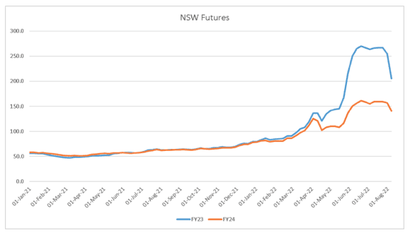
And this has led to a sharp reduction in futures prices.
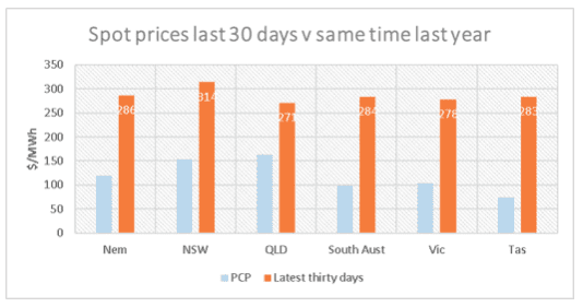
Yet the spot level remains extraordinarily high, notwithstanding spot is actually sharply down on its absolute recent peak.
Coal prices remain as high as ever, as does European gas
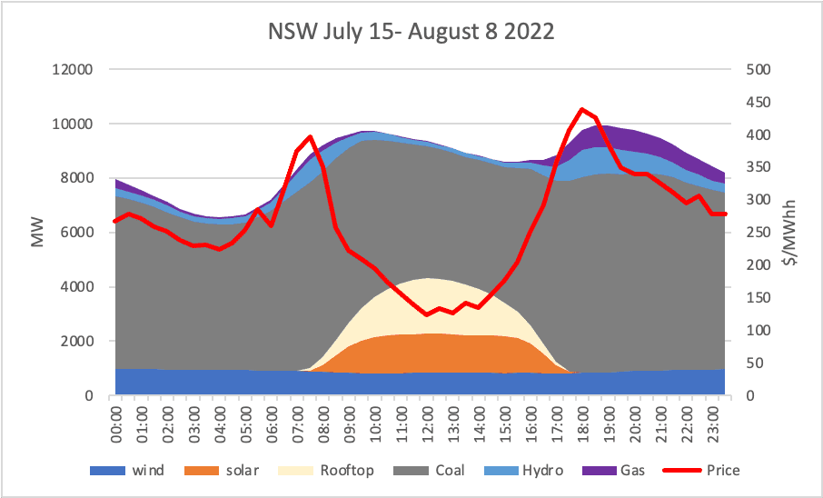
For interest and simplifying – by leaving out imports, and also demand – we can compare what was happening a year ago in the July 15- August 8 window:

In last year’s window (above), prices were sub $50 when solar was operating, and no gas or hydro was required. Coal set the price (as the last unit bid in, ignoring imports), and that price is driven by both the fuel cost but also the degree of competition between the coal generators.
When solar goes away there was enough coal and gas, and it was hydro’s turn to set the price. The way I draw the graph its’ hydro that is the actual price setter because historically hydro supply was limited and so it was priced on a scarcity basis.
Turning to this year (graph below), and we are past the worst of i. You can see, if you squint, that hydro is running pretty much every half hour and gas is running more often and that’s despite the higher VRE production.
A summary of the two periods is:

Basically, as much as the higher coal cost, it’s the extra 280MW of gas and hydro supply that drives most of the price increase, in my opinion.
The extra firming was required because of lower coal, probably lower net imports and a bit of extra demand and despite the VRE increase by almost 200MW on average (thanks to more utility solar).