The implications for supply and demand of electricity under decarbonisation

Introduction

In a series of notes we plan to outline the implications for the electricity industry in a world which takes the implications of COP21 as gospel truth.

That presupposes that policies are put in place that will result in Australia doing at least its share of the reduction in carbon output required to keep the increase in global temperature at 1.5 to 2.0C compared to the 20th century average. As far as electricity goes this means moving to about 70%-80% renewable by 2035 and on a pathway to 100% renewable by 2045.

This is based on the view that at the current global rate of emissions the carbon budget for 2c will be exhausted by 2035. At the moment there are zero signs that Australia or any other major country is seriously committed to such a course notwithstanding the COP21 agreement. Actions, and in this case policy actions, speak louder than words.

Electricity policy and climate change policy cover a lot of the same ground but are far from identical. For the most part the focus here is on electricity policy and the technical and economic issues but we start with the broader context.

Electricity is only 37% of emissions. An economy wide carbon tax is required.

In Australia stationary energy (electricity generation) is about 37% of total emissions, easily the largest sector but far from the only contributor. Fig 1 (below) is a blindingly obvious message that Step 1 of any sensible policy is an economy wide carbon tax. Any political party that doesn’t support that is missing the essential foundation of the lowest cost way of reducing emissions.

The alternative to a carbon tax is an even simpler legislative requirement that specifies the carbon emissions for various things, like in petrol or electricity generation and then lets the market find the least cost way of satisfying them. For instance, removing lead from petrol simply required catalytic converters, reducing sox and nox emissions requires generation scrubbers.

But these legislative moves do not work as broadly as an economy wide carbon tax. A carbon tax raises the cost of electricity and transport fuel, making substitutes more competitive and discouraging consumption. A tax is easy to administer and provides revenue certainty to the Government.

There would be modest negative impacts on consumer wealth, GDP. A $3o/t tax raises $5.5 bn per year increases the costs of electricity to residential about 10-12% and to business a bit more. At $30/t it adds less than 1 cent to the cost of a litre of petrol (based on 2.5 g co2/litre). A $30 per tonne tax would raise around $15 bn a year. None of this is news, but neither is it getting any airtime in the current debate.

Figure 1: Emission by sector
Figure 1: Emission by sector Figure 2: Australia’s CO2 emissions flat to growing
Figure 2: Australia’s CO2 emissions flat to growing


Moving to a high (70%-80%) renewable share by say 2035

In the remainder of this note we address the broad context of electricity demand outlook, and have a first glance at some of the issues surrounding high renewables penetration. Some of the conclusions may seem impossible or fanciful from today’s perspective but just proceed from the assumption that the world is going to decarbonize quickly and here are the technological issues and consequences. Subsequent notes will look more closely at a supply mix capable of keeping the lights on and aluminium smelters running and keeping Australia at the forefront of low cost global energy suppliers.

Electricity demand in the NEM by 2035 excluding electric vehicles

If GDP in Australia is going to grow at a compound pace of 2-3% through to 2035 and the Australian population is also going to grow at 1.0-1.3% per year, then we imagine electricity consumption will likely increase at say 0.5%-1.0% per year. Even if the growth rate turns out to be a bit lower, it probably does make sense to start to have a planning assumption that annual growth is about 1%. More aluminium smelters can close, to be sure, but other sources of growth may emerge.

For this exercise we adopt an energy demand growth forecast of 0.75% per year before allowing for electric vehicles and the conversion of other forms of energy consumption to electric.

Electric vehicles could add 33% to electricity demand

Transport is the broadly equal second largest contributor to Australia’s carbon emissions. Consistent with the 70-80% renewable electricity by 2035 we also assume that electric vehicles are 70-80% of vehicle kilometers travelled by that time. We estimate that 100% EV conversion would add about 33% to electricity demand, based on the following calculations.

Figure 3: impact of electric vehicles on electricity demand


Total electricity consumption in the NEM might be 300TWh by 2035

In the NEM grid sourced electricity production for calendar 2015 was 189 TWh. Allowing the existing sources of demand to grow 0.75% per year, adding in the assumed EV demand, and allowing for the continued distributed PV demand/supply of about 0.6 GW per year gets us to around 300 TWh by 2035, a 50% increase on 2015. Many demand forecasts include various scenarios, high growth, low growth etc in their demand forecasting models, but your author has never found these scenarios of any use and simply complicate the exercise. So we just pick one path, knowing it will almost certainly be wrong. That path produces the following graph of demand.

Figure 4: electricity demand under decarbonisation

Renewables make up 70-80% of supply

Before we think about the fact that wind and solar is “as available” rather than “as required” moving to renewables is very straight forward. Rooftop PV grows at about 0.6 GW per year and we just keep building more wind and utility (ground mounted, most likely single axis tracking) solar until we hit the desired target. In the graph below based on current cost trends we assume that in about five years solar in Australia is cheaper than wind.

We also model a declining capacity factor for wind as the best sites are used up. The scenario is just one of many paths, but we think its something of a consensus view in the renewable industry based solely on long run marginal cost [LRMC = price of electricity required to justify new investment]. As we get further into the model it maybe that wind gets more share relative to PV.

Figure 5: Generation mix in 80% renewables scenario

This scenario has not allowed any role for carbon capture and storage and nothing for concentrating solar with molten salt storage. They are two of several technologies which could emerge as more technically or economic viable. However I don’t think we need them and the market will supply its own answer. Next we turn to looking at the daily pattern of demand and some of the characteristics of “as available” compared to “on demand” supply.

The present daily pattern of demand and its variability

NEM demand is about 23 GW throughout much of the day on average. Lowest in the early morning and then peaking in the early evening. On an average day peak demand is around 6PM-7Pm Qld time. Rooftop solar is excluded from this chart as it isn’t officially measured. Across the NEM electricity demand is actually fairly predictable at least most of the time. Again we don’t measure separate Winter and Summer patterns in this first attempt.

Figure 6: NEM average demand by time of day

Wind output is very volatile

Fig 7 shows the average wind output over the over the past 12 months (17,000 half hourly measurements) sorted by time of day. We show the average but also one standard deviation either side. There is basically only 2/3 chance that the wind output on any given half hour will fall within a range of plus or minus one standard deviation. The minimum wind is about 34 MW during the 12 months and the maximum ( over the year) for virtually any half hour of the day is up around 3 GW.

It doesn’t show up so much in this chart but if we looked at the mean we would see a tendency for wind output to be at its lowest in the morning around the 10:00 am to lunch period. Also note that the times shown are QLD times and most of the wind is in South Australia. We’d expect the standard deviation of wind to reduce as more wind farms are built and particularly as they get more geographically dispersed but you’d need a lot of knowledge of wind speeds and correlations to do the calculations on that. Wind tends to run quite hard overnight when demand is lower.

Figure 7:Wind output by time of day past year

Solar PV is more predictable but not much use except in the middle of the day

At the moment there are only a few utility scale PV plants in operation and only Nyngan and Royalla have been operating for 12 months. Fig 8 below shows Nyngan. There is still a reasonable amount of volatility but the standard deviation in the middle of the day is about 35% for just this one solar farm compared to about 60% for the aggregate output of 35 or so wind farms operating in the NEM.

Figure 8: Nyngan solar farm showing average output by time of day

The good news is wind is a (small) partial hedge for solar

Figure 9 below shows an index of wind and solar output by time of day. We use an index so we can compare wind and solar when both have much larger output.

Figure 9: Wind and solar combined daily output pattern

Wind and solar capacity factors provide the limit to their contribution in the absence of storage

Generally speaking for renewables the capacity factor is the limit to the amount of electricity that can be contributed. For instance if solar has a capacity factor of 15% where 100% capacity factor means running 24 hours a day 365 days a year, then once solar represents more than 15% of the total installed capacity the marginal output is wasted. To see this imagine a system with 100 MW of demand and 100 MW of solar. At midday the solar runs 100% and supplies 100% of the demand. At night there is no solar. Overall solar is suppling 100% of demand at lunch time and 15% of total supply. Now if we raise the solar capacity to 200 mw, solar could supply 30% of the demand over the year but its supplying 200% of demand at lunch time and all the extra output is wasted.

The only ways to change this are to lift the capacity factor or introduce storage. This is likely to be a big advantage for single axis tracking solar. The capacity factor rises towards 30% so even without a decline in unit costs the higher capacity factor reduces the storage requirement. The NREL notes that in the USA for data up to 2014 PV capacity factors are increasing about 0.5% per year.

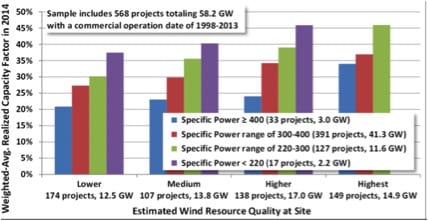
Wind in Australia typically achieves a capacity factor of 30-40%. Ongoing improvements, principally turbine heights, but also blade design, control systems and wind farm design mean that there is reasonable hope that capacity factors can continue to increase. The National Renewable Energy Lab [NREL] explains it thus:

“The lack of an obvious post-2005 trend in average capacity factors can be at least partially explained by two competing influences among more recent project vintages: a continued decline in average specific power (which should boost capacity factors, all else equal) versus a build-out of lower-quality wind resource sites (which should hurt capacity factors, all else equal).

The first of these competing influences—the decline in average “specific power” (i.e., W/m2 of rotor swept area) among more recent turbine vintages—has already been well-documented in Chapter 4 (see, in particular, Figures 24 and 26), but is shown yet again in Figure 33. All else equal, a lower average specific power will boost capacity factors, because there is more swept rotor area available (resulting in greater energy capture) for each watt of rated turbine capacity, meaning that the generator is likely to run closer to or at its rated capacity more often. “


The NREL goes on to show how capacity factors have increased after controlling for wind speed. The image below is taken from a 2014 report:
fig10


David Leitch is a regular contributor to Renew Economy and co-host of the weekly Energy Insiders Podcast. He is principal at ITK, specialising in analysis of electricity, gas and decarbonisation drawn from 33 years experience in stockbroking research & analysis for UBS, JPMorgan and predecessor firms.

Comments

17 responses to “The implications for supply and demand of electricity under decarbonisation”

  1. Peter F Avatar
    Peter F

    While there is some logic in suggesting that the contribution from a particular energy source is limited to its capacity factor, I think it is a significant oversimplification. For example most energy is used during daylight hours and moreover peaks are in summer so both of these factors favour solar, further if the market pays significantly higher prices for the afternoon it would reward west facing panels sited to the west of the load, so it is quite possible that single axis tracking solar could supply about 40% of demand without significant curtailment.

    Then we have the possibility of overbuilding. Gas peakers in the US operate at an average utilisation of 4% and still manage to make money. As the cost of wind and solar fall, if they only manage to sell 80% of their theoretical output, they can still make money. They will never have to accept negative prices as coal and nuclear do, so if there is spare capacity on a warm Sunday afternoon so what, current generation technology has had that problem since the first generator was built.

    That is where hydro can be used as infill rather than baseload is it is often used now

    In addition there is the possibility of storage at both ends of the grid. 30-90 minutes storage at a solar or wind farm allows the farm to take advantage of higher afternoon prices and reduces peak loads on the grid connection. Therefore more generation can be installed at a given site without costly grid upgrades. Storage (particularly thermal storage) near or behind the meter significantly reduces losses and investment across the entire grid but also absorbs surplus solar at mid-day and wind at night. The benefits of lowering grid costs are the major benefit rather than just backing up renewables

    Then there is the real possibility of demand management. Many domestic and even commercial and industrial loads can be time shifted without much penalty, eg pool pumps, dishwashers but even air-conditioners and heaters. In the Nordic region they already have a 2GW demand management load in a 24GW market.

    As to transport electrification.
    1. It will take much more than 20 years to electrify 70-80% of vehicle kilometers if we keep the same transport model. In 1950 the average Melbournian adult made 370 public transport trips, now it is 120. If we can get that back to 200 we will reduce the energy costs of transport significantly
    2. While it is true that teleworking has not taken off as expected, it is still growing and will grow faster once genuine high speed broadband makes real interactivity in meetings possible.
    3. We seem to be approaching “peak stuff” so even with continued economic growth the freight task will grow slower than the economy whereas up to 2010 trade in physical goods and services grew faster than economic growth.
    4. Long distance freight transport can be partially moved to rail but most will still be combustion fueled maybe compressed natural gas or bio-diesel but in either case using about 30% less energy per tonne mile than today’s trucks

    All in all I suspect electrical demand for transport will be less than half your projections

    Finally energy efficiency. If we converge toward California, Germany or Spain we should be able to halve our energy use per capita by 2035, 1.2% population growth per year is a 25% increase in population which is more than offset by decreasing energy intensity.

    In summary even at 40% energy efficiency improvement (i.e. still worse than Spain and Italy now) and allowing for a more conservative transport energy growth that means the total electrical demand is more like 235 x 1.25 x.6 = 176 TW.hrs adding back say 40 TW.hrs for electrical transport the electrical demand is still lower than it is today. If we allow for large scale conversion from gas to heat pumps for heating it may be possible to see a 5-10% increase on current demand, but then that is also a significant reduction in GHG intensity.

    1. Stephen Norris Avatar
      Stephen Norris

      One of the big plusses of solar thermal is that it includes “storage” in the form of molten salt.

      From what I’ve read, it seems to be the cheapest option for utility-size storage and would help a lot with FCAS.

      1. Peter F Avatar
        Peter F

        Stephen You are right storage doesn’t have to be batteries and a combined solar thermal and solar PV farm can be very economical because the solar thermal firms the solar PV during the day but the same transformers, grid connection etc can handle almost double the energy delivery over 24 hours.
        It is also quite likely that upgrading of our existing hydro can provide most of the peak backup we need

        1. Stephen Norris Avatar
          Stephen Norris

          Good point re Hydro, it also provides spinning reserve.

  2. Stephen Norris Avatar
    Stephen Norris

    I think the petrol price calculation has an error – it says 2.5g/l, which should be 2.5kg CO2/l petrol (which is just a typo), but $30/t is 3c/kg – so it’d increase the price of petrol by about 7.5c/l.

    1. David leitch Avatar
      David leitch

      Hi Stephen.
      I may have made a typo here and I don’t work with these conversions often, so good chance of error. According to this web site http://people.exeter.ac.uk/TWDavies/energy_conversion/Calculation%20of%20CO2%20emissions%20from%20fuels.htm

      Which may also be wrong it’s 0.2 kg per liter. $30 for a metric ton (1000 kg) of co2is $0.30 a kg and so per liter petroleum is as you say $0.06 liter about 4% of the pump price. Thanks for pointing that out.

      1. Stephen Norris Avatar
        Stephen Norris

        I think you’ve made two factor-of-ten errors, which cancel out.

        Firstly, $30/1000kg is 3000c/1000kg which is 3c/kg – I always make the same mistake, and I find thinking of it in terms of cents makes it much clearer.

        That said, 0.2kg/l is also wrong – octane (as a close approximation of petrol) is about 84% (C8H18 – Carbon is 96 out of 114) carbon by weight, so 1l (750g) of octane releases about 630g of carbon, which combines with oxygen to give 2.3kg of CO2.

        So, working it all out, you end up in the same place 🙂

  3. David Osmond Avatar
    David Osmond

    Always enjoy reading your analysis David, though in this case I have some concerns.

    You mention at one stage an example with solar having a capacity factor of 15%. This is fine for residential solar, but not for utility scale solar such as Nyngan, which is getting a capacity factor of more like 26%.

    A key difference between the two is that the residential CF is based on the DC capacity of the panels, whereas the utility scale CFs are generally based on the inverter AC capacity, or a grid connection limit.

    This means that a utility installation such as Nyngan does indeed export at 100% power capacity at noon on sunny days. In contrast, the residential system never gets to 100%, as it has electrical and inverter losses that occur after the DC panels. Indeed, it would rarely get to 90% of capacity.

    So your example of 100 MW of solar should probably either have a CF of ~26% and get to 100 MW at noon on a sunny day, or it should have a CF of ~16% but only reach 90 MW at noon on a sunny day.

    Moreover, if 100 MW is the average demand, then it is likely to be more than 100 MW at noon, as midday demand is higher than average demand.

    Related to this point, I get concerned when I read “Generally speaking for renewables the capacity factor is the limit to the amount of electricity that can be contributed”

    This doesn’t take into account the fact that in most cases, neither wind nor solar ever get to 100%, particularly when you agregate output over a range of locations.
    For example, an individual wind farm may, during windy times get close to 100% (a bit less is more likely), however a selection of wind farms over a large area such as the NEM will rarely produce at more than about 85%, as it is rare for it to be very windy at all locations simultaneously.

    It also doesn’t take into account that very small amounts of curtailment can allow penetration rates far in excess of the capacity factor rule of thumb. For example, in South Australia, wind is currently generating ~32% of annual demand, very similar to its capacity factor. In some instances, it is generating more than demand. The CF rule of thumb would suggest wind in SA has reached its limit. However, SA could install 50% more wind than at present, curtail wind generation when it exceeds demand, and still only suffer 8% curtailment losses. An 8% curtailment loss would only increase the LCOE of wind by 8%, which is pretty small in the scheme of things.

    1. David leitch Avatar
      David leitch

      Thanks for you comments David. I do appreciate the differences between residential and utility solar. The bigger point though is that the capacity factor of solar whether it is 15% for residential DC based or 32% for single tracking AC based is still a limit to how much value it provides in a largely renewable grid. If PV had a capacity factor of 100% we wouldn’t need anything else. Because the capacity factor is at best about 32% we need a lot of other generation and storage. To keep the lights on at night as the saying goes. The higher the capacity factor the less backup is required and so I m starting to think that higher capacity factor has some “hidden value” in the form of avoided system cost. I would be interested in your thoughts on this.

      1. David Osmond Avatar
        David Osmond

        Hi David, my point is if you want to use the capacity factor as a proxy for how much value it provides (though in general I feel this is overly simplistic), then rather than using the conventional capacity factor, you should be using an effective capacity factor, defined by the average output divided by maximum output. So if, for example, NSW had 10 GW of PV, with a capacity factor of 20% and a maximum output of 8 GW, then the effective capacity factor would be 25% (i.e. 2 GW/ 8 GW). And if NSW has 10 GW of wind, with an average CF of 35%, but a maximum generation of 8 GW, then it has an effective CF of 43.75%.

        But as I (and Peter F) mention, even using the effective capacity factor as a proxy for value is highly simplistic. Solar PV should be given credit for producing more when demand is high.

        The fact that wind and solar are slightly negatively correlated should mean that the combination of the two is worth more than their individual capacity factors would indicate (a perfect negative correlation would mean you could combine the two, and simply add their capacity factors together to get an effective capacity factor).

        And if it it takes only a modest amount of storage or curtailment to massively increase the effectiveness of a technology in meeting demand, then that is also worth acknowledging. ie. a technology that generates 12 hours on and 12 hours off every day is worth more than a technology that generates at 100% during spring and autumn, but nothing during summer and winter (the former only needs 12 hours of storage to become very useful, the latter needs 3 months of storage to achieve the same).

  4. Mark Roest Avatar
    Mark Roest

    Transportation batteries will go from 200 Wh/kg to 400, 600, 800 and beyond (probably not lithium-ion batteries) in the next few years, which means that long-haul freight trucks could drop their diesel engines, and charge during mandated rest breaks. At the upper end, we also get short-haul and medium-haul aircraft routes.
    Pricing will fall to US$100/kWh by 2020, for both stationary and mobile applications.

    1. Stephen Norris Avatar
      Stephen Norris

      I wish this were true, but I’m dubious.

      So I checked the numbers, and I’m a lot more optimistic!

      We’ve gone from lead acid (0.17MJ/kg) to high-density lithium-chemistry (0.875MJ/kg) in the past 20 years; that’s a factor of 5 or so (or 3-5, if you use the range of numbers lithium batteries get), so another factor of 4 isn’t implausible.

      Great insight!

  5. Cooma Doug Avatar
    Cooma Doug

    Many things twist capacity factors
    in a large base load system that we have. For example, large hydro in temperate zone Australia has a capacity factor of 13%. This is less then solar. It is so low because of the system security issues in a large scale base load coal gen system. There are many issues that cause the need to over cater in power availability.

    In a dispersed renewable grid, with storage adoption and load management on the load side of the meter, those same hydro sysems could have over 40% capacity factor. This is because of simple mathmatics and the result of eliminating
    large base load coal. This will change the nature of the market and the system needs.

  6. Ian Avatar
    Ian

    Solar and wind resources by definition are renewable so cannot be ‘wasted’ the sun will shine and the wind will blow regardless of whether any devise used to capture the energy is utilised or not. In the case of solar PV installation, surplus to mid day demand allows a longer period when that demand is met. Obviously when alternative energy supplies or storage facilities are much more expensive than solar installations then installing excess solar to take advantage of a longer period of maximal solar energy supply makes financial sense. Wind power is different, there is a narrow range between insufficient wind to turn turbine blades and sufficient wind to run at full capacity. At a particular location the wind is either blowing fast enough or not at all. There is no point in installing excess capacity at that location. Wind can vary over a wider geographic area so in one locale there may be sufficient to generate power whilst at another insufficient but excess capacity over the wider area would allow a more even supply of power. The total nameplate capacities may be far in excess of the demand but the overall installation would give a more reliable supply. No energy is wasted, that would not have been lost anyway if the installations were not in place.

    1. Stephen Norris Avatar
      Stephen Norris

      I agree about the “waste” – at least in the sense that you can’t waste the “fuel”. Consider, though, that PV panels or wind turbines tie up resources and have embodied energy – we really want to ensure we don’t waste the resource “capital” by having capacity that’s almost never needed.

      It’ll be a trade-off; is it better to spend the resources on infrequently used wind turbines or on batteries, for example.

      1. Ian Avatar
        Ian

        Solar PV power production follows roughly a bell curve. On a summers cloudless day,For 1 hour it produces close to nameplate capacity , for 4 to 5 hours it produces at or more than 90 % capacity and for 6 to 7 hours >= 75% capacity. So installing 10% more solar than required capacity gives you 4 or 5 hours of that capacity. Installing 33% more gives you 6 to 7 hours

  7. Tom Avatar
    Tom

    The CF “rule” is bullshit. Spilling energy does not greatly increase total cost.

Get up to 3 quotes from pre-vetted solar (and battery) installers.