The transition to renewable energy is proceeding apace as can be seen by looking at the data compiled by the folks at Open Electricity.
This data tracks the gigawatt hours (GWh) and is therefore a measure of Energy rather than max/min megawatts (MW) that AEMO track and publish. Accordingly we have interpreted it a little differently.
The first chart shows the breakdown between renewable and fossil generation.
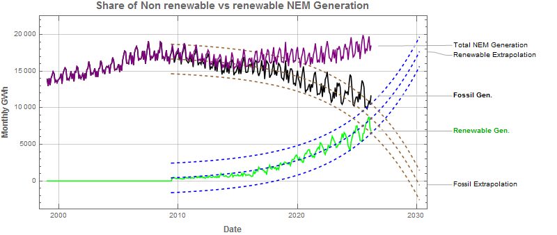
Variable Renewable generation (i.e. excluding hydro) has been growing exponentially since about 2010, as can be seen from the fitted dashed trends which have been extrapolated to 2030.
Subtracting the exponential trends from the average fossil generation indicates we could conceivably replace fossil energy completely by 2030.
Alas this is too optimistic – there are technical challenges to overcome to make this a reality and as can be seen from the chart the total NEM generation has been growing since about 2012 – no doubt due to increases in size to the Australian Economy and the electrification of homes, businesses and transport (particularly electric vehicles).
These factors will impede our capability to remove fossil plant from the NEM to sometime beyond 2030 ( at time of writing about 4 years away) .
The breakdown in total renewables is shown below – showing that solar has been doing the heavy lifting, but the contribution from wind has still been significant. Batteries are still small players – but they are undergoing their own exponential rollout.

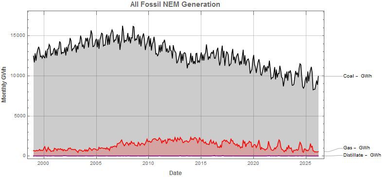
The decrease in fossil generation is mainly due to coal as can be seen from the chart below.
As utility batteries compete directly with gas generation – it is worth looking at how significant this now is. The chart below shows the recent trends.

In GWh terms – batteries are only now just starting to make a dent in the generation services traditionally provided by gas.
However, in speed of response and providing FCAS – batteries have had a larger effect than the chart above implies. Hydro combined with battery storage already out competes gas in most instances.
The final chart is the most important in our view – it shows the reduction in carbon emissions that has been achieved. The chart mirrors the fossil generation chart above – but the units are different. A lot has been achieved – but there is also a lot more still to do.