Our ability to harness ever-expanding amounts of data is completely transforming our understanding of environmental problems and solutions. Our Climate Insights blog series leverages data from CAIT 2.0, WRI’s climate data explorer, to shed light on the many dimensions of climate change that shape society, policy, and global development.
Carbon dioxide (CO2) emissions from human activities are now higher than at any point in our history. In fact, recent data reveals that global CO2 emissions were 150 times higher in 2011 than they were in 1850.

How did we arrive at such an unprecedented – and precarious – state? We recently updated CAIT 2.0, WRI’s climate data explorer, with CO2 emissions estimates from 1850- 2011, providing a rich data set that documents the historical growth in emissions throughout the world. The data also offers insights into related trends and drivers of emissions— including population growth, economic development, and energy use.
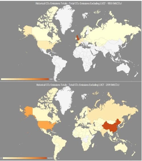
For context, at the beginning of this time period—1850—the United Kingdom was the top emitter of CO2, with emissions nearly six times those of the country with the second-highest emissions, the United States. France, Germany, and Belgium completed the list of top five emitters. In 2011, China ranked as world’s largest emitter, followed by the United States, India, Russia, and Japan. Tellingly, while the United States was the world’s second-largest emitter in both years, its emissions in 2011 were 266 times greater than those in 1850.

Other countries have followed similar trajectories, increasing their emissions over time. However, those trajectories look quite different throughout different moments in history. Read on for a visual history of some national, regional, and global CO2 emissions milestones over the past 160 years.
1850-1960: Industrializing Countries Dominate Emissions

Between 1850 and 1960, the world generally experienced a constant growth of emissions, due largely to industrialization and population growth, particularly in the United States. This development only saw some interruptions by historic events, like the Great Depression in the 1930s and the end of World War II in 1945. By the 1950s, however, China and Russia started seeing their emissions climb as their economies grew.
1960-2011: New Top Emitters Emerge

We saw some new developments after 1960. While the United States kept its place as the top CO2 emitter until 2005, Asian countries also started to emerge, led by China. The graph above shows the development of the current top five CO2-emitting countries since 1960, with the United Kingdom presented for comparison. The UK, once the world’s highest emitter, stabilized its total CO2 emissions. Russia experienced a significant reduction in emissions with the dissolution of the Soviet Union. But the most obvious development was the rise of China’s emissions in the first part of the 21st century and its overtaking of the United States as the world’s largest emitter after 2005.
1960-2011: Per Capita Emissions in the West—Stable, but High

By looking at these emissions trends on a per person basis, we can observe that, while global emissions were still rising overall, most of the industrialized countries stabilized their per capita emissions during the second half of the 20th century. However, annual per capita emissions in industrialized regions like North America and Europe were still far greater than per capita emissions in Latin America and the Caribbean, Africa, and Asia – despite consistent emissions growth in these regions. In 2011, annual per capita emissions varied greatly even within the top 10 CO2 emitters. For example, Saudi Arabia and the United States emitted more than 17 metric tons per person as compared to China and India, which added 6.7 and 1.5 metric tons per person per year, respectively.
1990s-2011: The Rise of Asia

In 1994, Asia’s gross domestic product (PPP) became the largest in the world. Interestingly, though, Asia became the largest emitter of CO2 one year before—in 1993—largely due to rapid economic growth in China. The chart above outlines this significant shift. In the past, the largest share of global emissions came from Europe and Northern America. But by the end of 2011, Asia dominated, contributing more than half of global CO2 emissions. As shown in the last graph, Asia’s per capita emissions still remain on a much lower level than in western regions.
2008: Developing Nations Surpass Industrialized Countries’ Emissions

An assessment of the UNFCCC’s Annex I (industrialized nations) and Non-Annex I (developing nations) division shows just how quickly the emissions space changed in the late 20th/early 21st century. By the year 2008, CO2 emissions from the developing world exceeded those of industrialized nations. If we include all greenhouse gases and emissions stemming from land use change and forestry—such as deforestation and tree-clearing for agriculture—this event moves up to 1994.
2011: The Top 10 Emitting Countries Still Make Up 78 Percent of Global CO2 Emissions

At the beginning of our timeline, just a small number of emitters were responsible for the majority of emissions. In 2011, the countries have changed, but the top 10 emitters still contributed 78 percent of global CO2 emissions. And much more data is available from 2011 than from previous years in history. The first graph above shows the top 10 emitters for CO2 emissions (excluding land use change and forestry).

In the second graph, we can see the differences when we include all greenhouse gases (including land use change and forestry). Most notably, Indonesia and Brazil ranked in the top 10 emitters, as a significant part of their national emissions come from the land-use change sector.
While all countries will need to work together to overcome the climate change challenge, we can see that the great majority of emissions are concentrated to a relatively small group of countries.
Create Your Own Emissions Stories
This sampling of emissions “stories” hopefully has piqued your interest for more. CAIT 2.0 offers many functions to quickly compare emissions, perform analysis, and create your own visualizations. CAIT’s international data set is now updated with historic CO2 emissions totals starting from 1850 and CO2 energy sector emissions starting from 1971. We now also have 2011 data available for all sectors and gases, and have introduced a cumulative emission calculation that allows for direct analysis of historic contributions. Stay tuned for an update of the U.S. states greenhouse gas data set, due out next month.
FOOTNOTE 1:
CAIT 2.0 has a full six greenhouse gas emission inventory for 1990-2011 including land use change and forestry emissions (LUCF), which comprise of emissions and removals associated with deforestation, cropland and grassland. However, pre-1990 data is only available for CO2 excluding LUCF. Therefore this historical analysis focuses only on CO2 emissions excluding LUCF to make a comparable analysis. Further blogs will analyze the most recent data including all gases and sources.
FOOTNOTE 2:
The EU is included because it is a party member of the UNFCCC.