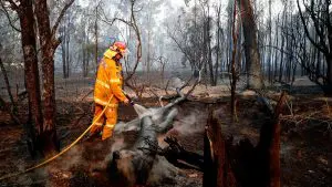
Back late on Saturday 14th January when I posted this preliminary article, I used the term “sizzling Saturday” to describe the day for a variety of reasons – first was the peak temperature that drove high demand levels (preceding this new all-time record) but then, related to that, was some pretty remarkable volatility.
Since that time, there’s been much said about the volatility across a variety of medium (including in person), but unfortunately we have to wait some weeks for the more official reports from the AER into the volatility – hence I thought it worthwhile to invest some time over the weekend to put this more forensic review together.
(A) Summing up price outcomes on the day
The following chart from NEM-Review sums up the trend of prices over the three-day period – Friday 13th, Saturday 14th and Sunday 15th January (the image taken from the animation below):

On that day (Saturday 14th January) were 14 Trading Periods where the QLD price settled above $1000/MWh– as listed in the table below for ease of reference:
| Trading Period | Price Reached | Notes | |
| 1 | 07:00 | $2,320.28/MWh | |
| 2 | 13:30 | $2,381.47/MWh | |
| 3 | 14:30 | $2,412.34/MWh | |
| 4 | 15:00 | $2,276.64/MWh | |
| 5 | 15:30 | $2,452.85/MWh | |
| 6 | 16:00 | $2,448.08/MWh | |
| 7 | 16:30 | $12,641.69/MWh | The AER will investigate and report on this one, as they note here – being above $5,000 |
| 8 | 17:00 | $8594.83/MWh | The AER will investigate and report on this one, as they note here – being above $5,000 |
| 9 | 17:30 | $9,126.80/MWh | The AER will investigate and report on this one, as they note here – being above $5,000 |
| 10 | 18:00 | $2,376.38/MWh | |
| 11 | 18:30 | $4,208.57/MWh | |
| 12 | 19:00 | $10,416.96/MWh | The AER will investigate and report on this one, as they note here – being above $5,000 |
| 13 | 20:00 | $2,397.93/MWh | |
| 14 | 23:00 | $2,195.38/MWh |
As noted in the table, the AER report, when it is published here (they say “by 14th March”) will only be on the four >$5,000/MWh spikes, and will be particularly focused on the “did anyone break the rules?” question.
We also expect that AEMO will publish a report on the day here – though again this is also a work in progress.
In the meantime, the following analysis might be of some assistance to a range of people…
(B) Animation of each dispatch interval through the day
Taking advantage of the automated “Time Travel & Record” function built within our ez2view energy sector browser, and investing a number of hours into sequencing it together, I’ve built the following animation:
A quick disclaimer with respect to the above – all errors and omissions (and I am sure there are a few) in the animation are my fault.
1) They may be due to lack of time to complete this thoroughly, or it might be due to some deficiency in my understanding, or it might be for some other reason.
2) Please feel free to point them out in comments below – or contact me directly, if you prefer. Call me on +61 (0)7 3368 4064.
(C) Highlighting some factors & questions
From the animation above, I’ve pulled out some of the factors mentioned to flag them for (possible) later analysis. Note that I do mean “possible” – as we have a number of initiatives on the go at present, and I have already blown our budget of time for analysis and commentary on WattClarity unfortunately:
C1) Underlying supply/demand dynamics
Through the animation, there were a number of general questions flagged about the overall supply/demand balance:
C1a) Gas Prices
In the animation above, I included a snapshot from the GasWatch product, Time-Travelled back to 14th January to highlight the gas prices that applied to uncontracted gas supplies on the day:

At gas price of $11.51/GJ this would translate to a break-even cost of generation of something like $130/MWh:
(a) For an open cycle GT;
(b) Not factoring in delivery of gas;
(c) Not factoring in variable O&M.
The true cost would be something north of this – suffice to say little incentive to turn on that day until electricity prices well above $100/MWh.
C1b) Contribution of Solar – Waxing and Waning
Also flagged on WattClarity on other days, we see contributions from solar PV declining into every afternoon after a peak relatively early in the day (peak shown before 12:00 in this post from Thursday 12th January). We also see (in the table above) that the spikes in price mostly occur later in the afternoon when the contribution from solar PV has mostly diminished.
One way to think of this is that solar PV progressively bids to infinity later in the afternoon as its capacity to supply wanes. When coupled with gas generators bidding well north of $100/MWh, one can see that there’s dwindling real competitive pressure.
NOTE – this is not to be confused with the incorrect “solar does not reduce peak demand” argument, which is addressed in a separate post today.
C1c) Only two big competitors
On a number of occasions here on WattClarity (and also in this detailed review of volatility in summer 2012-13) we have previously flagged the uplift in volatility that arose from the “3-into-2 merger” of Stanwell, Tarong and CS Energy into “new” Stanwell and “new” CS Energy. From the QLD Treasury perspective:
i. I imagine they are very grateful to not have to continue to prop up loss-making enterprises (some large cheques written in years gone by.
ii. Indeed, days like this will have improved the profit position.This dynamic has remained – though thankfully Labor’s election promise to merge Stanwell and CS Energy seems to have been quietly shelved (as Rod Sims noted here). What’s more than a little crazy is the fact that it was ever mooted in the first place.
C1d) Unhedged capacity
Over the past week a number of journalists have written about the production impact felt at Boyne Smelter (on the 19th and the 20th in the AFR, and on the 19th and the 20th in the Oz). Given our involvement in supporting a growing number of large energy users operating with some form of spot exposure and physical curtailment (a form of demand response) this development is of keen interest to us.
What’s been less noted has been the ironic situation whereby manufacturing plant, who opt for spot exposure because the contract prices offered to them are uneconomic create an environment are less fully hedged. What this might result in is an incentive for the generator to push this unhedged capacity to higher price bid bands – both:
i. To create short term volatility, and hence drive current quarter returns; and also
ii. To heighten concerns about future supply and hence drive up contract prices.However it is a fine balancing act, as higher contract prices will encourage new entrants (witness the large number of large-scale solar plant vying for commercial start in Queensland in the next year or two, for instance – including one sponsored by another major industrial). Once that “golden goose” has been cooked , it’ll be cooked for good…
C1e) Physical and financial prices
The animation (above) was specifically focused on the wholesale physical market – no view was provided of the financial market.
I’ve posted separately today with this illustration of how the price extremes in the physical market have already flowed through to Q1 2018 and Q1 2019 hedge contracts. A permanent effect or more temporary?
C1f) Flow-through to retail prices
Outside of the relatively few (large) energy users who have some spot exposure in their energy procurement arrangements (when mixed with physical risk management can deliver lower average cost – a form of demand response) most energy users will be interested in how periods of volatility like this:
(i) Will already have been factored into their current retail contract, in the form of a volatility premium; and/or
(ii) Is likely to flow through into future contract periods, by pushing up wholesale contract prices.Seeing the transfer of one day of spot market volatility (now historical) into uplift on quarter baseload contracts (still in the future), it becomes understandable how spot market volatility flows through to all of us.
C1g) What this might mean for the “50% renewable by 2030 state target”
Given the number of people who apparently support renewable development in survey after survey (notwithstanding the apparent disconnect with a lower percentage that actually follows through with their own financial commitment), I can understand this will be of interest to many.
Above, I have noted about the balancing act the Queensland generators (and in particular Stanwell Corporation and CS Energy) need to play if they are to achieve the “goldilocks” outcome of “just enough” price uplift feeding through into profit over the next 24 months without incentivising solar PV development to swamp the market come 2020.
However, I’ve previously provided some comments on the current Government’s audacious plan to transform the energy supply chain in Queensland in a remarkably short timeframe. If it is true that the Government implicit mandate is to run Stanwell and CS Energy into the ground, then one might wonder if they then think “well, what does it matter about Goldilocks – why not make hay when the sun shines, as the end is nigh anyway!?”
Unfortunately this might end up with the exit of a number of manufacturing installations. An “easier” way to make someone’s numbers, in terms of a percentage-driven target, but perhaps not in many people’s genuine interest?
C2) Nuances of the price setting method
Those with keen eyes will also have noted, in the animation above, a number of dispatch intervals where outcomes seemed a little stranger than normal – some of these are flagged below. Along with these are a number of principles that should perhaps not need espousing, but are echoed anyway:
C2a) Why it is necessary that the price can spike to $14,000/MWh
I’ve previously discussed on WattClarity before why such a high price cap is necessary as part of a market that is both:
(a) “Energy-only”; and
(b) “Gross pool”.I won’t go into this again, but feel free to contact me if you are interested.
C2b) Why it is essential that generators can rebid – including for “commercial” reasons, and as close as possible to “gate closure”
I’ve also previously commented on this, as well – such as here.
C2c) About the 5/30 issue
Also on WattClarity, we have previously included a number of articles discussing the 5/30 issue, such as these ones.
C2d) How Constraint Equations impact on price outcomes
On all of the occasions when the Queensland price spiked, flows with NSW were constrained in some form. In this animation, however, we did not drill into the details of transmission constraints (we have in some prior animations, though).
C2e) Dispatch Intervals where no bid shown was seen to set the price
No time to discuss more currently – the Current Bids widget was focused on Energy Prices, was filtered to QLD bids, and was set to keep the current QLD price in focus.
C2f) Dispatch Intervals where tranches at lower price are not dispatched
Perhaps another time we can get into ramp rates and other constraints…
C2g) Dispatch Intervals where tranches received some dispatch even above the dispatch price
No time to delve into this one, either
C2h) Several contributors to “Price Setter”
There were a number of instances highlighting this
(D) Understanding more about “How Prices are Set, in the NEM”
As noted, I don’t have any extra time currently to delve into more detail.
(a) I’m also not an expert – and am, in more general terms, nervous when I see how liberally this term is used in the media and in other quarters these days.
(b) I am just someone who asks a lot of questions, seeking to understand more and more – and, in asking questions, is able to progressively enhance the software products we develop with the valued support of our long-term clients.
One of the people who have helped us greatly over the past couple of years as we have sought to progressively improve our ez2view higher-end dashboard has been Allan O’Neil, a former Analyst/Trader and Manager Analysis at EnergyAustralia. He is probably also nervous about being labelled an “expert” – so suffice to say that he’s one person who I trust to give me a straight answer to a question, or to tell me he does not know.
He’s begun providing an on-site educational service about “how prices are set, in the NEM” focusing specifically on wholesale physical prices (i.e. what we in Australia call the “spot” market). If the article (and animation) above generate more questions than answers, then this might be a good opportunity for you to also work your way up the learning curve.
Source: WattClarity. Reproduced with permission.