Supply is still increasing
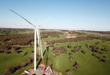
There is still more than 6GW of new wind and solar supply either under construction, or with power purchase agreements in place, that will enter Australia’s electricity market. That’s excluding the 1 to 2GW per year of behind-the-meter supply. And the existing supply will increase output further as transmission restrictions or other “hold-point” solutions are gradually relaxed.
Even assuming a conservative 32 per cent average capacity factor for all the new supply, that’s about 17 terawatt hours of new energy, and over the next three years another 3-4TWh of rooftop.
In total, that’s 10% of total NEM-wide demand. That’s twice the output of the Liddell coal generator, to be shuttered by 2023. And more new supply is bound to be announced one way or another, even if the pace slows. Building the NSW-SA interconnector, and the new NSW renewable energy zone will open up projects.
Demand is not increasing. Partly it’s not increasing because the federal and state governments are so slow to embrace policies like electric vehicles. Partly it’s because the energy-intensive export industries are struggling to find viable new projects. Partly it’s because energy efficiency continues to move ahead. Partly it’s recession.
As discussed at length, the aluminium industry is perpetually under threat.
It’s for those reasons that ITK still believes that the risk of early coal plant closure is significant. In our view, it’s a contest between the worst NSW generator and Yallourn. Yallourn will likely have to go if transmission between Victoria and NSW doesn’t improve. If Yallourn can export its increasing excess of lower variable cost than NSW coal generation to NSW then it may be that a NSW generator will be the next to go.
Even allowing for all that, the recent decline in electricity prices is astonishing. We show the futures price graph again at the end of this piece, but of passing interest was to compare the daily average price curves. We used April 01 to May 13, 2019 compared to 2020.


In general, it’s the morning peak that has been flattened the most. We would have to look into the supply by fuel data to see why it is that the morning peak has seen the biggest reduction. So that flattening of the morning peak reduces the storage arbitrage.
The evening peak in most states is still evident and is about the same price differential to the pre-peak price this year, as last. However, in general that evening price duration has shortened. That is, the high prices last for less time.
The major message here is you need good imagination in forecasting. What is going on today is no guide to the future, and there are no good guides to the future. Investors should constantly think hard about the downside risks but equally the potential for price spikes if, say, Yallourn announced early closure or free rego for EVs was announced by state governments.


