Two years ago, on August 25, 2021, I started running a weekly simulation of Australian’s main electricity grid, to show that it could get very close to 100% renewable electricity with just five hours of storage.
While there have been many simulations of a 100% renewable electricity grid for Australia, including some ground-breaking studies from BZE (2010), UNSW (2013) and the ANU (2017), most of them use synthetic data for wind and solar traces, making it easy for sceptics to distrust them.
The same is true of AEMO’s 2022 ISP which reaches 98% renewable in the mid-2040s. I was keen to use actual generation (rescaled) and demand data.
I wanted to conduct the simulations in near-real time. One-off studies using old data get released and quickly forgotten by the mainstream public. I was eager to produce regular weekly updates to my twitter (X) account to regularly demonstrate that close to 100% renewable was readily affordable and achievable.
A 100% renewable grid is far more difficult and expensive than a 96%-99% renewable grid. A key point of my simulation was to show that a 96%-99% renewable grid may be much more feasible than people realised.
Moreover, virtually all grids around the world rely on fossil-fuelled peakers to occasionally provide power during extreme demand events or when multiple generations sources are simultaneously unavailable.
It is unrealistic to expect wind and solar grids to work economically without fossil peaker plants when no other grids have managed it either, except for a few grids dominated by hydro.
Installation of short-term storage using utility and residential batteries is growing rapidly, and in the case of utility batteries are proving very economic. But the economics of long-term storage are highly problematic. I wanted to show that it is possible to get very close to 100% renewable electricity without any long-term storage.
The main findings
In brief, as I outline in detail below, very close to 100% renewable electricity is feasible for Australia’s NEM at reasonable cost using just several hours of battery storage.
This simulation used 24GW/120GWh (five hours at average demand) and achieved 98.8% renewable supply at a cost of $95/MWh, including the cost of additional transmission, storage and curtailment.
Costs can be reduced further to approximately $92/MWh by halving the storage requirements, while still achieving a renewable penetration of around 96%.
Wind, solar and hydro generation directly supplied 89% of demand, without the need to be temporarily stored. Only 10% of demand’s supply had to pass through storage.
The predicted emission intensity of the simulation was 7kg CO2-e per MWh when only considering direct Scope 1 emissions, or 35 kg CO2-e per MWh when considering full-lifecycle emissions.
The most challenging weeks in this simulation were all during late autumn or winter, and were characterised by above average demand and poor solar generation.
While the wind generation was also below average, wind performed comparatively well compared to solar during these difficult week-long periods. On the other hand, solar performed exceptionally well on the day with highest demand, which was a hot summer day.
Approximately 9GW of ‘other’ generation was required to firm the renewable supply during the most challenging night of the simulation. Over the two years of this simulation it would have run at a capacity factor of 3%.
Methodology
My simulation was of the Australia’s National Electricity Market (the NEM), which represents approximately 80% of Australia’s electricity demand. The following paragraphs describe my methodology.
Each week, I would download demand and generation data from OpenNEM. I left demand unchanged. The generation data for wind, rooftop and utility solar data was rescaled to supply ~60%, 25% and 20% of annual demand respectively. For example, over the last year rooftop PV generation has met ~10% of NEM demand.
The target for rooftop PV was 25%, so I rescaled the last 7 days of utility solar data by 2.5x (ie, 25% divided by 10%). The scale factors slowly reduce each week as more wind and solar is installed on the NEM.
Note that the sum of 60%, 25% and 20% is greater than 100%. This is important. Any optimised model of a highly renewable grid will have significant amounts of over-generation.
It is better to over-generate and have some curtailment than to generate exactly what you need over the year, but with significant shortfalls during some months requiring huge amounts of storage or backup. As will be seen later in this article, this simulation ended up having 18% excess generation over the year.
The decision to use 60% wind and 45% solar was based on rough optimisation experiments. A mixture reasonably close to 50:50 takes advantage of the fact that NEM wind and solar are negatively correlated with each other.
Wind tends to generate above average during the night and during winter, complementing the solar generation. My model has a bias to wind because wind requires less short-term storage, which is used primarily to shift solar generation from the day to the evening and night. Less storage helps keep the predicted cost down.
My simulation used 24GW/120GWh (5 hours at average demand) of storage and existing hydro to firm up the wind and solar, to match supply with demand. Both the hydro and storage were assumed highly flexible.
Note that I did not use the actual hydro generation data. I completely changed the dispatch of hydro so that it had minimal generation during periods when it wasn’t needed, and elevated levels whenever there was a day with significant shortfalls of wind and solar relative to demand.
This is reasonable as most of the hydro capacity on the NEM is associated with large storage dams, making the hydro highly dispatchable. However, to maintain consistency with historical generation, hydro generation was also subject to the following constraints:
- Hydro generation was kept between 200MW and 6,000MW
- Weekly hydro generation was kept above 168GWh
- Annual hydro generation was targeted at between 6% and 9% of demand, though ideally closer to 15,000GWh, or about 7.5% of demand.
If the wind, solar, storage and hydro was unable to meet demand, then the model supplements generation with ‘Other’. ‘Other’ was deliberately left undefined. It could be gas generation. Indeed, in the short to medium term it is likely to be existing gas peakers that will help firm renewables along with storage and hydro.
But longer term, ‘Other’ could be a highly flexible dispatchable generator running on renewable fuels such as synthetic gas, biofuels or green hydrogen, or it could be long-term storage such as Snowy 2.0. When calculating the renewable percentage of the simulation, I have assumed ‘other’ is not renewable, even though it is hoped that in the future ‘other’ will become renewable.
Each week I posted the results of the simulation of the previous seven days to my Twitter account. On August 23, 2023, I posted the 104th week, marking two years of simulations.
Generation summary
Key results from the 104 weeks of simulations are summarised as follows:
- Renewables met 98.8% of demand over the 2 years, with the remaining 1.2% met by ‘Other’. The statistics were nearly identical for each of the two years, with year 1 being 98.8% renewable and year 2 98.9% renewable.
- ‘Other’ generation peaked at 9.05GW on the night of 4 July 2023. Over the two years its average capacity factor was 3%.
- Hydro met 7.1% of demand. This was lower than my target of 7.5% and also less than actual hydro generation of 7.9%. This means that dam storage levels in my simulation would have ended the 2-year period higher than they did in the real world.
- 17% of the wind and solar generation was in excess of requirements and ended up being curtailed.
- 11% of wind and solar generation went into storage. Storage discharge met 10% of demand.
- 82% of demand was directly powered by wind and solar without having to pass through storage or be curtailed.

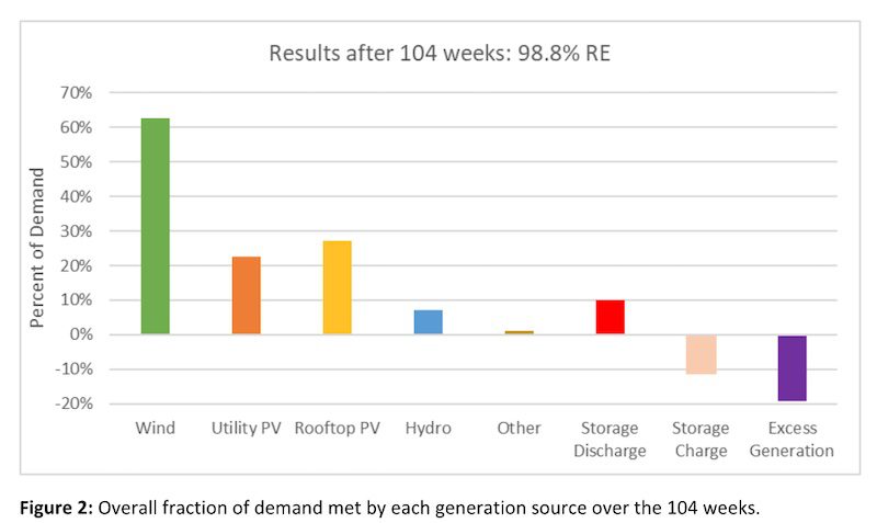
The wind and solar generation ended up slightly exceeding the targets of 60%, 20% and 25% for wind, utility solar and rooftop solar respectively.
It is impossible to know in advance if the years would be above or below average, so it is not surprising that they did not exactly hit their target. However, the methodology used to rescale the wind and solar data meant that it was very likely that they would exceed their targets.
General observations
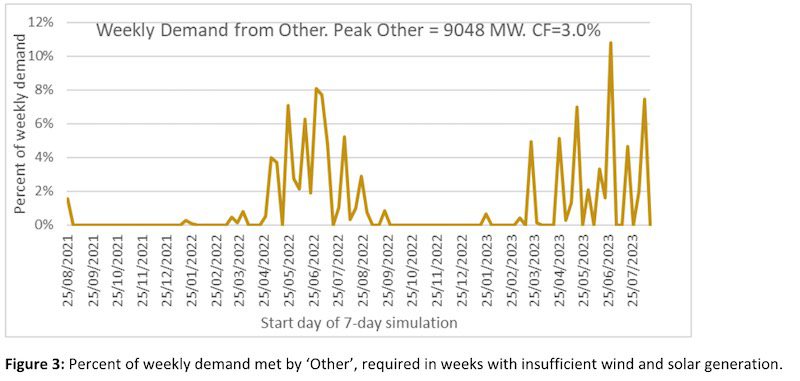
Figure 3 shows the weekly fraction of demand that was met by ‘Other’. Levels of ‘Other’ were close to zero for almost seven months each year from September to late March.
However, by April though to late August most weeks required some levels of ‘Other’, due to the inability of wind, solar, storage and hydro to entirely meet demand throughout the week.
The week starting on 28 June 2023 proved to be the most difficult week of the simulation, with ‘Other’ having to provide 10.8% of demand.
The graph illustrates clearly that late autumn and winter will prove to be the most challenging period for a mostly renewable grid in Australia.
Solar generation in late June and early July can often be as low half the annual average. And while wind tends to be above average during winter, there are often stretches of 2 or 3 days in a row that have significantly below average wind. This can leave a significant shortfall in generation that cannot be entirely filled by existing hydro.
The challenge of matching supply and demand during winter will be even more difficult as we start to electrify more of the gas heating that is present in the southern states, particularly Victoria.
Doing so will elevate winter demand much more than summer demand. However, it should be noted that electrification of residential and commercial gas use is only likely to increase demand by ~9%, whereas electrification of cars and light commercial vehicles is likely to increase demand by a much larger percentage of 30%-40%.
And in contrast with electrification of gas heating, electrification of transport could greatly assist the integration of renewable supply if most charging of EVs is done smartly in response to wholesale electricity prices.
It is important to note that wind in Queensland is not well correlated with wind in the southern states. That means that when it is calm in South Australia, Victoria, Tasmania and New South Wales, it is often windier than average in Queensland, and even more so in Northern Queensland.
For this reason, it is unfortunate that wind only made up 4% of Queensland demand over the last year, or about 1/3 of the NEM average of 13%.
More wind in Queensland will greatly help to improve the geographic diversity of renewable generation, making it easier to match supply and demand over the year.
However, it will not completely solve the problem. There will remain many days with poor renewable supply in both the southern states and in Queensland. Never-the-less, increases in Queensland wind generation will make it easier to get closer to 100% renewable electricity.
It is interesting to note that the ISP is predicting that approximately 9GW of peaking gas or liquids will need to be retained in the NEM’s generation mix out to 2050, which is almost identical to the peak requirements of ‘Other’ so far in this study.
However, the ISP is a much more sophisticated model than the simulation I have done here. It includes an approximate doubling in demand due to electrification of transport and other sectors, and has modelled many years of generation, ensuring that supply stays secure and reliable.
Unlike this study, it also includes long-term storage in the form of Snowy 2.0 with 7-days of storage, plus other additional pumped hydro projects with 24-48 hours of storage duration.
Challenging days and weeks
Table 1 shows some statistics for the 5 most challenging weeks of the 104 weekly simulations run so far. I have ranked them according to the fraction of demand that was needed to be supplied by ‘Other’.
The table shows that the most challenging week was week 97, starting on June 28, 2023, which required 10.8% of demand to be met by ‘Other’. The simulation for this week is shown in Figure 4.

A few key observations about the really challenging weeks can be made from Table 1:
- They all had above average demand, with 3 of the 5 weeks being more than 7% above average.
- They had very poor solar generation, often 50% of the annual average.
- They all had below average wind generation, but not nearly to the same extent as solar. Four of the 5 weeks were less than 11% below average.

The three most difficult weeks had demand that was 7%-8% above average (relative demand 107%-108%). This highlights that it is not just the wind and solar resource that creates a difficult period, and that above average demand also plays a significant role.
The much better performance of wind relative to solar in these difficult weeks is another reason why my model has a bias to wind generation over solar.
When the wind and solar resources are added together, the five worst weeks had relative variable renewable energy (VRE) that ranged from 73% to 82% of the two-year average.
Interestingly, the worst week for wind and solar (week #37) was worse than any of these five weeks, with relative VRE = 69.4%, but it only made it to #13 on the list of challenging weeks due to this VRE drought occurring on a week with demand that was 2% lower than average.
Table 2 shows some statistics for the five most challenging days of the simulation. Again, they have been ranked according to the percentage of demand coming from ‘Other’.
The two most challenging days were consecutive days, 3 and 4 July 2023, both contributing toward week #97 being the most challenging of my simulation, shown in Figure 4.
Interestingly, the third most challenging day, June 17, 2022, had a lower relative VRE score of 39% (wind and solar 61% below average). But it was preceded by a day with much better renewable resource, with a relative VRE value of 76%.
This resulted in the day starting with much higher storage levels than July 4. It was also helped by having slightly lower demand than July 3 and 4, 2023. The simulation of this challenging week is shown in Figure 5.

Table 2 shows that both wind and solar play a significant role in determining the most challenging days of the year. This contrasts with the worst weeks, which are mostly dominated by poor solar days.
This demonstrates that while wind and solar can both have very poor days, solar is more likely than wind to have an entire week of well below average generation.

My simulation is currently only two years in length, which is not sufficient for looking at extreme VRE drought events. But it is nevertheless interesting to compare the results from my simulation with a much longer-term study.
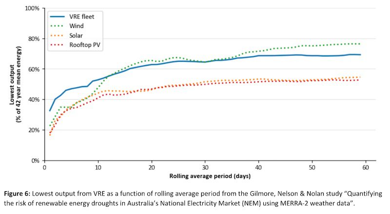
Joel Gilmore, Tim Nelson and Tahlia Nolan analysed 42 years of simulated wind and solar traces to look at the worst VRE droughts that could be expected in their 2022 study “Quantifying the risk of renewable energy droughts in Australia’s National Electricity Market (NEM) using MERRA-2 weather data.”
They found the worst day in 42 years to have a relative VRE supply of 32.8%, or about 6% worse than the worst day this simulation has seen.
An additional deficit of 6% would likely require an additional 1.5GW from ‘Other’. An approximate guess might be that the current peak value of 9.05GW from ‘Other’ in this simulation might increase to about 10.5GW if a one-in-42-year extremely bad VRE day is encountered.
Also of interest from this paper is the figure reproduced in Figure 6, below. It shows that when looking at 42 years of data, the worst periods for solar are worse than the worst periods for wind at virtually all length periods.
In contrast, this two-year simulation had equally bad one-day periods from both wind and solar, but solar had much worse seven-day periods than wind.
It suggests that this two-year simulation may have seen close to worst periods for wind, particularly over a one-day period, but not for solar.
This may well be because the wind in this two-year simulation, being based on current wind generation, is less geographically diverse than the wind in the 42-year synthetic traces of their study, which is based on what the ISP expects future wind generation might look like.
Other Interesting weeks
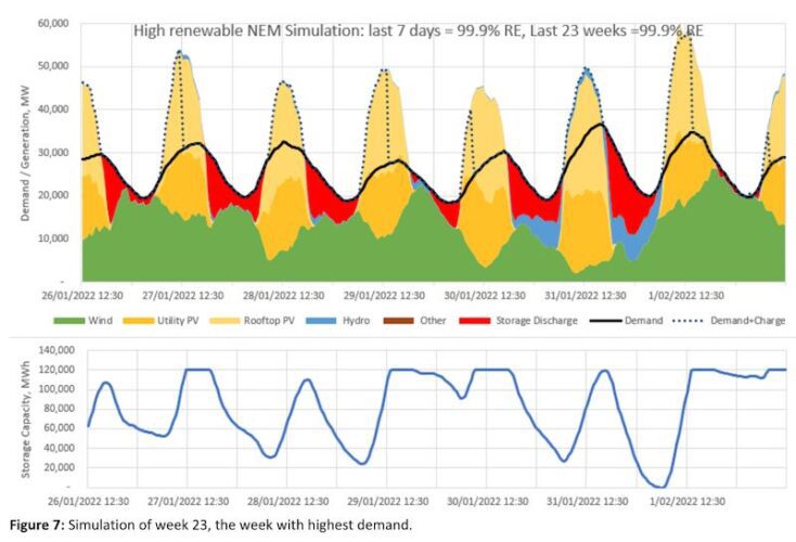
Week 23, starting on Jan 26, 2022, was the week containing the highest demand interval, peaking at 36GW in the afternoon of January 31. That day also had the highest average demand, at just over 28 GW or 19% above average.
Summer is when the NEM normally sees the day with the highest demand. Utility solar generation was 50% above average during this day, while rooftop solar generation was 41% above average. A very small amount of ‘Other’ was required to get through the night of Jan 31, meaning that the week only reached 99.9% renewable.
It’s worth mentioning that the last two years were La Nina years. This summer is forecast to be El Nino, and is more likely to have a period of very hot conditions and even more extreme demand than seen over the last two summers. It will be interesting to see how the simulation copes with an extreme heat wave during El Nino.
Despite the lack of El Nino in this simulation, it looks extremely likely that a highly renewable NEM with significant quantities of solar and five hours of storage is much better equipped to cope with extreme demand in summer than it is to deal with extreme demand in winter.
Week 69 starting Dec 14, 2022, was the week with the most curtailment. Generation from wind and solar was 54% above average. Storage was maxed out at 120GWh nearly the entire week, with almost no need to discharge storage at all. 99.6% of demand was met directly from the renewable supply, with only 0.4% needing to pass via storage.

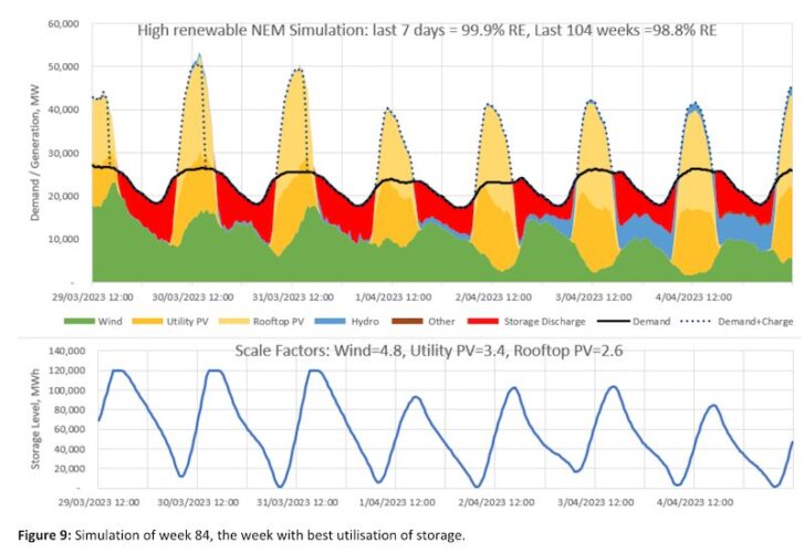
Week 84 starting March 29, 2023, was the week that best utilised the storage. The storage discharged an average of 84% of a full cycle each day, compared to the 104-week average of 47%.
The week was 99.9% renewable, but only 2% of generation was excess to requirements. It is arguably the week where the simulation worked best, with almost exactly the right amount of renewable generation and storage needed to match supply.
Average Daily Profiles
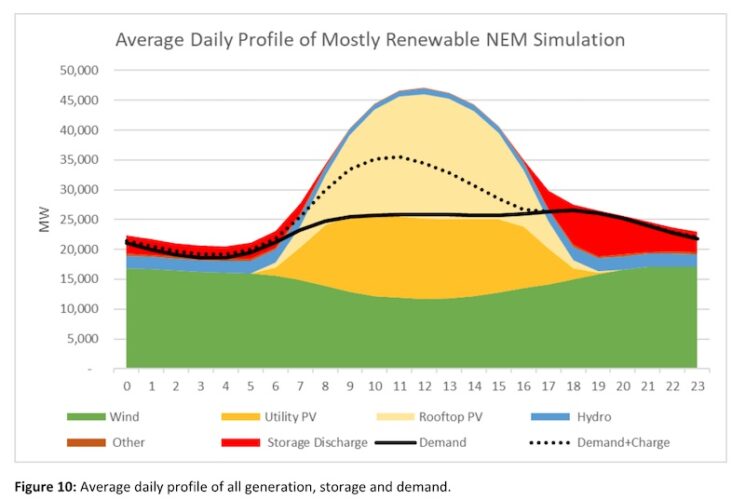
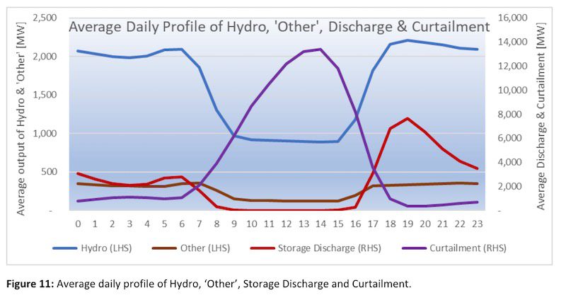
Figures 10 and 11 show the average daily profile of all generation, storage, demand and curtailment. Figure 10 indicates that wind has a bias to night-time generation, complementing to some extent the solar profile.
Figure 11 shows how the dispatch of hydro and ‘Other’ generation is highly biased to the night-time, while curtailment is primarily during the peak solar hours, reaching a peak value of around 13GW at noon. Storage discharge reaches a peak value of 7.6GW at 7pm.
Costs and Emissions
Table 3 and Figure 12 show that this near-100% renewable electricity supply is estimated to cost around $95/MWh, or $19.5 billion per year.
About 69% of this cost comes from the supply of wind, solar and hydro generation, 5% from ‘Other’, 18% from storage and 7% from extra transmission costs, beyond what we currently pay for transmission.

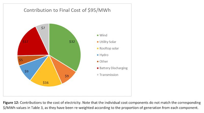
Capex and Opex costs are based primarily on the 2022-23 CSIRO GenCost report and from AEMO’s 2023 Input and Assumptions worksheets. Most values are based on a 15-year average out to 2038.
For storage I’ve assumed 18GW of four-hour batteries and 6GW of eight-hour batteries to achieve the assumed 24GW/120GWh of storage, at a total cost of $35 billion, annualised to $3.6 billion per year.
Costs for “Other” assume open-cycle gas turbines, with fuel cost of $12/GJ, heat rate of 10.9 GJ/MWh and capacity factor of 3.1%.
Hydro costs of $124/MWh are based on a 30% premium to the average price that hydro received over the five-year period 2017-21.
The $/MWh figures for wind and solar are pre-curtailment. Given that 13% of the wind and 23% of the solar generation was curtailed, the post-curtailment prices would be 15% and 29% higher, respectively.
Transmission costs are based on a 30% premium to costs in the 2022 ISP. Data from the ISP indicates that each MWh of utility wind and storage generation adds about $7.60/MWh in transmission costs. This is then applied to the 138TWh of utility solar and wind generation that is in excess of what was generated in 2022.
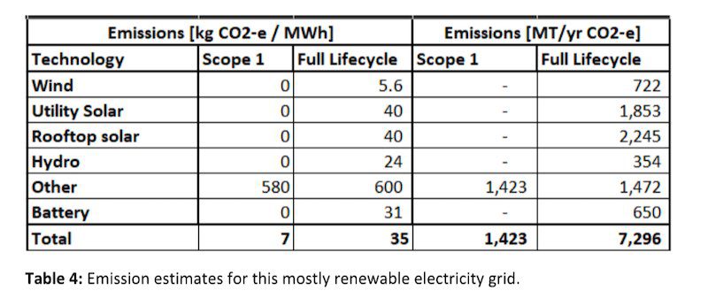
Table 4 shows two estimates of the emission intensity of the simulated grid. The first estimate includes only direct (scope 1) emissions from each technology and arrives at a grid intensity of 7kg CO2-e per MWh. In this calculation, ‘Other’ is the only technology with direct emissions, assumed to be 580kg CO2-e/MWh as appropriate for an Open Cycle Gas Turbine (OCGT).
The second figure is an estimate of the full lifecycle emissions, including the emissions associated with building each technology.
The table indicates the assumed kg CO2-e/MWh for each technology. The figure for the battery is based on assumed embodied emissions of 65kg/kWh. The resultant estimated full lifecycle emission intensity of the grid is 35kg CO2-e/MWh.
It is worth noting that while the wind, solar and batteries have far lower emissions than the ‘Other’ on a per MWh basis, because they are producing far more electricity, the annual full-lifecycle emissions of the wind and solar generation (4.8GT/yr) is a few times higher than those coming from ‘Other’ (1.5GT/yr).
The full life-cycle emissions from the batteries are also almost half the annual emissions from ‘Other’. This emphasises that one should be cautious about aiming to fully eliminate ‘Other’ by building lots of over-generation or storage.
Each of these options involve embodied emissions that should not be ignored when considering the optimal mix for a very low carbon grid.
The 650 MT/yr of annual emissions due to the batteries are easily justified by the reduced emissions from ‘Other’ that those batteries enable, but that may not be the case if battery storage levels are increased dramatically beyond what is modelled in this study.
Along with cost, this is one of the key reasons that this study does not try to fully eliminate ‘Other’. The marginal cost of abatement becomes very high. Nevertheless, the predicted full-lifecycle emission intensity of 35kg CO2-e/MWh of this simulation is lower than virtually all major existing electricity grids in the world.
Zero carbon options for ‘other’
As mentioned earlier, Australia’s current gas peaker fleet is mostly likely to fill the role of ‘Other’ in the short to medium term. It should be noted that the importance of peakers such as these are not just a feature of grids mostly powered by wind and solar.
Even if nuclear was used to mostly decarbonise the NEM, gas peakers would play an important role on days of extreme demand, or during occasions when multiple nuclear units were simultaneously out of action.
It does not make sense to build a nuclear plant that is only required on rare occasions to deal with tail-risk events, just as it does not make sense to build lots of wind and solar farms to enable 100% renewable even on the days with terrible wind and solar resource.
There are far better ways to spend money to decarbonise our society than to build highly underutilised wind, solar or nuclear to eliminate the last 1-2% of fossil generation from our electricity sector.
Except for a few grids mostly powered by hydro, all electricity grids around the world have a need for fossil peaker plants. All these grids will require a low-carbon option for ‘Other’ if they want to fully decarbonise.
There are few potential options that could fill this roll. One option is that the fossil plants could transition to being fuelled by renewable synthetic gas, biofuels or green hydrogen. Another option is a large demand response market.
It is likely that in the future demand will be more responsive to price signals. This is particularly true for demand due to charging of electrical vehicles, green hydrogen production, generation of heat (such as hot water) or water desalination. Any additional responsive demand is likely to reduce the requirements of ‘Other’.
This simulation has only used short-term storage. But long-term storage options like the 2GW/350GWh Snowy 2.0 are currently being built, and they can also help to reduce dependence on ‘Other’. To eliminate all ‘Other’ in my simulation would have required 9GW/800GWh of long-term storage, in addition to the 24GW/120GWh of short-term storage already discussed.
However, it is possible to halve the GWh requirements of long-term storage to just 400GWh if wind and solar generation was increased from 112% of annual demand to 118% of annual demand, as shown in Figure 13.
This additional generation might cost $650 million a year, or $6.5 billion over a decade. It is not currently clear if the cost of this extra generation would outweigh the reduced cost of long-term storage. Moreover, two years of simulations is not nearly enough to accurately estimate long-term storage requirements.

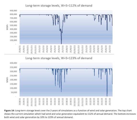
If we were to build 9GW/800GWh of long-term storage to eliminate the requirement of ‘Other’ in this simulation, then the top chart in Figure 14 shows how the storage levels would have changed over the two-year simulation.
Storage levels would have decreased to zero on July 16, 2022, after a few weeks of poor wind and solar generation during the first winter of my simulation. Long-term storage levels would have remained higher during the second winter.
The lower chart in Figure 14 looks at long-term storage levels if we instead increased wind and solar generation to 123% of annual demand. Under this scenario, long-term storage requirements would have reduced to 8.5GW/335GWh, and it would now be the second winter that fully depleted long-term storage.
On July 5, 2023, storage levels would have decreased to zero due almost entirely to the very poor days of wind and solar and high demand during the previous two to three days.
In all these calculations, it has been assumed that the round trip efficiency of the long-term storage is 70%.
Another option to remove ‘Other’ is hydrogen. If some of the 17% of generation that was excess to requirements was used to generate hydrogen via 3GW of 70% efficient PEM electrolysers, then it is estimated that they could have run at a utilisation of approximately 66% and produced about 300 million kgs of hydrogen per year. They would have consumed just under half of the excess generation.
If this hydrogen was used to fuel a hydrogen reciprocating generator with efficiency of 32%, then they could have generated almost 4TWh/y of electricity, which is more than enough to cover the 2.5TWh/y of generation coming from ‘Other’.
Approximately 160 million kilograms of hydrogen would need to have been stored prior to April to get through the first winter. This could either be in underground storage caverns or the hydrogen could be converted to ammonia or synthetic gas and stored in above ground tanks.
Sensitivity of renewable penetration to less storage
This simulation assumed 24GW/120GWh of short-term storage. It is possible that actual storage installations will fall short of this.
Earlier, it was mentioned that only 10% of generation came from storage, indicating that 89% of supply could come directly from renewable sources without any storage at all. But the NEM currently has approximately 1.2GW/1.6GWh of utility batteries, 1GW/2GWh of residential batteries and 1.3GW/18GWh of pumped hydro.
It will soon also have another 4GW/11GWh of utility batteries that are financially committed or under construction. So, it is clear that 7GW/33GWh of storage will soon be readily achieved.
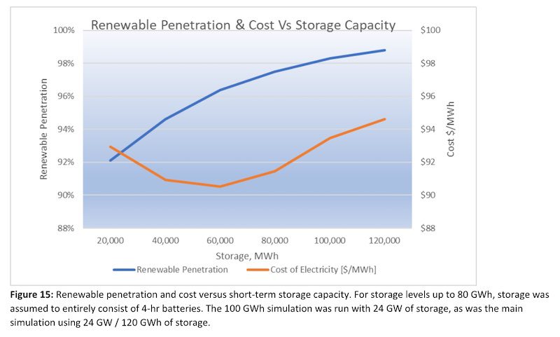
Figure 15 indicates the renewable penetration and costs achievable by lesser amounts of short-term storage. It shows that even with just 10GW/40GWh of storage, 94% renewable is possible. More storage has a higher storage cost, but this is offset by lower costs for ‘Other’.
Figure 15 indicates that the lowest cost simulation (~$91/MWh) used 15GW/60GWh of storage and reached a renewable penetration of 96%. By having just half of the storage capacity of the original 120GWh model, this solution reduced annual storage costs by about $1.7 billion, but this was offset by about $0.4 billion a year in extra ‘Other’ costs.
It should be noted that the unit cost of ‘Other’ reduced from $408/MWh in the base 120GWh storage simulation down to $245/MWh in the 60GWh simulation due to the increased capacity factor of ‘Other’ reducing its capex and fixed operating cost components.
FAQs
- How did I choose the wind and solar scale factors? They are chosen to get wind, utility and rooftop solar close to 60%, 20% and 25% of annual demand, which are my targets for this model. When this study commenced in Aug 2021, the annual penetration rate of wind, utility and rooftop solar on the NEM was 11.1%, 4.0% and 7.3% respectively, so the scale factors were 5.4x, 5.0x and 3.4x respectively. As each week passes and we install more wind and solar, the required scale factors reduce. At week 52 they’d reduced to 4.9x, 4.0x and 2.9x respectively, and by week 104, they’d reduced to 4.7x, 2.8x and 2.5x respectively.
- How many GW of wind and solar will it take to reach this target penetration? Based on current demand levels as was done in this simulation, it will take approximately 41 GW of wind, 19 GW of utility PV and 39 GW of rooftop PV, based on assumed capacity factors of 34%, 25% and 15% respectively. However, it is likely demand will more than double over the next couple of decades as we electrify sectors such as transport and heating.
- Does your model assume perfect foresight? For the first 6 days of each 7-day simulation, my model assumes 24 hours perfect foresight. That is, it knows exactly what the wind, solar and demand will be 24 hours in advance. AEMO can reasonably accurately predict these quantities 24 hours in advance (and beyond), though not perfectly. For the last day of my 7-day simulation, the length of the perfect foresight linearly reduces to zero hours.
- Does your simulation consider transmission constraints? No, this simulation is a highly simplified model of the NEM. It assumes generation on any part of the grid can meet demand on any other part of the grid. For this reason, this aspect of model is optimistic. For a more sophisticated model, I recommend looking at AEMO’s 2022 ISP. Its step-change scenario reaches 98% renewable by the middle of the 2040s with 2x current demand & 270GWh of storage + Snowy2.0
- Does your simulation change the weightings between states, to reduce the influence of South Australian wind which is currently over-represented, and to increase the weight of Queensland wind which is currently under-represented? No, this simulation applies the same scale factors to renewables in each state, which makes the simulation conservative.
- What efficiency have I assumed for the storage? 90% 2-way efficiency.
- Have you modelled increased demand due to electrification of other sectors? No, this study used demand exactly as it was. I would like to model increased demand in the future, however assumptions about what the increased demand profiles would look like are likely to be highly debatable.
David Osmond is a Principal Wind Engineer at Windlab, where he has worked since it was founded in 2003.
You can read his progress report after the first year of simulations here: A near 100 per cent renewables grid is well within reach, and with little storage

