This year’s Global Carbon Budget is out, and it is a treasure trove of charts for anyone who really wants to understand human carbon emissions.
The budget is the work of 77 people, from 46 organisations in 14 countries. With that many wonks working together they simply suck up all the oxygen. So all the units are gigatonnes of carbon (GtC), each of which is equal to 3.664 GtCO2 (carbon dioxide is the unit more familiar outside scientific circles).
This post is a Wonkblog style overview of where man made carbon emissions come from, where they go and what that means.
1) Fossil fuels dominate emissions since 1950
Although fossils fuels are now the major source of human carbon emissions, until as late as 1950 land use change was dominant. Today around 85% of global energy supply comes from fossil fuels, and this dominates our carbon emissions.

2) Coal emissions have soared in the last decade
The rise of coal emissions in the last decade has been staggering. In 2012 the shares of fossil fuel emissions were coal (43%), oil (33%), gas (18%), cement (5%) and flaring (1%, not shown).

3) Emissions growth is in the developing world
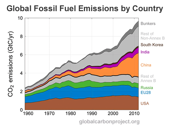
As much as I hate the categories of ‘developed’ and ‘developing’ world, they are apt for emissions. In 1990 just 34% of fossil fuel emissions came from the developing world (non-Annex B), today that figure is 57% and rising.

4) Four regions account for 58% of emissions
Four major emitters accounted for 58% of global emissions in 2012. They were China (27%), United States (14%), EU28 (10%) and India (6%). Chinese emissions growth since 2000 has been staggering.

5) China is passing Europe in per capita emissions
Between 1980 and 2010 around 600 million Chinese were lifted out of poverty. This economic miracle has used enormous amounts of energy, much of which has come from carbon intensive coal. This has driven up Chinese per capita emissions dramatically, to the point where they now exceed Europe.

6) Emissions are balanced by sinks
Despite the fact that carbon emissions get all the press, carbon sinks are hugely important too. Since 1870 human carbon emissions have ended up in the atmosphere (41%), land sink (31%) and ocean sink (28%).

7) Sinks are increasing with emissions
As we emit more carbon dioxide by the year each of the three major sinks (atmosphere, ocean, land) are absorbing more carbon. Although we tend to focus on growing atmospheric carbon concentrations, ocean acidification is also hugely worrying. As the world continues to warm the future function of ocean and land sinks may come under strain.

8) Without the land and ocean we’d be at 550ppm
Since 1750 human activity has generated enough carbon emissions to push atmospheric carbon dioxide concentrations above 550 parts per million (ppm). Increased carbon absorption by land and ocean sinks is what has kept the global average concentration to 393ppm for 2012. The famous Keeling Curve has tracked actual concentration in Hawaii since 1958.

9) Future warming is dependent on future emissions
The new IPCC report uses four representative concentration pathways (RCPs) to estimate how much the earth will warm by the end of this century under different emissions scenarios. The rapid mitigation scenario (RCP 2.6) is estimated to keep warming, above pre-industrial times, to 0.9-2.3°C by 2100. Whereas the runaway emissions scenario (RCP 8.5) could bring 3.2-5.4°C of surface warming by 2100. Or put more simply, future warming is dependent on future emissions.
You, me and the GCP
I think the Global Carbon Project is wonderful, and have personally learnt a great deal from their work. If these 9 charts have whet your appetite for understanding more about global carbon emissions I highly recommend this year’s budget. They also have a wonderful new Carbon Atlas for visualizing the world’s carbon fluxes.
This article was originally published on Shrink That Footprint. Reproduced here with permission
Read more at https://shrinkthatfootprint.com/explain-carbon-budget#7ZVzhKFJuhXiffHH.99