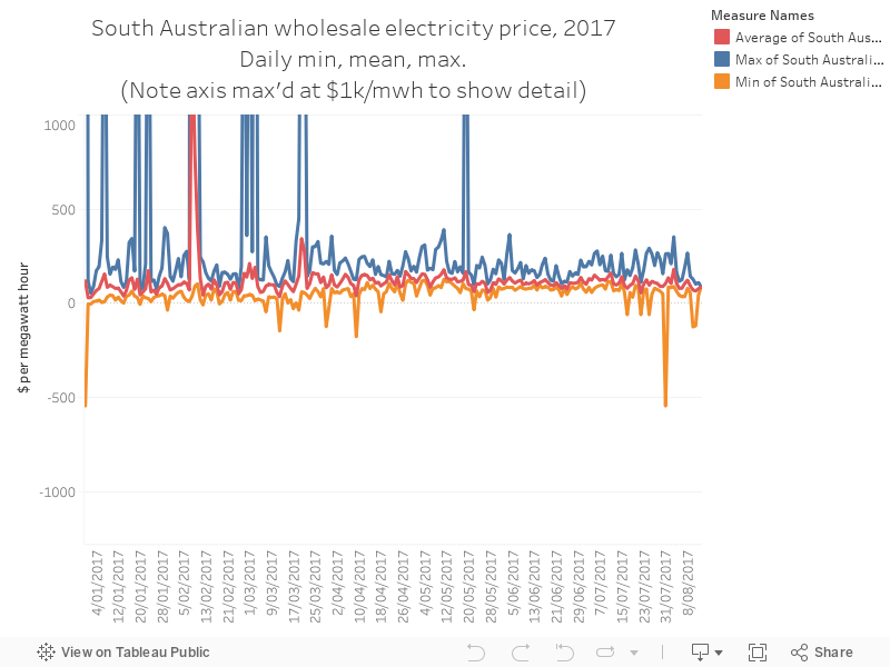
Today’s chart shows the daily minimum, mean and maximum (the chart cuts off at $1,000 per megawatt hour to give us a better view of what’s going on at lower price levels) wholesale electricity price in South Australia.
Wholesale isn’t the whole story – you also pay network, retail and environmental charges on your bill, and often fluctuations in these tell a more complete story about what you pay every quarter.
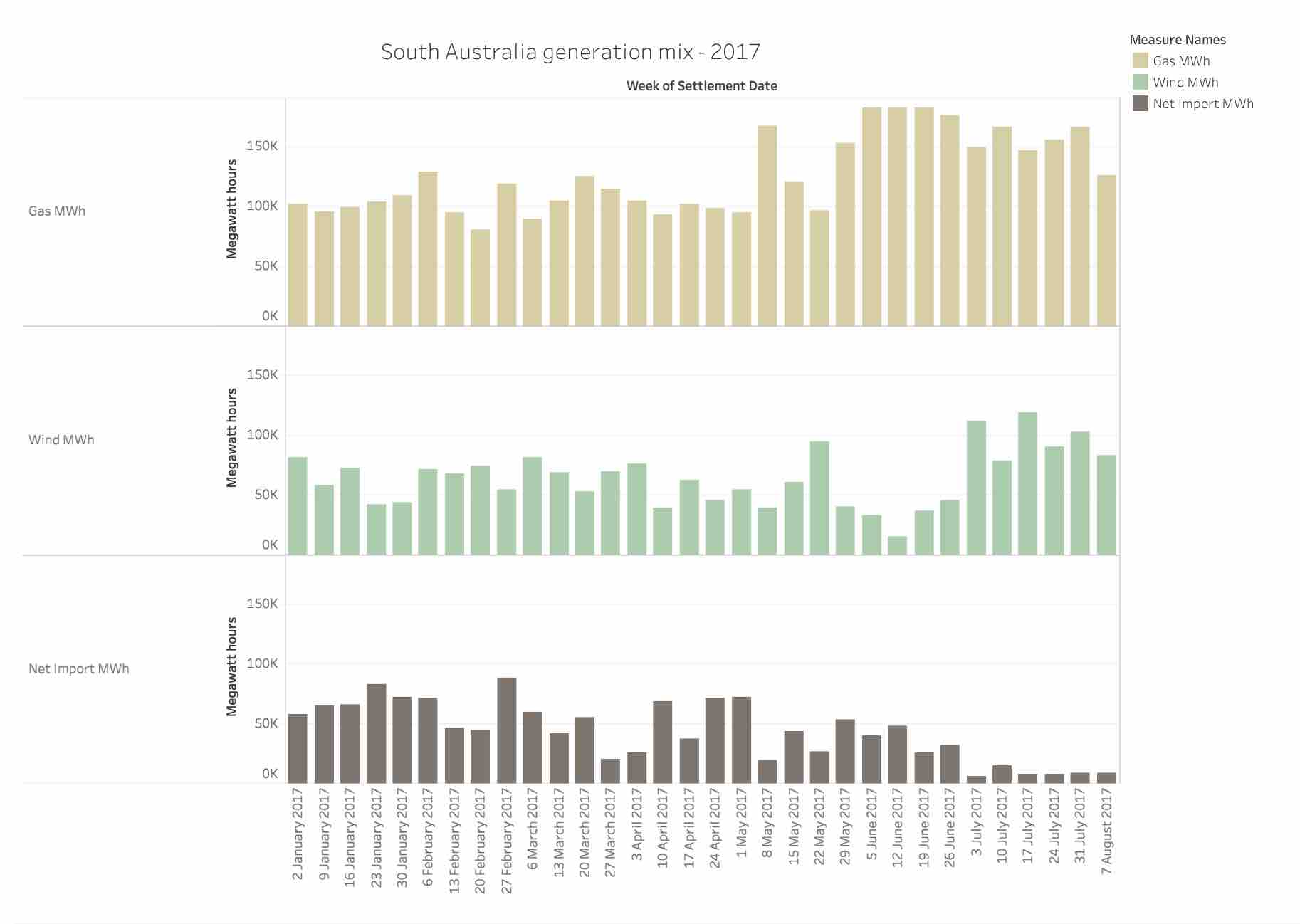
The chart below shows how there’s been a slight dip as wind power has increased output in July (as you can see in yesterday’s chart), and how prices were higher when gas dominated the fuel mix in the state. You can also see the prevalence of price spikes above $1k/MWh in summer, which is pretty normal.
Click on ‘Full Screen’ to view full graph.
Author: Ketan Joshi. Reproduced with permission.