Continuing on our series of publishing the maps of existing generation in each of the states that form part of the National Electricity Market, here is Queensland. Earlier this week we published the maps for both NSW and South Australia. Victoria and Tasmania are still to come.
And, yes, we are working on building an online interactive map that shows both existing and the pipeline of projects in the NEM. Watch this space.
Queensland has a target of 50 per cent renewables by 2030 – at least the Labor government does, the LNP promise to rip that target up if they win power in the election this year. By the end of 2020, the share of renewables is expected to be around 20 per cent, thanks also to its country-leading rooftop solar capacity. So it still has some work to do.
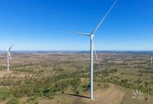
In the map below, coal is represented in black, gas in grey, solar in yellow, wind in green, hydro in blue, and diesel in pink. It doesn’t include smaller renewable resources of under 30MW. The map is sourced from the AER’s newly published State of the Energy Market report.

See also:
Graph of the Day: Map of South Australia generation: wind, solar, batteries, gas
and
Graph of the Day: Map of NSW generation: wind, solar, hydro, coal and gas