Critics of wind farms often cite the timing of wind energy – and its apparent mis-match with peak demand, as one of its greatest deficiencies. This Graph of the Day, however, shows that it is often not the case.
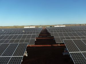
The graph(s) of the day from Infigen Energy shows how production from its Capital wind farm near Bungendore has coincided with incidences of peak demand in NSW, when price events have jumped to more than 300/MWh.
According to Infigen Energy, there have been 162 half hour intervals with prices greater than $300/MWh in the period from July 1, 2009 and January 31, 20013.
Of those intervals, Capital Wind Farm produced at least 20 per cent of its maximum capacity 88 per cent of the time. And it shows that Capital is most likely to be producing at 60-80 per cent of its maximum capacity when NSW has seen high prices.

This next graph of the day shows the corresponding percentage of the intervals where the Capital wind farm has been generating during high prices.

Industry executives say that wind farms located inland – such as the 270MW Collgar wind farm in WA – produce similar matching profiles with peak demand. Indeed, some say that sites for new wind farm developments are being chosen specifically for the wind profile to be able to deliver more in the day-time peaks.