If last week’s Graph of the Day wasn’t a convincing enough depiction of the inextricable link between Australia’s coal power plants and its greenhouse gas emissions, try this one on for size.
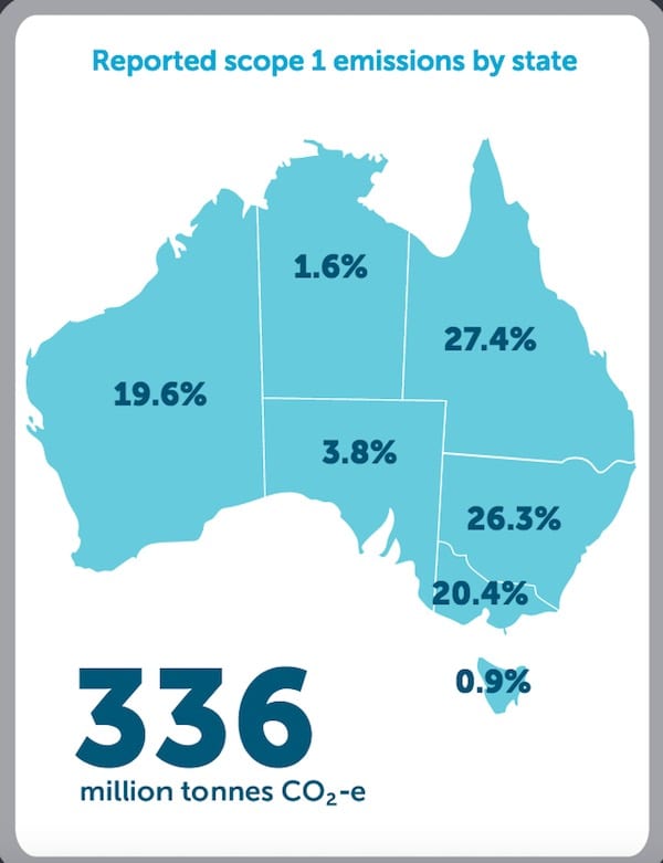
This chart – which like last week’s comes from the latest Clean Energy Regulator data on national emissions – shows that the Australian states which still depend heavily on electricity from coal-fired power plants contribute 93.7 per cent of the nation’s total scope 1 emissions.

Of those states, Queensland is the worst offender, contributing a 27.4 per cent share of scope 1 emissions. Queensland is followed closely by its southern neighbour, NSW, which contributes 26.3 per cent. Victoria is next, with 20.4 per cent, and WA contributes just under one-fifth, at 19.6 per cent.
Meanwhile, those states without coal power – the Northern Territory, Tasmania, and the more recently coal-free South Australia – contribute a total of just 6.3 per cent to the national total of scope 1 emissions: 0.9 per cent from Tasmania, 1.6 per cent from the Northern Territory, and just 3.8 per cent from South Australia.
South Australia quit coal in May 2016 and now sources half of its generation from wind and solar, with plans to lift this to 75 per cent within a decade.
By comparison, the Northern Territory’s two comparatively small grids are mostly powered by natural gas, on a path to more renewables. And Tasmania frequently runs on close enough to 100 per cent renewables, thanks to its huge hydro resource.
So what’s the downside for SA? Well, it’s not higher prices – a myth Giles Parkinson debunks, again, in this piece from Tuesday.
And it’s not compromised reliability. The state has, after all, made it through the summer of 2017/18 without any blackouts, thanks in part to its huge amount of rooftop solar, its high penetration of large-scale renewables, its distributed battery storage, and its newly installed Tesla Neoen Big Battery.
Perhaps the downside will be political fallout? Let’s see what happens in the March 17 election.