See also: Moody’s: Why battery storage is bad news for coal and gas generators
The duck season is officially open. No, it’s not the traditional shooting season where hunters armed with shotguns try to impose zero altitude on thousands of ducks. This one is about the impact of rooftop solar on network demand, and the mess it is making with traditional business models.
For anyone not familiar with the “solar duck”, here is one below. It measures the impact of rooftop solar on network demand. It show’s the duck’s back and abdomen sinking as more rooftop solar is installed. initially, the neck straightens, but it too, along with the head, droops as solar reduces peak demand as well as midday demand.

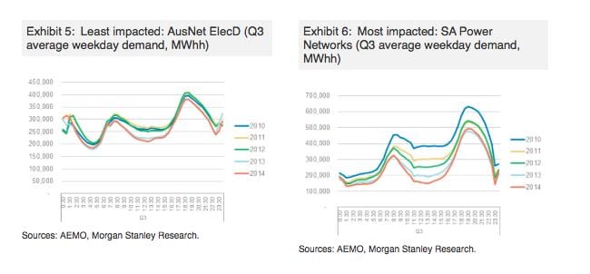
This is it, in all its glory. It shows the changing demand patterns in South Australia, and on the monopoly network provider, SA Power Networks, caused by the rise in rooftop solar, which now has a penetration rate of 18.3 per cent in the state.
The point being made by Morgan Stanley analysts, who produced this graph, is that increasing solar is changing patterns of usage, and could mean that networks will be able to spend less on upgrades and extensions.
That could deliver savings, but because the regulators are now likely to keep a close eye on developments, it could also mean a reduction in the allowable regulated capital expenditure.
That, in turn, means less revenues for companies used to making profits simply by building bigger networks. The more they are allowed to spend, the more they are allowed to charge consumers.
This is one of the reasons why Morgan Stanley has slapped an “underweight” rating on SAPN owners, Spark Infrastructure, but has not done so on the other main listed utility in Australia, SPN.
SPN operates the network in eastern Victoria, and it has a much lower penetration of rooftop solar than SAPN, or even the Powercor network in western Victoria that is also owned by Spark.
This is Morgan Stanley’s comparative duck curves for the two networks.

“Ausnet’s electricity distribution network in eastern Victoria (ElecD) shows some demand reduction over time due to efficiency and lower industrial activity,” the analysts note. “But it has limited hollowing out (the duck has a small ‘abdomen’) as solar penetration in the network is low at ~10.1% ( with 3.4kW average system size) and production is lower due to the Victorian sun.
“In contrast, SA Power Networks (SAPN) shows material annual declines in demand, and a pronounced hollowing out.
“South Australia has ~18.3% solar penetration, an above-average installation size of ~4.3kW and more productive sun. The pattern for Powercor, the western Victorian network, approaches that of SAPN. Powercor has ~10.2% solar penetration with an average installation size of 3.8kW.
“Based on our demand pattern analysis, we think the networks in our coverage most vulnerable to the ‘duck lowering its head’ are Powercor and SAPN. Therefore, all other things being equal, we think Powercor and SAPN will see lower RAB growth relative to peers, particularly Ausnet.”
Morgan Stanley’s conclusions are interesting, particularly in combination with the new report by Moody’s Investor Services analysis of the US network market, and the potential impact of battery storage.
Moody’s argued that widespread battery storage would help flatten the curve, lifting the duck’s belly and lowering its head. That will soften the blow for networks, Moody’s argues, but will have a bigger impact on wholesale generators, particularly the merchant plants that profited from large spikes in peak demand.
Those spikes are already being reduced in number and duration, and battery storage could eliminate many of them altogether.
Although Morgan Stanley does not look at the issue of battery storage in its analysis, it supports the idea that networks should be able to cope over the long term.
“To be clear, while we consider scenarios where energy networks become stranded and/or subject to ‘death spiral’ impacts (fixed costs socialised over a declining user base), these are not our base case,” the Morgan Stanley analysts write. “Put simply, we do not anticipate that large portions of the community will cut themselves off from the grid.
“Having said that, we think that network capital intensity could decline in future years, particularly if technology enables load flattening, obviating the need for network augmentation for peak demand.”