An unavoidable graphic has been doing the rounds on social media – it purports to show the remarkable failure of forecasts of rapid renewable energy growth over the past few decades. Each forecast seems to optimistically project a massive upwards swing of renewable energy, and each has failed to be realised in the actual growth of renewable energy in America.
It was published in JP Morgan’s ‘Annual Energy Paper‘, a major project overseen by the well-known economist and author Vaclav Smil. Smil is a skeptic of the idea that any transition away from fossil fuels will be fast; he cites previous historical examples of transitions, each particularly slow, and presents that as proof this one will be slow, too.
And in JP Morgan’s paper, the very first chart shows “overly ambitious forecasts of the 4th great energy transition”, with the renewable share of primary energy consumption in the United States remaining at a low level.
Each of those lines is, purportedly, a “forecast” of renewable energy that did not manifest. But trying to pick apart this graphic, which is quickly getting traction on climate denial and renewable skeptic sites and tweets, shows that most of these are not ‘forecasts’, but rather scenarios, plans, targets or explorations of technical potential.
Some are almost impossible to track down. Danish physicist Bent Sørensen, for instance, seems to have published the figure between 1978 and 1980, and it isn’t easy to figure out where the prediction of 50% by 2000 was made. There was never any “Clinton Presidential Advisory Panel” – the phrase can only be found in republications of this very chart; so that’s a mystery.
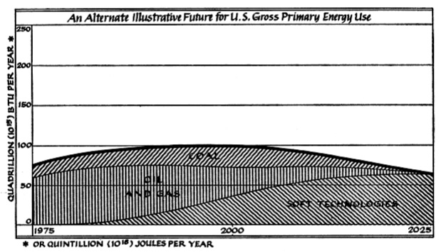
Amory Lovins, the head of the well-regarded Rocky Mountain Institute, gets pinged here, too. Science writer Alexis Madrigal wrote on his old blog that “In 1976, Amory Lovins published an incredibly famous and (over)cited paper in the journal Foreign Affairs in which he posited two future energy paths. The hard path called for crazy amounts of energy demand growth, satisfied by new nuclear and coal plants. The soft path, heavy on small-scale renewables and efficiency, is illustrated above. While not quite a “forecast” — Lovins was more of a “could/should” guy than a “will” guy — it certainly represented a vision of a future that did not come to pass”. The chart itself is headlined as “an alternate illustrative future” – very, very clearly not a “forecast” of the default outcome for renewable energy.
The Carter administration in the US had ambitions for 20% renewable energy by the year 2000, set in the early 1980s, famously associated with a prominent installation of panels at the White House (torn off by Reagan, of course). This was based off a series of reviews of the potential of renewables by US government agencies, and referred to all renewables, not ‘solar only’ as per the chart. Of course, a goal or ambition is not a forecast – and to describe it as such is deceptive.
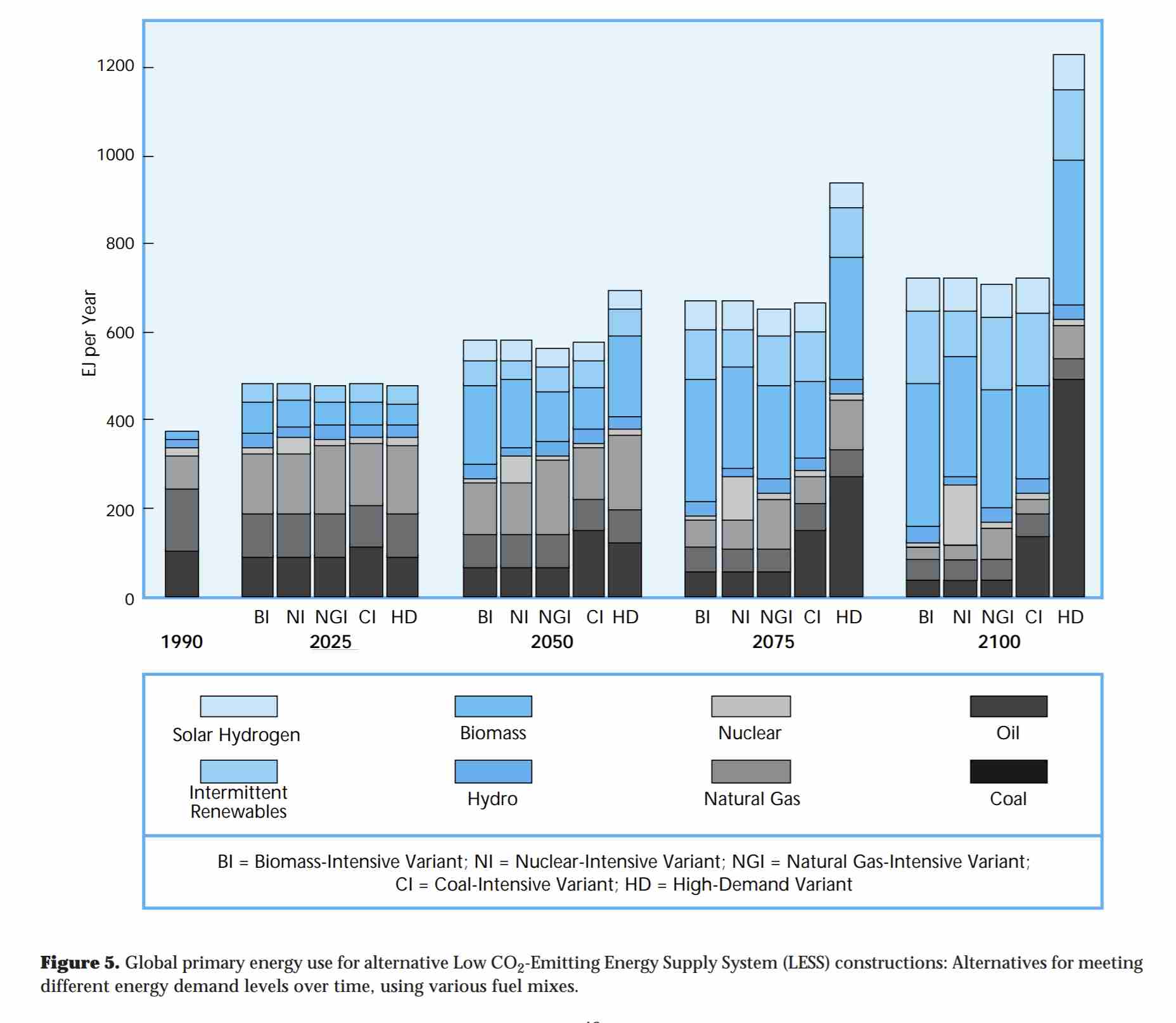
The IPCC reference seems to be 1995 second assessment report, which includes what it describes as a series of “thought experiments” testing the boundaries of what might be possible for low emissions technologies. “Deep reductions of CO2 emissions from energy supply systems are technically possible within 50 to 100 years, using alternative strategies”, wrote the IPCC. Again: not a forecast in any sense of the phrase – it was a boundary-testing exercise to model technical and economic feasibility.
Google’s 2008 “2030 clean power plan” is, of course, in the same boat. The hint is in the name! “The energy team at Google has been crunching the numbers to see how we could greatly reduce fossil fuel use by 2030. Our analysis, led by Jeffery Greenblatt, suggests a potential path to weaning the U.S. off of coal and oil for electricity generation by 2030 (with some remaining use of natural gas as well as nuclear), and cutting oil use for cars by 40%”. Also not a forecast – Google are explicit in many spots that a range of actions are required for this to be realised.
The 7th line is sourced to the National Renewable Energy Laboratory (NREL). That’s probably this one (thank you Jamie, on Twitter). “The fraction of U.S. energy demand currently supplied by renewables (8%) is certain to grow, but only slowly without expanded support for renewable energy”, they wrote. Three scenarios are reported for 2030 renewable proportion: BAU (15%), ‘National premiums’ (22%) and ‘RD&D Intensification’ (28%). Smil selects the highest of the three, and presents that as if it’s a forecast.
And, finally, a single sentence at the end states that “In 2020, Mark Jacobson forecasted 80% by 2030”. No, he did not. “It is not a graph of what will necessarily happen. It is a graph of what we need to happen to avoid 1.5C warming and to eliminate as much pollution ASAP”, Jacobson said on Twitter, describing his recent modelling studies.
What is a forecast, really?
For every reference that can be verified on this graphic, none are forecasts. They are ambitious scenarios or targets designed to something very clear: drive change towards a better outcome. A forecast is simply a description of what is most likely to occur based on information we have today. There is, of course, a collection of actual forecasts, that is an expectation of ‘business as usual’, that stem from some very influential sources indeed. The most famous is the International Energy Agency, whose solar forecasts have consistently turned out to be quite wrong.
Would you guess it? The @IEA's updated outlook for solar power additions is: oops it grew again but now it stops here. Embarrassing.https://t.co/8OylYmeMrO pic.twitter.com/CQMkRFq8to
— Lauri Myllyvirta (@laurimyllyvirta) November 13, 2019
Of course, the IEA defends this in the grounds that these numbers are also not forecasts. But their ‘World Energy Outlooks’ are frequently cited by fossil fuel companies as such – pointing to the ‘forecasted’ continued output of fossil fuels as reason to dig up and sell more fossil fuels. This spawned the ‘fix the WEO‘ campaign. Perhaps in response to criticism, the IEA recently hailed solar as the ‘new king‘ of energy, and is publishing more ambitious scenarios in their upcoming reports.
Another point of comparison is a 1989 report in the UK that badly under-estimated the role of renewable energy and efficiency in reducing emissions, and over-estimated the role of coal-to-gas switching, CO2 capture, and nuclear power:
https://twitter.com/KetanJ0/status/1389120621435621377
Or, a 1977 prediction of nuclear power that I dug up in Australia’s Trove archives:
https://twitter.com/KetanJ0/status/1296028097091952640
Today, the key technologies being ‘forecasted’ to grow rapidly despite a lack of any real progress for decades are carbon capture, or carbon removal. These get rammed into various future scenarios because they balance out the unspoken push to ensure fossil fuels “need” to stay at high levels in coming years.
https://twitter.com/KetanJ0/status/1372154488979652612
Predictions aren’t politically neutral – ever. Nor are scenarios, or models, or the shape that imagination of the future takes. Sometimes it works to encourage a decrease in fossil fuel usage, and sometimes it works to encourage an increase, or at least a slower decline. Therefore, forecasts, scenarios, predictions and plans all come packaged with the worldview of the person who made them. This isn’t good or bad – it’s just largely unavoidable. And if that worldview is pro-fossil, it can be challenged.
It is probably a healthy thing if we come to accept this. Smil’s own preference for using ‘primary energy’ – which includes the energy wasted when you convert fossil fuels into usable energy – has been widely criticised, as it downplays the role of renewable energy.
“To be sure, we should not expect the fourth great transition to happen overnight. Nor should we regard the outlook of a contrarian who abjures quantitative forecasts as gospel truth, or allow it to dampen our enthusiasm for a transition that he acknowledges is desirable and inevitable”, wrote Greentech Media’s Chris Nelder, in 2013. Eight years on, we can double or triple that, because wind and solar in particular have fallen in price and expanded in deployment far faster than anyone expected. That did not happen by itself – it happened due to government subsidies, activism and effort from a range of players across the board. Historical forecasts are only meaningful in the context of understanding the positions of the past, and the impacts of effort on the outcomes in the present.
Climate action only happens if it’s made to happen – variance from the ‘default’ only comes about through effort. A worldview that despises activism, argument, political fights and community lobbying is guaranteed to fulfil its own prediction that a fossil fuelled world is here to stay.


