Donate
Sign Up
Search
Renewables
Solar
Wind
Wave
Biomass
Geothermal
Solar
Rooftop PV
Utility PV
Solar Thermal
Policy & Planning
Storage
Battery
Pumped Hydro
Solar Thermal
Hydrogen
Electric Vehicles
Electric Cars
Hydrogen Fuel Cell
Green Energy Calendar
Podcasts
Energy Insiders
Solar Insiders
SwitchedOn Australia
The Driven
Videos
Webinars
Charts
Explainers
Markets
Utilities
Press Releases
The Driven
One Step Off The Grid
Search
Search
Search
Monday, June 22, 2026
Donate
Subscribe
Donate
Sign Up
Search
Renewables
Solar
Wind
Wave
Biomass
Geothermal
Solar
Rooftop PV
Utility PV
Solar Thermal
Policy & Planning
Storage
Battery
Pumped Hydro
Solar Thermal
Hydrogen
Electric Vehicles
Electric Cars
Hydrogen Fuel Cell
Green Energy Calendar
Podcasts
Energy Insiders
Solar Insiders
SwitchedOn Australia
The Driven
Videos
Webinars
Charts
Explainers
Markets
Utilities
Press Releases
The Driven
One Step Off The Grid
Home
Wind
Solar
Storage
Electrification
Commentary
Podcasts
Maps
Big Battery Storage
Large Scale Wind Farms
Offshore Wind Farms
Large Scale Solar Farm
Pumped Hydro
All
The Driven
One Step Off The Grid
Donate
Sign Up
Search
Renewables
Solar
Wind
Wave
Biomass
Geothermal
Solar
Rooftop PV
Utility PV
Solar Thermal
Policy & Planning
Storage
Battery
Pumped Hydro
Solar Thermal
Hydrogen
Electric Vehicles
Electric Cars
Hydrogen Fuel Cell
Green Energy Calendar
Podcasts
Energy Insiders
Solar Insiders
SwitchedOn Australia
The Driven
Videos
Webinars
Charts
Explainers
Markets
Utilities
Press Releases
The Driven
One Step Off The Grid
Monday, June 22, 2026
Search
Search
Search
Lindsay Wilson
Email
Graph of the Day: Climate science for beginners
For those not up to reading the IPCC’s latest report, some simple charts and a short guide explaining how humans are warming the world. Written for humans.
Lindsay Wilson
Oct 15, 2013
3
We might blow our carbon budget sooner than we think
If global carbon emissions continue to grow at 2% each year we will blow through the 840 GtC carbon budget at the start of 2035.
Lindsay Wilson
Oct 3, 2013
0
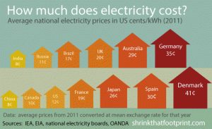
Graph of the Day: Average electricity prices around the world
Where is electricity expensive and where is it cheap? Compare the average $/kWh electricity prices from 17 different countries – including Australia.
Lindsay Wilson
Sep 24, 2013
3
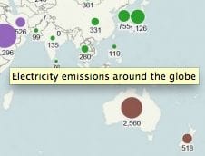
Graph of the Day: How green is your electricity?
Ever curious how much electricity is being used where? And how dirty it is? Using data from 60 countries, Australia comes out badly.
Lindsay Wilson
Sep 16, 2013
0
Mind the carbon gap: Three ways to count emissions
There are huge gaps between how much carbon a country extracts, produces and consumes. Recognising this should be key when designing climate policy.
Lindsay Wilson
Sep 1, 2013
2
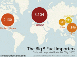
The world’s biggest importers, and exporters of carbon pollution
Second in three-part series analyses major importers and exporters of fuels and products, and how carbon moves around the world, before and after combustion.
Lindsay Wilson
Aug 29, 2013
1
The rise and rise of traded carbon
The first in a three-part series: how carbon is traded between where fuels are extracted, emissions produced and products consumed.
Lindsay Wilson
Aug 28, 2013
1
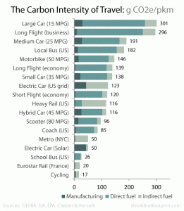
Graph of the Day: Five elements of sustainable transport
By comparing the carbon intensity of different types of passenger transport, we can use it to explain the key elements of a sustainable transport system.
Lindsay Wilson
Aug 20, 2013
1
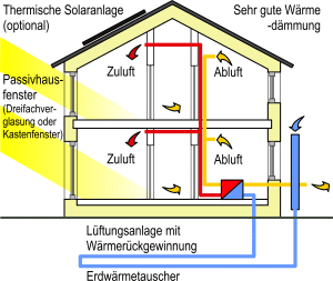
How a passivhaus insulates you from power bills
Using a mix of rocket science and common sense, a passive house offers optimal thermal comfort, minimal carbon footprint, and heaps of natural light.
Lindsay Wilson
Aug 16, 2013
3
Graph of the Day: Greenhouse emissions explained in 7 balloons
They may not look threatening, but these balloons represent the majority of positive climate forcings – that is, they’re the major causes of climate change.
Lindsay Wilson
Aug 5, 2013
2
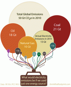
Graph of the Day: Why the world needs low carbon electricity
What would global electricity generation emissions look like if the world used just one generation technology? The result reveals a stark comparison.
Lindsay Wilson
Aug 1, 2013
6
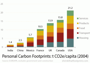
Graph of the Day: Your carbon footprint – and how to shrink it
The personal carbon footprints – tCO2e/capita – of 7 different countries; and a list of 13 ways to get more life out of less carbon.
Lindsay Wilson
Jul 26, 2013
7
Previous Page
1
2
3
4
Next Page