We were too busy on other stories yesterday to give great attention to the latest Australian Energy Market Operator analysis of the South Australian market, but some of the graph are as stunning as yesterday’s claims by AGL Energy that there is a surplus of around 9,000MW of unneeded fossil fuel capacity in the National Electricity Market.
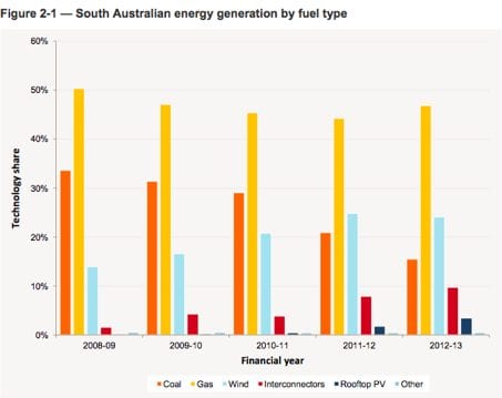
The first is the dramatic evolution of the state’s generation mix since it began to ramp up the deployment of wind energy in a big way, and the recent contribution from rooftop solar. South Australia is interesting because it is one of the modern economies with the highest rates of wind energy (24.1 per cent in 2012/13) in the world, and of rooftop solar (3.4 per cent, double the previous year).
Not only is Whyalla still on the map, but the rest of the state is too, and South Australia supplied 27.5 per cent of its electricity needs through wind and solar.
Over the last four years, as wind power nearly doubled, the use of gas has declined and it now accounts for less than half of total generation. The use of local coal has more than halved – with Playford B closed all year and Northern only used half the time – and while this has been only partially offset by more imports from Victoria, it would hardly be any dirtier than the two coal-fired generators at Port Augusta. Wind has overtaken coal and solar PV has overtaken diesel.
But just in case people were thinking that the amount of emission reductions were not significant – as some mainstream media are only too ready to believe – this next graph is the killer. Not only has the emissions of local generators improved dramatically, but the combined emissions of both local and imported generation is also down significantly.
So this underlines two points: Wind (and solar) does not require extra fossil fuel generation to be deployed; and the deployment of wind (and solar) does indeed cause emissions from electricity generation to be reduced (and not increased as the pro-nuclear lobby is fond of telling anyone).
One interesting addendum is that wind energy capacity of 1,210MW accounted for 20.1 per cent of the state’s installed capacity, but 24.1 per cent of total generation, another piece of data in the eye who believe that wind energy’s share of capacity is normally well above its share of generation.
As renewables campaigners also noted, the neighbouring state of Victoria has been left behind because of its restrictive planning laws. Queensland too, because it only has a measly 15MW of wind generation, no large scale solar (although a lot of rooftop).
And here’s one final really big graphic which shows the change in generation mix from just over a decade ago to now. When will the other states follow?

