The main graph above shows a 180 day moving average of thermal generation (coal + gas) and variable renewable energy and hydro electricity production.
The moving average lags what’s going on but presents a better, longer term view. I used 180 days because it shows the seasonality, and you can see how the thermal share increases in winter and the renewable share increases in spring. Right now, the renewable share is around its max for this summer season.
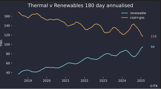
Figure 1. Thermal v Renewables. Data: NEM Review
The figure above shows the low wind situation during winter 2024, but the trend is fairly clear. More detailed analysis is required but given that overall growth in “underlying” electricity demand remains modest, every MWh that VRE gains is more less 1 MWh that thermal generation loses.
So, in summary, 11 terawatt hours (TWh) more of VRE will see the lines cross.
In a figure that will surprise no one the heavy lifting in the growth of VRE production is being done by rooftop solar. That said wind capacity has increased by around 2 GW vs last year but hasn’t fully ramped up.
At a capacity factor of say 35% 2 GW of wind produces about 3 TWh and rooftop solar produces an incremental 1.5 TWh each year.
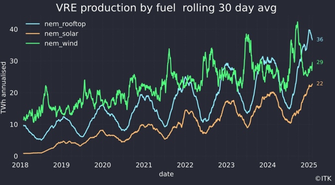
Figure 2. VRE Data: NEM Review
Even a more normal Winter will help this trailing average.
Looking at the shares over the past week, which is far more influenced by short term weather, the VRE share was 41% and renewables share 45%. The pleasing thing is the growth in wind.
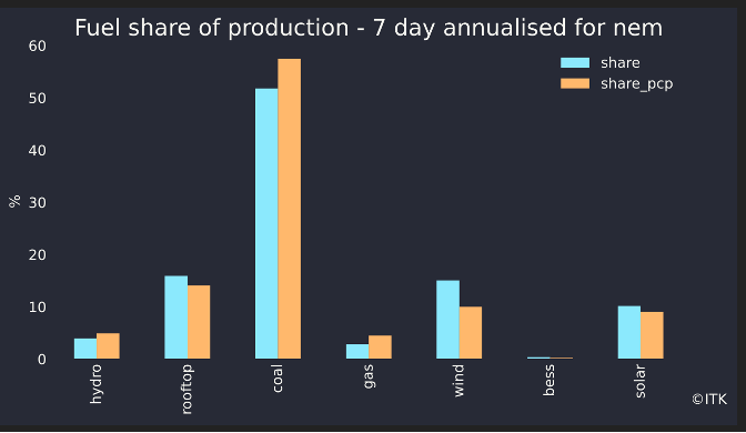
Figure 2. VRE Data: NEM Review
But spot prices aren’t trending down
Increasingly, what I think I’m seeing is spot prices that are mostly low, with very high occasional spikes. South Australia is a relatively small market and depending on your perspective price is vulnerable to relative small shifts in conditions and/or is being manipulated.
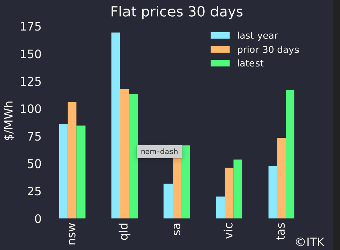
Figure 4. Flat prices. Data: NEM Review
It’s flat prices, if anything, that the mainstream media talks about, but it is encouraging to see that wind and solar prices have kind of held up during this period of generally abundant supply.
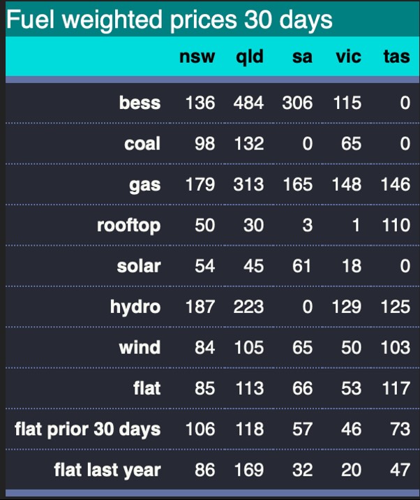
Figure 5. Fuel weighted prices. Data: NEM Review
In the following 8 day average chart what shows up is one price spike that pushed prices briefly over $14,000/MWh is enough to move the average price up to $74/MWh even though most prices in South Australia we well below that.
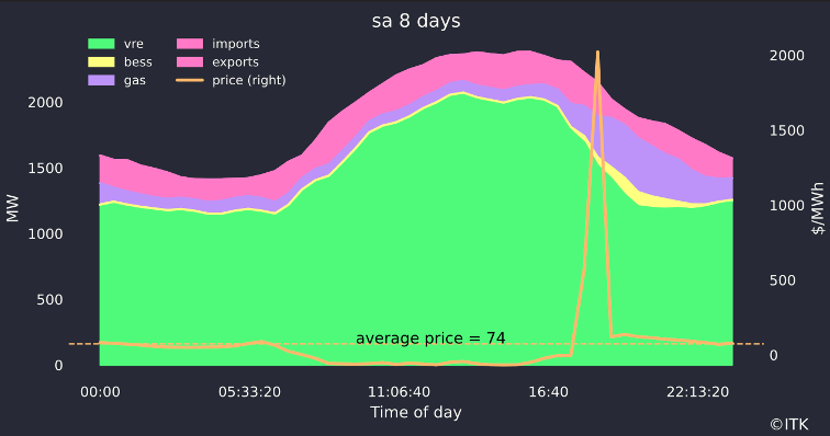
Figure 6. Sth Aust. Time of day. Data: NEM Review
That spike happened, I think yesterday and the chart shows reduced imports, anticipated because gas supply had increased ahead of the disruption.
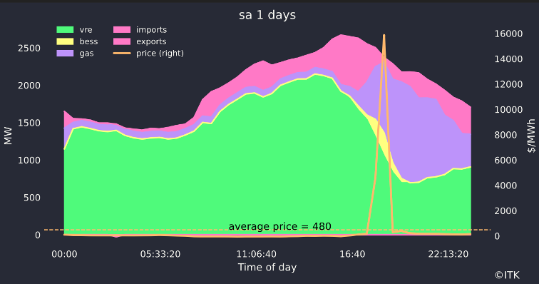
Figure 7. SA Time of Day. Data: NEM Review
That spike didn’t happen in Victoria (but the will likely start happening when Yallourn closes or if an LYA unit breaks) and the average price is much lower.
The figure below shows the 8 day picture for Victoria but if I just looked at yesterday I’d have seen hydro, gas and batteries at much higher outputs during the spike. Batteries in both SA and VIC appear to have captured the price spike but as seen in the table above right now the best place on average to have a battery is QLD.
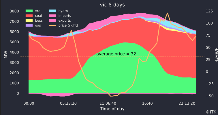
Figure 8. Victoria time of day. Data: NEM Review
Conclusion – more batteries will reduce price spikes
More wind will help reduce average evening prices, but only lots of batteries, or a lot more gas can manage the volatility.
There needs to be enough batteries such that there is an excess of supply at the time of these price spikes and so they bid the price down a bit. Despite the GWs of batteries under construction, once more coal closes there may be still be the potential for price spikes in the evenings for some years yet.
For the roughly two GW of wind ramping up NEM review data shows Golden Plains has now hit maximum output of 160 MW and Clark Creek has hit 60 MW.
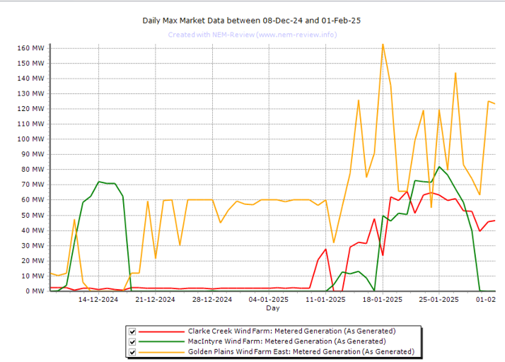
Figure 8. 2 GW of Wind ramps up. Source: NEM Review