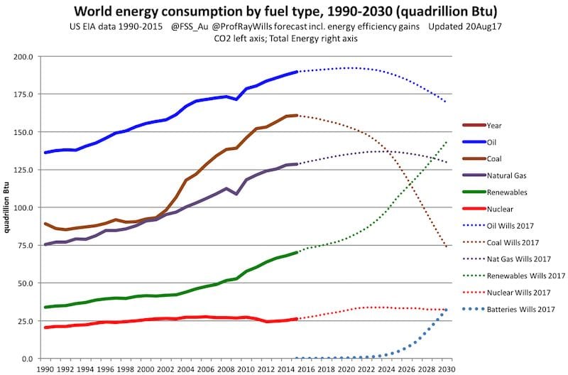
With energy policy looking set to move backwards in Australia, these four charts put together and Tweeted over the weekend by clean energy industry veteran and occasional RE contributor, Ray Wills, illustrate just how quickly the transformation of the global energy market is moving in the opposite direction.
In the race to build new energy#wind fast#solar faster
& #batteries will be faster again#Coal has started a fast exit#auspolpic.twitter.com/izsVxNTiYi— Prof Ray Wills (@ProfRayWills) October 22, 2017
Readers will note that coal doesn’t feature in the first chart, on global capacity growth, at all. It does, however, feature in the following three, where the data tells a separate story.
Graph two, which charts how long it takes to deliver a range of different types of power plant, is particularly interesting in the Australian context, considering current projections about the future energy mix under the proposed National Energy Guarantee.


