Graph of the Day: South Australia’s shifting fuel mix

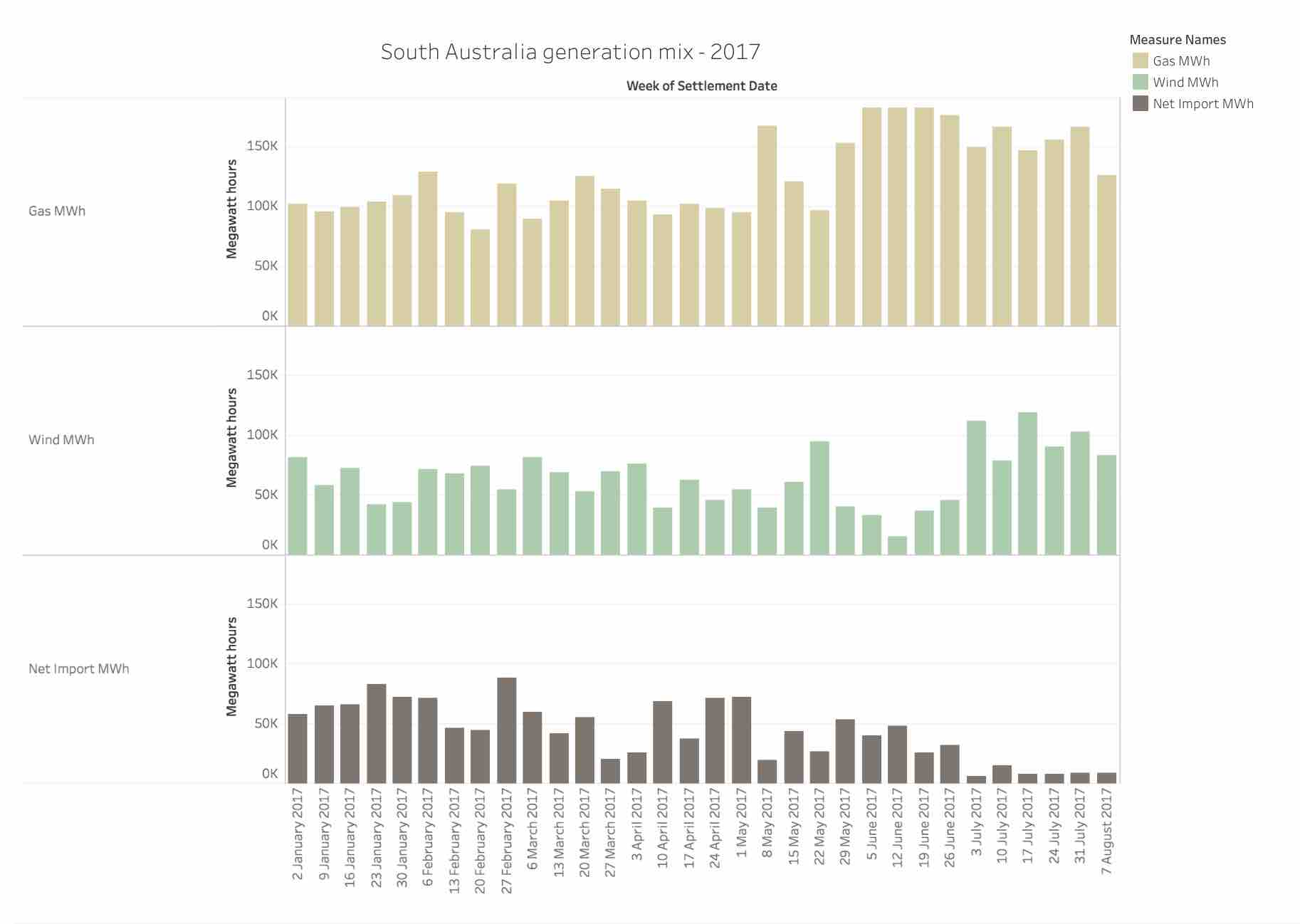
Today’s chart is a simple illustration of shifts in the fuel mix so far – interestingly, after a low-wind month in June, July’s high wind output means very little reliance on Victorian imports and lower exposure to high-priced gas in SA.

This illustrates the advantages of wind power but it also shows the un-realised further benefits of firmed wind power – once you start dispatching low-cost resource, it’ll reduce reliance on Victoria, add grid stability and also, quite importantly, reduce the amount of gas being dispatched in the state, resulting in (presumably) lower prices.

Click on 'Full Screen' to view full graph.
Author: Ketan Joshi. Reproduced with permission.

Ketan Joshi is a European-based climate and energy consultant.

Comments

3 responses to “Graph of the Day: South Australia’s shifting fuel mix”

  1. GlennM Avatar
    GlennM

    Sometimes Capitalism works…Provide cheap wind and the others magically disappear.

  2. Just_Chris Avatar
    Just_Chris

    I think there may be more at play with the change in the levels of imports than just the availability of wind. The drop in net imports coincides too neatly with the beginning of the new financial year for my liking. Is this change related to some of the new SA energy plan rules? Initially there was a target to source 35% (from memory) of dispatchable power from within SA. Is that what is driving this? I know there have been some delays to some rules but haven’t been following it closely enough to say anything intelligent on the subject. It will be interesting to see what the graph looks like in a few months time.

  3. Hugh McCann Avatar
    Hugh McCann

    Love the embedded Tableau. Though how frustrating is it trying to get the formatting to be stable!

Get up to 3 quotes from pre-vetted solar (and battery) installers.