I’m sure that people in South Australia can confirm that it has been windy over the last few days. What might surprise them is how wind has dominated the state’s electricity supply – and how consistent its output has been.
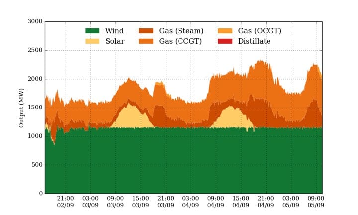
This graph below comes from Dylan McConnell at Melbourne’s Climate and Energy College and quite frankly, it is barely believable: it shows wind output in the state at a constant output of around 1200MW over the last three days.
As the graph shows, the orange and dark orange bits represent gas – which is also pretty constant due to the new guidelines imposed by AEMO, the market operator. Yellow represents the output of the state’s 700MW of rooftop solar.
But it is the green that fascinates. South Australia has just over 1,700MW of wind online, but it is highly unusual to see it so constant. The reason is that AEMO has put in constraints to limit the output at 1200MW, which it does when it cannot find a fourth gas unit to operate at the same time.
It’s not surprising, seeing that gas is expensive and usually want a lot more than $100/MWh. It means that some unlucky wind farms get part of their output curtailed, but it paints an interesting picture of “baseload wind”.


