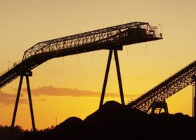
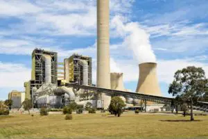
I’ve been away for a while on a short break for the school holidays and returned to the growing murmurs about the potential closure of the Hazelwood Power Station in – both in the regular media (such as Saturday’s article in the Age and this article today in the AFR) and plenty of views, already, in social media.
(A) Looking backwards
Charging up NEM-Review again, I produced this trend of monthly aggregate production and approximate spot revenues for the station since the beginning of the NEM:

As can be seen, production volumes have been declining since the peak in October 2011. This will be one of the historical factors weighing on the minds of the shareholders (Engie and Mitsui) in relation to the future of the station.
A1) Average monthly spot revenue
Taking the monthly aggregate data for the station we produced this trend of monthly average spot revenue for the station:

As noted on the chart, Hazelwood station had been enjoying higher average spot revenue in recent months – higher than most other periods in the 18 years since the initiation of the NEM! However (as noted) these average revenues were on reduced volumes over the period.
The first chart above shows that Hazelwood aggregate spot revenues also appear to have been reasonably healthy (despite the lower production volumes).
… which might lead readers to surmise that a closure decision (if it eventuates) is more to do with a view of what’s coming down the path in the future, rather than recent results.
A2) Comparison with Wind and Solar
Given the ongoing energy-sector transitional journey we’ve all embarked on, it’s natural that many will want to draw comparisons between the size of Hazelwood and the aggregate amount of ‘new renewables’ that would need to be constructed in order to replace the ageing dinosaur that is Hazelwood.
However readers should be very aware that such simple “swap this with that” mental exercises can be overly simplistic – and potentially dangerously so, if the level of thinking does not progress further than these initial comparisons.
A2a) Most Simplistic
Most people start at nameplate capacity of various supply options – and this is entirely understandable as an entry point.
For instance, with 8 x 220MW units (nameplate), the station maximum potential output is of the order of 1,760MW. At first brush, many treat all MW as equal and hence infer that Hazelwood might be replaced with 8 wind farms of approximately the same size as Ararat Wind Farm, which recently began operations (full size 240MW when completed so 10% larger than a Hazelwood unit based on nameplate).
A2b) Somewhat less simplistic, but still not enough
Understanding the innate intermittency of wind and solar (the only 2 renewables options being deployed at scale as new generation sources in the NEM), most people progress to a more mature comparison of MWh production. This is a better approach.
For this reason, we have included in the first chart above both:
(i) Trended aggregate output from small-scale solar PV in Victoria; and
See notes here about the difficulties in “measuring” aggregate output from rooftop PV in a particular area – like the state of Victoria.
Note also that there are no large scale plants in the state currently, and notably none in the list of 12 to gain funding from ARENA. Hence no signs that VIC will see other than lots of small-scale PV for some years to come.
(ii) Trended aggregate output from all wind farms across Victoria (including Ararat and 9 others, one of which is significantly larger than Ararat).
As a somewhat-useful rule-of-thumb, readers can eyeball the chart above and make some observations about “how many times” new wind or rooftop solar PV capacity would need to be added to Victoria in order to replace the Hazelwood output.
(i) Between 2 and 3 times the total number of wind farms currently producing (noting that there are 10 of them); or
(ii) Perhaps 10 times the number of solar panels deployed across the state currently.
Even this, however, is not enough…
A2c) A better (more nuanced) understanding
To be truly useful, a comparison will need to take into account the different nuances (such as locationality and temporal value) that is inherent in keeping the lights on 24×7×365 across all pockets of the NEM. These nuances are reflected at both macro and micro level in various ways, including:
(i) At a grid-wide (and market-wide) level, many informed stakeholders – such as AEMO and BNEF – are noting how this transition is producing increasing complexity, and challenge, which remains to be solved.
(ii) In the escalating “wind correlation penalty” that wind-heavy portfolios would suffer if a simple MWh-for-MWh swap were to be carried (I’ve posted these comments earlier about how this is already being suffered by portfolios like Infigen in South Australia). Such a penalty – and especially the fact that it will accelerate in severity with increasing (all else being equal) will increasingly call the long-term viability of an energy-only, gross pool market design into question (albeit that other options such as capacity payments have many warts).
I do hope to see commentary flowing from the mooted closure quickly progressing from the simplistic to the more useful.
(B) Looking forwards
Looking backwards can only take us so far, however. A more important (though far more difficult) consideration is about what is unfolding in front of us.
B1) Diversity of opinions
As frequent readers of WattClarity® will be aware, I did have some involvement with one of the consulting firms that specialises in energy market modelling – which helped to reinforce my view that every model’s just a model(they’re poor reflections of the technical, commercial, political and psychological complexities inherent in reality – though in some cases might be useful).
Hence we’re not going to allow ourselves to get distracted by claims (expressed with certainty by various commentators) that certain things are “certain” to happen as a result of a Hazelwood closure.
I would make one exception, however – I would put money on the chance that, in the coming weeks (stretching into months, if the closure decision is actually made at the Board Meeting, as mooted) we will see an increased volume of frenzied commentary from people sitting at both extremes of the “Emotion-o-Meter”.
B2) What’s the data already showing
Beyond models, and more simple conjecture, the market already provides several sources of data that some might take to be a hint in terms of what might happen following the closure of Hazelwood during 2017.
B2a) In the physical market?
The AEMO, through its MT PASA process, receives and aggregates all (major) generator’s forecasts of the availability of their capacity out 2 years into the future – and then aggregates this to produce a view of the aggregate supply capacity in each region.
Using our ez2view software, we have provided this comparison of the aggregate supply capacity declared to be available in Victoria over the coming 12 months – with a “delta” shown to the aggregate capacity as generators had collectively declared to the AEMO a couple of days prior (i.e. 10 updates beforehand).

Certainly a drop of 1,760MW in capacity available (which would result from the closure of Hazelwood) would be noticeable here – but none is.
If and when a decision is made, Engie will be bound (by the market rules) to alert AEMO (and hence the market) through the PASA process.
B2b) In the financial market?
What is “the market” collectively thinking of this possibility?
Glancing into the financial market using the ez2trend framework we have under development, we see that futures prices for Victoria have been escalating for the three following Q2 periods:

If the closure was to take effect from 1st April 2017 (as mooted in the article in The Age), the first quarter directly affected would be Q2 2017. Hence the BaseLoad price has been trended for that quarter.
It’s important to note that:
(i) The escalation of prices shown here for Q2 2017 (and for Q2 2018 and Q2 2019) obviously pre-dates any announcement by Engie confirming a closure – and pre-dates this weekend’s article in the Age. Hence other factors are also at work.
(ii) Also shown is how the Q2 2016 price jumped sharply in the quarter, as a result of what were some remarkable prices seen across all regions over that quarter. We cannot know, for sure, but we can presume that the effects in the physical market flowed through to trader’s expectations for prices in subsequent years.
B3) Several factors we’ll watch out for
Moving forwards, there are a number of other Victorian-centric developments we’ll keep an eye on in order to give consideration to the potential impacts of a Hazelwood closure.
B3a) Next moves, for the Portland Aluminium Smelter?
One of these is the (mooted) looming decision that Alcoa may still need to make with respect to the ongoing future of the large Portland aluminium smelter – triggered by the end of the long-dated, low-priced hedge that was agreed by the SECV with Alcoa many years ago.
We’ve already experienced the closure of the Point Henry smelter (and Kurri Kurri in NSW) – but Portland is significantly larger, and would make a bigger dent in the supply/demand balance.
Closure of Portland would have some effect in partially balancing out the effect of the withdrawal of the large energy supplies produced historically by Hazelwood.
B3b) The unfolding dramas with the EBA at Loy Yang A?
Over the weekend there were more news articles (such as this article from Sunday in the Age) about the ongoing dramas at neighbouring and larger Loy Yang A power station.
If Hazelwood were to close, it certainly would place far more significance on the outcomes of these negotiations – and any industrial action that might be conducted in the lead-up to a formal resolution.
If the coal sector is in terminal decline, then some might view union demands such as this (reportedly rejecting a 20% pay rise over 4 years in the hopes of something more) as dancing the sector into an earlier grave. Difficult to understand how this is helping members to a sustainable future? Or perhaps part of the union objective is with an eye to the future redundancy payments (a multiple of final salary) or early retirement (for the lucky workers on legacy on defined benefits scheme, hence with payout also being a multiple of final pay)?
Source: WattClarity. Reproduced with permission.