Screenshot
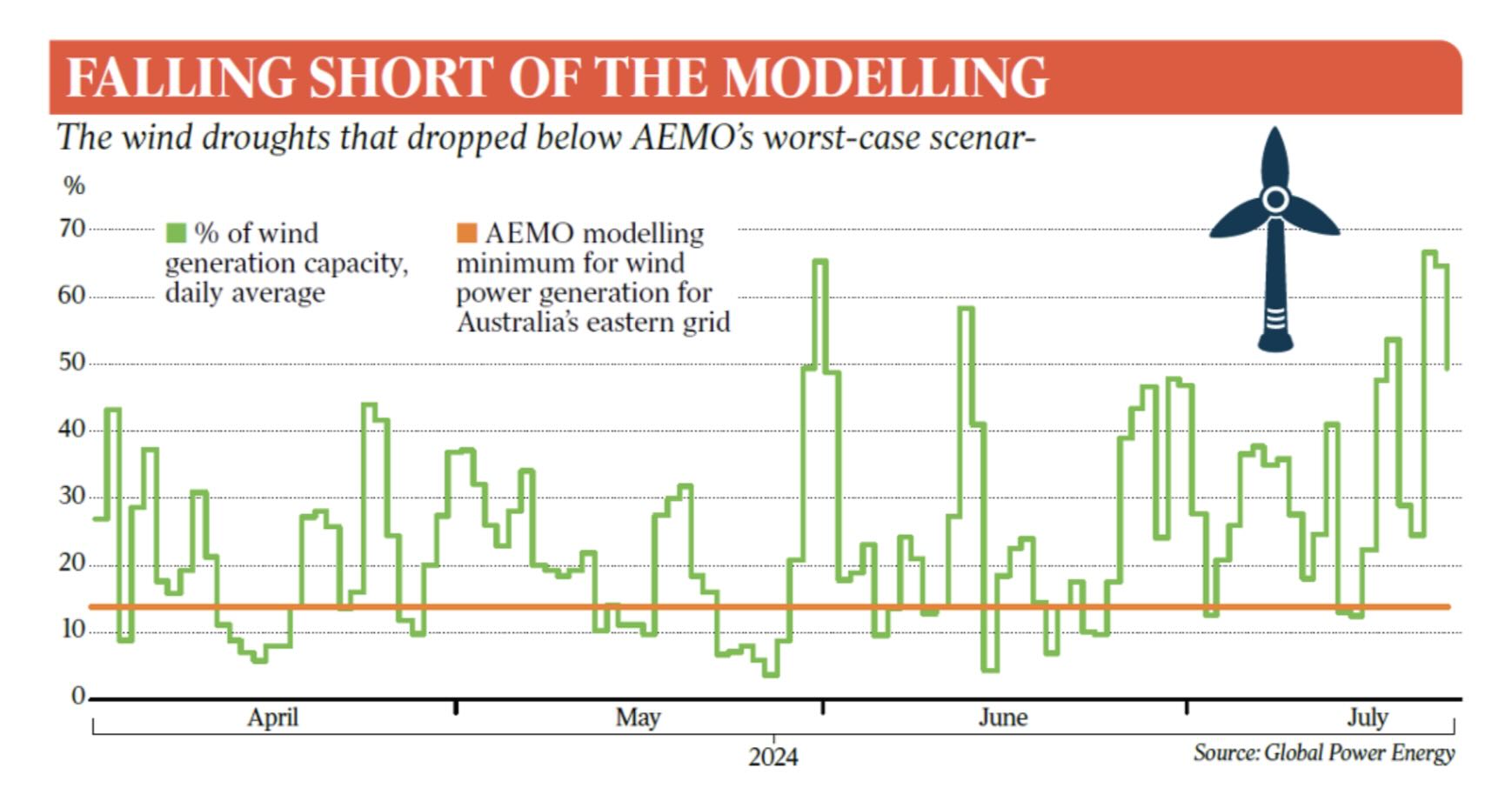
In recent weeks this chart has circulated through the usual redoubts of climate and energy contrarianism – The Australian, Sky News, the Institute of Public Affairs etc – and several times here on LinkedIn, in a slightly different format.
It first seems to have appeared in a breathless front page “exclusive” by Chris Uhlmann for The Weekend Australian edition of 29 November.
The gist of Uhlmann’s article was that AEMO’s 2024 Integrated System Plan (ISP), “was built on a model that assumes wind power will never fall below 14 per cent[i] of its generation capacity for multiple days” – hence the 14% line on the chart – but that analysis based on actual data for NEM[ii] windfarm collective output over April-July 2024, “shows wind collapsing to about half that level during three separate week-long slumps”.
Uhlmann goes on to explain that AEMO had taken “a historical severe dark and still weather event observed in June 2019” and by “casting that across eight days” had constructed a synthetic “worst-case scenario” (Uhlmann’s words, not AEMO’s[iii]). He asserts that “the operator’s plan for the level of generation needed in 2040 to manage these extreme conditions was built around that assumption”[iv], then goes on to highlight most of the events shown on the chart where the actual capacity factor line for the NEM’s wind farms fell below 14%.
The analysis is attributed to Global Power Energy Australia (GPE), a completely reputable consulting firm of experienced energy professionals.
I can’t find it or any reference to this work on their website, but I don’t doubt they produced the underlying analysis and chart data, given Uhlmann’s article directly quotes GPE’s chief executive, who has also defended the analysis in LinkedIn comments.
And clearly the chart utterly shreds AEMO’s “worst-case scenario”, proving it to have been wildly over-optimistic on nearly a dozen occasions, drawn from just four months of real world data. No?
No. Putting aside all debate about whether the entire edifice of AEMO’s ISP modelling stands or falls on whether a single scenario is indeed “worst-case”, there’s a much simpler, fundamental problem in the presentation of this chart that quicker readers than me will have realised from the get go.
It’s plotting actual daily capacity factors against a threshold value for capacity factor averaged across an eight-day wind slump.
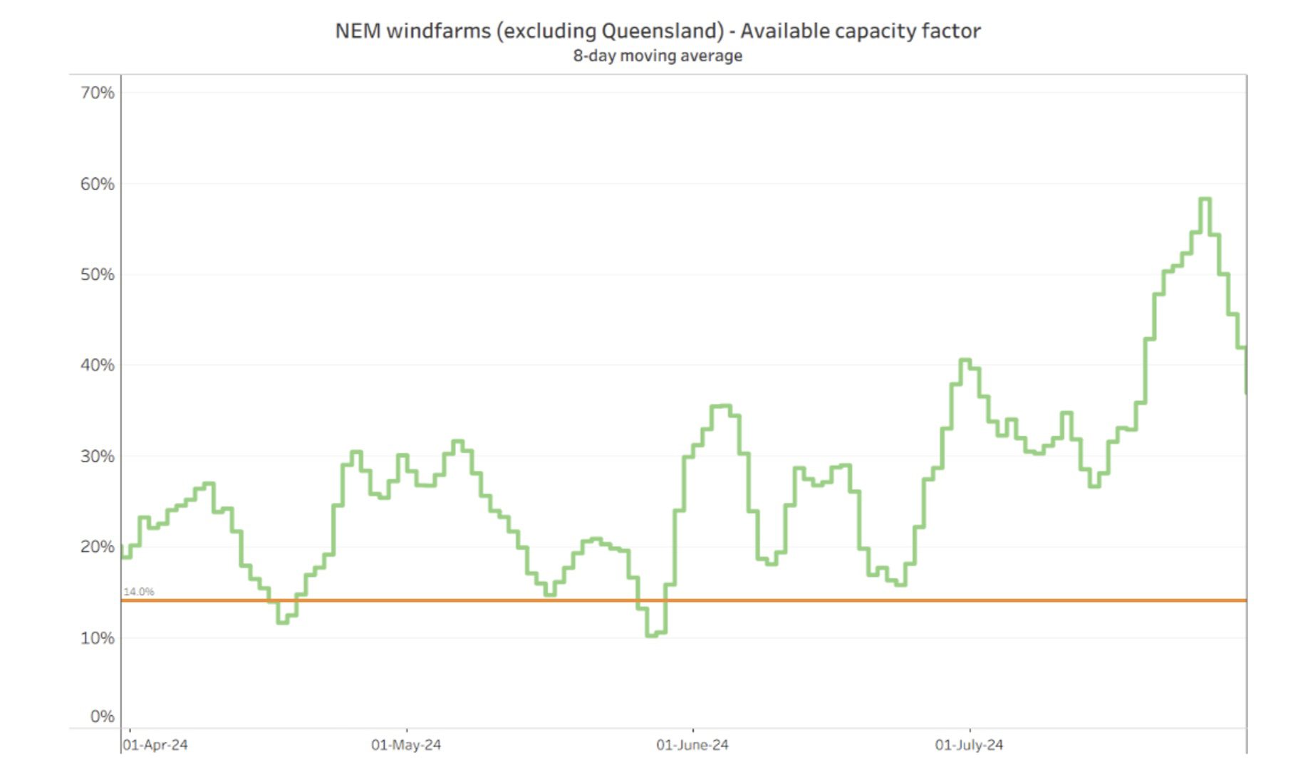
Here’s what the chart should look like:
Averaging removes the daily noise in the actual capacity factor line and, crucially, yields a series that is directly comparable with the 14% threshold level. Now, instead of many events falling well below that threshold, we can see there were just two falling marginally below it.
This could still raise reasonable questions about what a worst-case wind drought might entail – but it doesn’t quite make for the “gotcha” that Uhlmann thought he was revealing.
[i] There’s actually no reference to this 14 per cent figure in the relevant section of AEMO’s 2024 ISP. However a value close to this can be derived from supporting data published along with the ISP, specifically data underlying the analysis of the synthetic VRE drought event discussed in endnote iii.
[ii] The analysis actually appears to cover NEM windfarms excluding Queensland. This isn’t made explicit in the chart nor the Uhlmann article, but would be consistent with the referenced analysis in the ISP.
[iii] This eight-day synthesised event is discussed in Appendix 4 to AEMO’s 2024 ISP, where it is referred to as “an extended period of low VRE [variable renewable energy] conditions”. Importantly the event studied by AEMO combined an extended period of low wind coincident with low solar output. The chart and Uhlmann’s commentary are silent on actual solar conditions during 2024’s low wind periods.
[iv] This is a misrepresentation of the role of the low VRE event analysed by AEMO, which was to test the resilience of the ISP’s already-determined expansion plan against a scenario more severe than any of the inputs actually driving the planning model.
[v] AEMO’s commentary in Appendix 4 does in fact reference 2024’s low wind conditions, noting that “April and May 2024 showed extreme low wind productions across southern states. However, the solar outputs were still relatively high. As new solar capacity is forecast to increase in the future, the severity of the effects of these recent wind droughts is similar to the example conditions explored in this section.”
A four-hour big battery proposed for construction in state's south-east is seeking a federal green…
The Octopus Investments battery has approval for up to 2 GWh, making it one of…
AGL chief nixes the idea that the company would ever be building coal-fired power stations…
One of Australia’s oldest continuously working wind farms, and a vital ingredient of a world-leading…
New funding will help establish manufacturing facilities for two automated technologies – robots that install…
All Electric Homes founder Trent Jones warns that a shortage of skilled tradies, fragmented business…