On RenewEconomy we have reported on the latest marginal loss factor calculations by the Australian Energy Market Operator, which have provided a mixed bag for Australia’s power generators – but particularly newly constructed wind and solar farms.
Some, such as the Silverton wind farm near Broken Hill and the Broken Hill solar farm, have had massive downgrades to their MLFs, which calculates how much of their output is credited by the market operator. The Broken Hill solar farm, for instance, will get paid for just 75 per cent of its output.
Other wind and solar farms have experienced a slight increase in MLFs, and some have had a reprieve from an earlier draft calculation after a re-think about how quickly many new projects will join the grid.
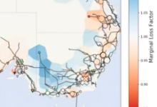
The folk at power engineering and project management company Ekistica put together this fascinating gif, showing the history of MLFs in Australia over the last few years – the blue areas show where MLFs have a factor of more than 1.0, meaning they are close to load or have no grid constraints.
The pink and red show the areas which have low MLFs. How that has changed gives some insight into the evolution of the grid over the past decade.
Ekistica’s Lyndon Frearson says that with the rapid increase in the volume of discussion regarding MLF’s in the NEM, Ekistica thought it would be useful to visualise how MLF’s have changed over the last decade whilst also showing where and what new generation has entered the market during that time.
“At first glance the animation is not surprising, given the large amount of discussion that has occurred over the previous months,” Frearson says.
“For many years, large sections of North Western Victoria, Western NSW and Northern QLD have had high MLF’s and yet in the last year or so, the MLF’s have dropped dramatically in all these regions. Of course the scale and rate of these changes has shocked some in the industry until we take time to consider what MLF’s are and what they are trying to achieve.
“MLF’s are, at the core, a mechanism to tell the market where there is a mismatch between the location of generation relative to loads.
“I don’t propose to go into the nuts and bolts of MLF’s at this point, save noting that they are an attempt to put a price to the losses associated with the distances that energy mast be transmitted through the network from the various generation points to loads.
“While MLF’s may be an in-elegant mechanism in the context of providing certainty to investors in the energy sector, and there are indeed many arguments for more accurate ways of determining the real costs of of the system losses that MLF’s are trying to reflect, it is worth noting that they have achieved precisely what they were intended to do:
“high MLF’s have encouraged developers to locate new sources of generation in those regions, with the consequence that future MLF’s have been lower for consumers (load) in those regions.”
Frearson says that, to be clear, this is not an argument in support of the present MLF mechanism as there are clearly many challenges to resolve.
These include the timing of MLF reviews, the actual calculations and weightings of peak versus of peak generation, the relativities of differing reference nodes, whom receives the financial benefit associated with the differences between actual and forecast losses, and the extent to which MLF’s take into account future generation scenarios are all issues that deserve further review.
“That said, the animation does highlight how a market mechanism can drive behaviour often in a manner that can be unexpected in both the scope and rate of the change it causes, particularly in the context of new and disruptive technologies.”


