The purpose of our various clean energy policies – such as the carbon tax, the renewable energy target and, to some extent, the various energy efficiency measures – is to reduce the carbon emissions from our energy system. The hope is that by spending on such measures now, we will mitigate future, and potentially must more costly, spends on avoidable climate impacts.
No doubt in the forthcoming election, the value of these policy measures will be debated ad nauseum. The reality of climate change is that we’ll have to wait many decades to judge the real value. In the meantime we have to monitor incremental changes in such things as our electrical power sector carbon emissions in order to get a sense of whether the policies are driving appropriate short-term responses.
For the electricity sector this would seem pretty straight-forward because the market operator, AEMO, publishes estimates of the emissions associated with the electrical power generated and dispatched on the National Electricity Market, or the NEM. Before we look at the ‘data’, it is important to provide the caveat that AEMO’s estimates are not direct measurements of emissions at the point of power generation. Rather they derive from calibrations of the emission factors of individual generators, and estimates of the parasitic loads (i.e. the energy consumed by the plant itself in generating dispatched energy) and the metered sent-out energy dispatched onto the NEM by the generators.
As illustrated below, the take home message from AEMO’s estimates is that there is, at face value, a staggering decline in the emissions from our fossil fuel dominated electrical power sector. AEMO’s estimates show a decline of around 7% in the last financial year alone, since the implementation of the carbon tax. Since annual emissions from fossil fuel generation peaked at around 188 million tonnes in the financial year 2008-09, AEMO estimates show emissions have fallen by around 14%.

Estimated annual CO2 emissions associated with electrical power production dispatched on the NEM. Data from AEMO, image by Mike Sandiford

Estimated annual emissions associated with electrical power production dispatched in New South Wales, Victoria and Queensland. Data from AEMO, image by Mike Sandiford
These estimates relate to the emissions at the point of generation and point directly to the significant decline in the energy dispatched by fossil fuel generators. They are the product of the combined effects of a significant reduction in demand for electrical power dispatched on the NEM and a reduction in the proportion that fossil fuel contributes to the sent out energy, relative to cleaner energy technologies dispatching on the NEM such as hydro and wind power. This effect contributes an overall reduction in the emissions intensity of the electrical power generation.
The combined effect can be partly attributed to the direct effects of the clean energy policy instruments, and partly the indirect consequence of structural changes in the economy.
As noted in previous columns, since 2009 our demand for electrical power dispatched on the NEM has been declining at an astonishing rate, especially in New South Wales. Since the peak in 2008-09, NEM-wide demand has fallen by around 1.5 gigawatts, or around 6.5%, with 2/3 of this occurring in New South Wales. In the last financial year, New South Wales demand fell 400 megawatts or almost 5%. In total, New South Wales demand has fallen some 10% since its peak.

Annual average electricity demand on the NEM in gigawatts. Data from AEMO. Tasmania only joined the NEM in 2005, giving a kick in total demand. Grey circles are total demand with Tasmanian demand subtracted post 2005. Data from AEMO, image by Mike Sandiford
A number of factors are contributing to this decline in demand, including the rapid take up of distributed generation (such as solar PV) and energy efficiency measures (such as pink batts), as well as structural changes in the economy. The closure of the Kurri Kurri aluminium smelter has reduced demand by around 320 megawatts equivalent to about 3.5% of NSW demand. It alone accounts for almost 1/3 of the NSW demand reduction since the peak in 2008-09, and 20% of the total reduction in NEM-wide demand. NEM wide demand reduction attributed to domestic solar PV generation is of a similar scale.
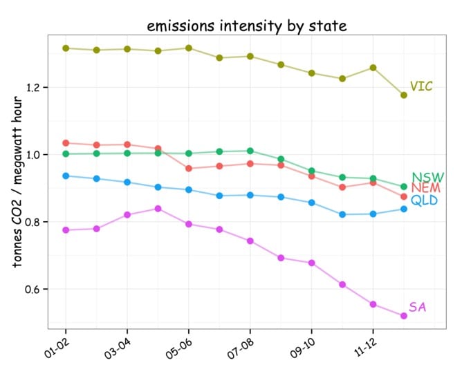
Across the board, the emissions intensity of our electrical power generation dispatched on the NEM has been declining. The biggest reduction has occurred in South Australia where the emission intensity has fallen by about 35% over the last decade, due mostly to the impact of new wind generation. Elsewhere more modest declines in the emission intensity can be partly related to the increasing proportion of hydro-power in the NEM dispatch stack in the last few years due to the breaking of the millennium drought, combined with the reduction in overall demand. Since it is coal-fired power generation that is taking the brunt of the demand reduction, the proportion of fossil fuels in the generation mix is declining more rapidly than the overall decline in demand.

Estimated annual emissions intensity by state. Data from AEMO, image by Mike Sandiford
As discussed earlier, one of the caveats on AEMO’s estimates is the emission factors of our various fossil fuel generators. If the emission factors vary with output then the estimates may suffer a systematic bias when demand shifts. While it should be possible to deduce if this is the case from coal consumption statistics, such data is not readily available other than at the national scale across all uses, including steel production. In the recently released Statistical Review of World Energy 2013, BP estimates that Australian coal consumption in calendar year 2012 was down more than 10% on just three years earlier. While this accords with the reduced output from our coal-fired power generators, there remains ambiguity in just how much is due to declining domestic steel production.
If AEMO’s estimates do faithfully track the total emissions from our electric power sector, as is likely, then the results are quite staggering. At an annual decline of 3.5%, it would take just 20 years to halve emissions. That would go a long way to meeting our obligations to a global effort to mitigate avoidable costs of future greenhouse-gas related climate change. If we could maintain the 7% decline of the last financial year we would achieve a 75% decarbonisation of electrical power sector in just 20 years.
That would be something.
Finally, if you are wondering what the carbon tax has been doing to the cost of electricity on the wholesale market, then take a look at the graph below. Annual revenues have almost doubled, from $6.1 billion in 20011-12 to $12.1 billion in 2012-13. About 60% of that rise is attributable to the carbon tax ($3.8 billion) with the remainder due to the dynamics of the market. Despite the steep rise, revenues are not yet at record highs, being lower (in 2013 dollar terms) than in the drought years of 2006-07 and 2007-08.

Annual wholesale revenue for electrical power dispatched on the NEM. Grey circles show actual revenue for the given financial year. Red circles show the revenue adjusted to 2013 dollar terms. Black circle shows the residual revenue for financial year 2012-13 obtained by subtracting the carbon tax component ($3.8 billion) from the total revenue.Red line shows the average revenue in 2013 dollar terms. Data from AEMO, image by Mike Sandiford
The wholesale price impacts of the carbon tax and other clean energy measures have varied from state to state. In New South Wales, wholesale prices are barely above the long-term average of $52 per megawatt hour, despite the hefty carbon tax. This reflects the continuing price suppression in a heavily oversupplied market. In contrast, in Queensland wholesale prices are now at record highs averaging $70 per megawatt hour over the last financial year.

Annual wholesale prices, in New South Wales. Grey shows actual prices for the given financial year. Red circles show the prices adjusted to 2013 dollar terms. Black circle shows the residual price for financial year 2012-13 obtained by subtracting the carbon tax component from the total price. Red line shows the average price for years 1999-2012 in 2013 dollar terms. Data from AEMO, image by Mike Sandiford

Annual wholesale prices across the NEM. Grey circles show actual prices for the given financial year. Red circles show the prices adjusted to 2013 dollar terms. Black circle shows the residual price for financial year 2012-13 obtained by subtracting the carbon tax component from the total price. Red line shows the average price for years 1999-2012 in 2013 dollar terms. Data from AEMO, image by Mike Sandiford
Mike Sandiford is Director of the Melbourne Energy Institute at University of Melbourne. He does not work for, consult to, own shares in or receive funding from any company or organisation that would benefit from this article, and has no relevant affiliations.![]()
This article was originally published at The Conversation.
Read the original article.

