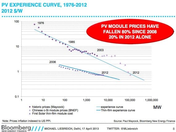
I know most of you have seen such graphs many times, but I can’t resist sharing another one every once in awhile. And the truth is, a lot of people are completely oblivious to this. Those who follow cleantech news know the strong trend, but the common person certainly doesn’t. Do everyone a favor — share this graph with your friends! ![]()

Wind Power Prices Also Dropping
Wind turbine prices have followed a similar (if not quite as extreme) trend. Since 2008, wind turbine prices have fallen 29%. Wind power is more mature than solar. It is already the cheapest electricity option in many or even most places. You can see in the graph below that it had most of its massive price drops in the 1990s.

The full BNEF presentation those graphs come from was a presentation at the Clean Energy Ministerial in Delhi, India on April 17, 2013.
Stay tuned, because I’ve got a post coming in about one hour that goes very well with these, but takes things even a step further.
This article was originally published on CleanTechnica. Reproduced with permission