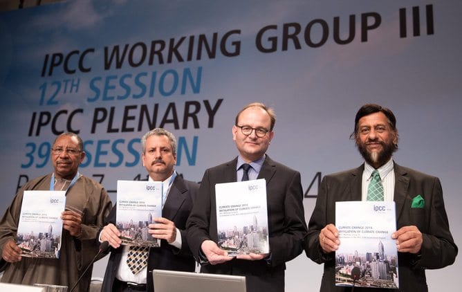
In the wake of this month’s Intergovernmental Panel on Climate Change (IPCC) report on ways to cut global greenhouse gas emissions, accusations began to fly in the media that the report had been censored by governments.
Are these accusations true? Well no, not exactly. Parts were edited out of the summary, although all of the details survive elsewhere in the report.
But although this doesn’t amount to the censorship scandal some people clearly wanted to read about, the edits do tell an interesting story. They show us that countries are already looking at how their bargaining chips will stack up at the crucial round of United Nations climate negotiations in Paris next year.
What part of the report was changed?
All IPCC reports include an executive summary called the Summary for Policymakers (SPM). The contents of this summary are approved by the member governments at a plenary meeting once the report itself is complete. This process begins with a draft developed by the researchers who wrote the actual report. Government delegates then debate which of these points should be included in the approved summary, and what emphasis they should receive.
At the plenary meeting in Berlin last week, significant changes were made to the draft summary. The approved SPM emphasises justice and sustainability more than the draft did, and downplays the need for countries to cooperate to deal with climate change.
Delegates also deleted all of the graphs and text that describe the greenhouse gas emissions of specific regions and groups of countries. The approved summary only presents data on global totals.
However, the governments are not allowed to make any fundamental changes to the underlying report, all of which is publicly available. There is also a second executive summary, called the Technical Summary, which governments are not allowed to edit either.
So countries get to put the spin they want on the SPM, but they do not and cannot “censor” the report itself. Nor can they amend the Technical Summary, which remains the executive summary as the scientists see it.
Why do countries want to spin the summary?
In November and December next year, the governments of the world will meet in Paris at the 21st annual meeting of the members of the United Nations Framework Convention on Climate Change. Their goal is to achieve a binding, worldwide agreement on climate change. This will be the most important summit since the meeting in Copenhagen in 2009and possibly since Kyoto in 1997, which spawned the Kyoto Protocol.
It is easy to be sceptical about the likelihood of governments reaching such an agreement. But as long as an agreement is on the table, each country will want to secure the most favourable terms possible.
In Copenhagen, governments forged a non-binding agreement to limit global warming to 2C over the pre-industrial average. But there is no agreement on the specific way in which the burden of cutting emissions should be distributed.
Some governments might suggest that all countries should eventually move towards an equal level of emissions per person. Others such as China and India might argue that that is not fair because rich countries have a longer history of high emissions, which those countries should be held responsible for.
Many countries have good reasons for not wanting specific information about their own emissions to make it into the IPCC summary. If the SPM includes details of regional trends as well as global ones, that might be seen as an endorsement of a particular approach to burden-sharing.
What was left out of the summary and why?
There are three graphs of historical emissions trends that are in the Technical Summary but not the approved version of the SPM. Each of these shows emissions broken down into broad groups of countries based on geography or development status.
I was an author on Chapter 5 of the report, which deals with historical trends in emissions. I was not at the governmental plenary meeting, so I can only speculate about why some things made it into the approved summary and others did not. But it is easy to see why some governments might find some graphs controversial.
The first of these graphs breaks down annual emissions and historical cumulative emissions by broad global regions. One of these regions is the developed countries – North America, Western Europe, Japan, Australia, and New Zealand. The rest of the world is split into four geographical regions. The graph clearly shows that since the 1970s, growth in total greenhouse gas emissions came mostly from developing countries.

The graph also shows that developed countries are now responsible for less than half of total historical greenhouse gas emissions. Historical responsibility for emissions looks like an idea that might backfire on its proponents in the developing world.
Another graph shows that per capita emissions have grown rapidly in middle-income countries like China and India, but have declined in both the richest and the poorest countries. Despite that, it also shows that per capita emissions remain much higher in the developed world than in developing countries.
Both rich and poor countries would have reason for not wanting others to see this graph.

Finally, there is a graph showing that the greenhouse gases emitted to produce goods destined for rich countries outweigh the emissions created by rich countries to make goods for export elsewhere. Naturally, the reverse is necessarily true for middle- and low-income countries.

These results are often used to argue that rich countries have reduced their emissions by offshoring production to developing countries, although the reality is somewhat more complicated.
They are also used to argue that rich countries should be held responsible for their consumption emissions rather than their production emissions. But both importers and exporters gain from international trade, so this is clearly not a cut-and-dried issue.
It is understandable why rich importers like the United States and Europe might not want details of their offshored emissions to be highlighted, or why China might not want attention drawn to its rapid emissions growth.
It’s diplomatically more prudent to keep the information general and avoid specifics. But while that might help countries get around the negotiating table in Paris, it doesn’t really show them what to do when they get there.
Source: The Conversation. Reproduced with permission.


