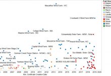
At RenewEconomy we do like a good graph, and we are pretty impressed with this one, above, which comes courtesy of Warwick Johnston of industry analysts SunWiz. It tracks the history of Australian renewable energy developments over the past 20 years.
It does this by tracking the large-scale generators by the date they started generating renewable energy certificates (horizontal axis), and their average annual production of RECs (vertical axis).
It turns out to be a wonderful historical document of the changing face of renewable technology in Australia.
Note how, in 2001 and 2002, the technologies of choice at the time were some smaller wind farms, some landfill gas, and some waste, and some hydro generation.
Over subsequent years, wind came to dominate production in terms of output; there was a brief flurry of bagasse (sugar residues) around 2007, and waste coal mine gas had a brief time in the limelight around 2012.
Since then it has virtually been all wind, and most recently solar (in the red). Fascinating and illuminating.

