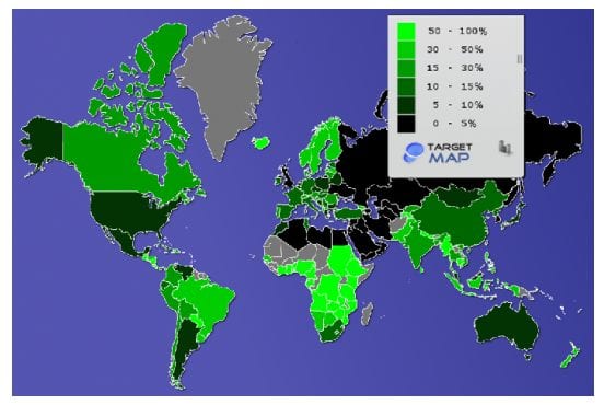
Today’s Graph of the Day comes courtesy of The Energy Collective, and gives an interesting perspective of the level of renewable energy in the electricity systems of countries across the globe: the lighter the green, the higher the percentage of renewables.
But appearances can be deceiving. The sub-Sahara region is bathed in light green, but this is because they rely on traditional biomass – which is not necessarily renewable nor particularly healthy. This is evolving as rural populations move to the cities, grids expand, and off-grid solar products, particularly lighting, also increases its penetration.
Of the major economies, Scandinavian countries, New Zealand, and Brazil have the brightest shade of green thanks to their considerable hydro resources. Most other European countries hover between 10 and 30 per cent renewables, and hydro also helps China into a lighter shade of green, while economies such as the US and Australia are credited with no more than 10 per cent and Russia and the oil-rich Middle East are a sea of black.
(Australian is right on the margin of 10 per cent, having been basically unchanged for the last decade, although rooftop solar and some new wind farms has probably pushed that to around 12 per cent now. This graph relates to 2011).
The original article notes that for most countries not endowed with geysers or mighty rivers—solar and wind hold the most promise. This can be seen from recent growth rates.


