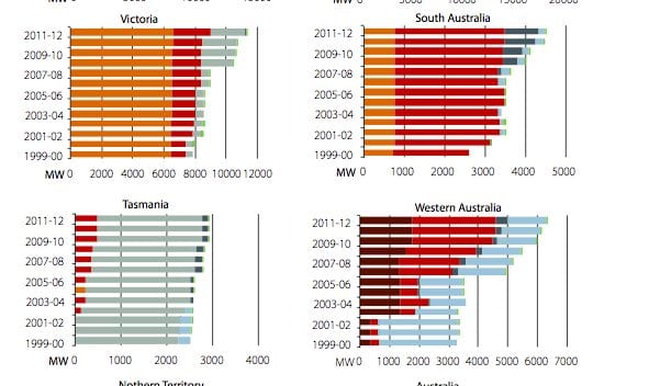
This set of graph’s should be self-explanatory, but give a fascinating picture of Australia’s generation profile, state by state and nationally. What this graph of the day – sourced from the Bureau of Resource and Energy Economic – does is emphasise the different profiles of Australia’s six states and the biggest territory.
At the top we see Queensland and Australia is a sea of black, from black coal, with growing amounts of gas and, suprisingly, some splashes of green. Victoria relies heavily on brown coal, while South Australia is mostly gas. We should point out that this has not caught up with latest data from South Australia, which shows that nearly one third of that state’s generation comes from wind and rooftop solar.
Tasmania is mostly hydro, the Northern Territory is mostly gas, and WA has a growing share of black coal and gas. The one territory not on this chart is the ACT, which currently sources all its electricity as part of the NSW section of the eastern states grid, but it has plans to source 90 per cent of its electricity needs from renewables by 2020. An ambitious plan unencumbered by a local fossil fuel industry.


