Andrew Bolt, damned statistics, and climate change

Climate sceptics and denialists put forward many arguments to support their views that climate change is not a big issue. A core argument has been that warming has stopped over the past ten to fifteen years. Graph after graph that seems to support this position have been published. But the statistical basis of these graphs is very fragile.

This argument confuses the short term effects of weather cycles such as El Nino and La Nina and other factors such as volcanic activity with the long term effects of increasing concentrations of greenhouse gas emissions.

In this article I look at one example of this approach and show how very small changes in the selection of the period of temperature trends can give very different warming trend results. And the very variable temperature data means that presentation of relatively short term trends is simply not statistically valid. Longer time scales are needed to identify underlying trends.

In his blog of 2 November, high profile climate commentator Andrew Bolt reproduced two global temperature graphs, one for the past 12 years to September, showing ‘no warming’ and a second graph for the past 15 years showing ‘statistically insignificant’ warming since January 1998, shown below.

From the Bolt Blog  

 pears graph 1

I thought it might be interesting to explore the sensitivity of these trends to the period of warming considered. I downloaded the monthly GISS/NASA data to September 2013, as shown in the red line on the Bolt graph, from two different starting dates, January 1996 and September 1997, then looked at the linear trends.

 pears graph 2

My graph shows that shifting the starting date of the period back by less than 2 years from September 1997 to January 1996 can increase the estimated rate of warming by 70 percent (from 0.063C/decade to 0.107C/decade). The September 2013 data point shows recent warming well above the long term average, which has begun to lift the warming trend calculation. If the dominance of La Nina events over the past decade is finishing, Mr Bolt may not be so keen to keep showing us warming trend graphs to support his argument that warming has stopped.

Focusing on short term warming trends, even as long as 15 years, is a risky business.

Mr Bolt’s comment that the warming trend over the past 15 years is ‘statistically insignificant’ seems to be his interpretation of the fact that the trend is ‘not statistically significant’. This term actually highlights the wide scatter of the data in the short term. So it’s not that the warming trend is necessarily trivial, it’s just that the data are very scattered, so firm conclusions can’t be drawn about the actual trend: you need a longer period of data to improve the statistical significance of a trend with such variability.

This is a good example of where the statistical interpretation of ‘not significant’ relates to the validity of the trendline’s representation of the data, not whether the actual trend in warming is ‘significant’ or not. Mr Bolt’s colloquial interpretation is erroneous from a statistical perspective. It may well be that the trend shown seems to indicate that the warming trend is very low. But the lack of statistical significance means that such a conclusion is speculative, due to the variability of the data.

For those who are interested, the R2 values (an indication of the statistical certainty of the trend line) are 0.157 for the line in my graph starting with January 1996 data, and 0.053 for the line starting in September 1997. A perfect statistical trend would have a value of 1 and, the lower the value, the less reliable is the trend line as an indicator of what is really happening. Clearly drawing conclusions from this data set is to draw a very long bow.

The sensitivity of the result to the exact period chosen is illustrated by comparison of Mr Bolt’s 12 and 15 year trends in his blog, as well as the difference between my GISS warming trends and Mr Bolt’s 15 year trend. My ‘low’ trend’s starting point is only a few months different from his, using the same data set, yet my trend is 0.063 degrees C per decade while his graph shows 0.070 degrees.

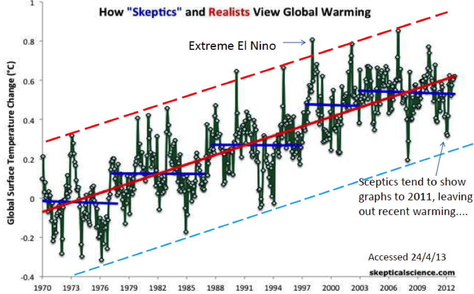
If we look back to the 1970s to get a more statistically valid picture, we see that there is a clear warming trend overall, the hottest periods show a clear trend towards greater warming and the ‘cold’ periods show ongoing warming. The problem is that periods of no warming or cooling have consistently been overwhelmed by the periods of strong warming. You just have to be a bit patient.

The graph below, from the scepticalscience website, with some additions by me, shows this longer term trend.

pears graph 3

An interesting question is whether Mr Bolt is showing a lack of understanding of the interpretation of statistically ‘noisy’ data, whether this is a deliberate attempt to confuse and mislead, or there is some other explanation. I’ll leave that to others to judge.

Alan Pears works at RMIT in Melbourne.

Comments

15 responses to “Andrew Bolt, damned statistics, and climate change”

  1. Keith Avatar
    Keith

    The Sceptical science graph is perhaps the best demonstration of how a denier can get 5 periods of no change (or cooling) in a 42 year period where the temperature has been clearly rising. The giveaway is that as you enter each new “cooling” period, you have to “set” the “start” temperature at a higher point.

  2. Jason Avatar
    Jason

    isn’t there any type of standards that can be applied? For example if he is cherry picking and manipulating the data to arrive at a pre conceived agenda isn’t the media watch dog able to convictBolt of giving misleading and false conclusions based on cherry picked stats?
    Essentially can’t we force Bolt to print a correction or whack him with an enormous fine?

    1. Concerned Avatar
      Concerned

      Jason ,get an education

      1. Jason Avatar
        Jason

        Really? That’s your response? I suppose you don’t believe in holding people responsible for their actions? Or are you too afraid to stand and say what you think?

        1. Jason Avatar
          Jason

          Maybe i should have included ” wouldn’t it be nice if” for the more intelligent and educated elites mingling amongst us….

          1. wideEyedPupil Avatar
            wideEyedPupil

            Don’t bother, Concerned is a grumpy old man who doesn’t get out enough. Trolls almost every discussion on RE that is remotely political or cultural wars fodder. He is lamentable contrarian in all respects.

  3. Martin Avatar
    Martin

    Climate is the weather averages over a period of at least 30 years. Anything less than 30 years and we’re talking about weather variability, not climate. Even Andrew Bolt should know this.

  4. Concerned Avatar
    Concerned

    A Batchelor of Ed,and he is lecturing on Stats?Anyone who knows anything about StatsIs now falling off their chairs laughing.

  5. derekbolton Avatar
    derekbolton

    Alan, I’m not sure I follow your logic about Bolt’s interpretation of significance. You seem to suggest that he referred to statistical significance when he meant significance of the magnitude of the trend, then go on to note that the trend is not trivial, but the scatter makes it uncertain. Doesn’t that indicate he used the term correctly?
    What annoys me is that you can always achieve statistical insignificance by taking a sufficiently small dataset, which is exactly what Bolt has done.

    Anyway, making predictions from historical data with no regard to what the data means is thoroughly flawed. This is what ‘chartists’ do with stock market data. It’s no better than astrology. We know all sorts of physical processes that affect temperature, and the only sensible way to proceed is to build a model based on them. E.g. there’s the fundamental fact that bodies radiate energy as the fourth power of their absolute temperature. That seriously limits how far a straight line trend could be maintained.

  6. Alan Pears Avatar
    Alan Pears

    Good to see some responses. A couple of points. First, to Derek: sorry if I didn’t make it clear. Mr Bolt uses the graph to argue that the warming trend is insignificantly small – ie trivial. My point is that the data are very scattered, so the trendline is what’s not statistically significant. So it is simply not possible to claim that the trendline shows warming is minimal, as it very likely does not reflect the real trend – which could be strong warming or even cooling given the scattered nature of the data points. You need either less scattered data (which would not reflect reality) or a longer time period to get a statistically significant trend.
    To ‘concerned’ I should point out that my BE is a degree in engineering, not education. But I do also have a DipEd. I think this comment unfairly insults educators. In my experience, they often understand principles and complex issues much better than many more qualified people, as they have to explain them to their students. And students are great at exposing any poor logic or factual anomalies! Much more skilled than many climate sceptics.
    I’m not trying to argue that a degree in engineering (or any qualification really) is necessarily evidence of high competence. Indeed, in my many years of working in industry I have found quite a few engineers who have been trying to rewrite the laws of physics and chemistry….. But you can follow Greg Hunt’s example and look up R squared on Wikipedia to confirm my interpretation.

    1. Concerned Avatar
      Concerned

      Ok.,Engineering,then why distort the Stats,where is the alpha level etc.The null hypothesis,We are talking about a regression.just an opinion?It only gives you an indication.P?F?amy goodness.

    2. Concerned Avatar
      Concerned

      Amazingly,just finished some post grad course in Stats at CQU.

  7. Martin Avatar
    Martin

    Alan,

    I regard your contributions to the climate change and renewable energy debates very highly.

    But what I don’t understand is why we bother to respond to non-climate data sets.

    If Andrew Bolt wants to discuss climate change, or the absence thereof, let him present two consecutive 30-year-period data sets. And if he doesn’t, point out to him that he is talking about weather variability, not climate.

    Our side of the debate needs the same discipline when talking about climate change: 30 years or more is climate; less then 30 years is weather.

    That also means that we shouldn’t contribute any particular weather event to climate change.

    But it is fair and reasonable to warn of the risk of more extreme weather events with continued climate change.

  8. Bernie Zelvis Avatar
    Bernie Zelvis

    Thanks for a very informative article.

    It’s sad to see a troll, the lamentable ‘Concerned’ (yeah right) arrive and proceed with ad hominem attacks. This is where I agree with google’s policy of encouraging the use of real names on internet posts… I’d like to know who this troll really is for we should all take responsibility for our actions as should Andrew Bolt.

    So here I find myself agreeing with Jason, Bolt should be taken to task for his deception. It’s difficult to believe it is less that that.

    ‘Climategate’ is another cesspool of slander championed by James Delingpole. The Telegraph, obviously aware of possible legal ramifications publish this introduction/disclaimer with his blog-

    “James Delingpole is a writer, journalist and broadcaster who is right about everything. He is the author of numerous fantastically entertaining …”

    He and The Telegraph are therefore protected under the umbrella of ‘satire’… it’s humour, fantasy.

    However, the average denier, unaware of the meaning of the intro treat his blog as factual news.

    On the subject of signal and noise, any engineer should be able to understand the concept and the calculations. NASA’s Bruce Wielicki explains-

    On the subject of the ‘pause’ and the IPCC, far from being unaware of it, the details and specification of the filter designed to extract the 15-20 year SDO were clearly described in their 2007 AR-4 publication found here in chapter 3 appendix 3a-

    http://www.ipcc.ch/publications_and_data/ar4/wg1/en/ch3sappendix-3-a.html

    Hope this information is helpful.

  9. ozgipsy Avatar
    ozgipsy

    Hmmmm no mention that the IPCC admitted as much also. And it’s not 10 – 15 it’s 15-16.

Get up to 3 quotes from pre-vetted solar (and battery) installers.