Many years ago, I recall a debate at a Clean Energy Council conference where we all agreed that a consumer guide to solar PV was an essential and much needed tool.
After many years, this has evolved into a very comprehensive booklet that is freely available to consumers and industry alike and to some degree, sets the benchmark for what consumers should look for and expect when buying solar PV.
As our industry and market evolves however, the complexity of seemingly minuscule details contained within this guide requires ever increasing research and effort to get right.
We have been fortunate to contribute in a small way to this guide over the years and have just completed a new analysis and table which will be released in the latest edition.
Page eleven of the guide contains a seemingly innocuous guide to what consumers can expect in terms of daily and annual revenue’s from a “typical solar system in average conditions, based on current FIT’s”
Let me tell you, in today’s policy climate, updating this table turned into nothing short of an “intriguing, investigative mystery case.” Hyerbole you say? No way, this took all my connections, a lot of work and raised some fascinating issues about the state of play in Australia.
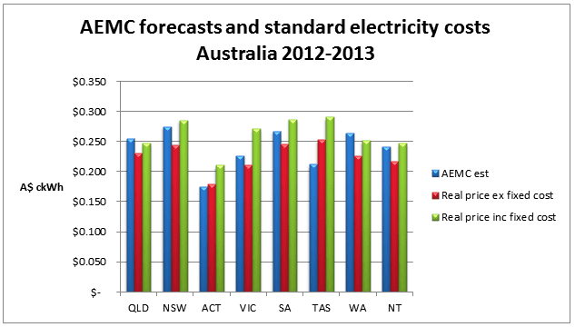
My primary analytical tool starts with Australian Energy Market Commission data from late 2011. This crucial document is one of the few places you can find well researched facts on the forecast retail price of electricity, what it’s made up of and includes vital statistics on average energy consumption and such.
However, we know things have changed so I set out to create a comparison of these rates to current rates. This is where it started to get difficult because as we all know, the number of retail offers and market complexity out there beggars belief. However, we used regulated rates where available and where they weren’t, we researched the typical rates that we could get until we got a good sense of what was a reasonable balance between the two.
Ultimately, it’s impossible to cover every combination and permutation of offers and rates and the implications for consumers with PV, but we did arrive with an average variation of 10% (under) what the AEMC had forecast – pretty close. Most States were under but a couple were above, interestingly.
Armed with this and aware that in a highly volatile and competitive market lower than average offers are inevitable, we proceeded to do some calculations about what that meant for solar consumers under different export scenario’s.
We modelled 5 per cent, 25 per cent, 50 per cent and 75 per cent export ratio’s ( which correlate roughly with what industry and IPART have said over the years) to establish the amount of offset and exported energy could be expected based on average household consumption levels.
This is an increasingly vital statistic owing to the fact that with the proliferation of NET FIT’s (or indeed a lack of them), calculating financial returns relies on combining the savings (offset) and the exports.
Then we triple checked the FIT’s and some of the terms and conditions around them and the plot thickened even more. Anyone who operates Nationally kind of knows this stuff, but its always good to get a refresher and dig a little deeper. Firstly, just finding out what solar rates are available is not easy because they vary depending on the retailer, the tariff structure, the terms and conditions of the offer, your location and so on. FWIW, the National average flat rate is hovering around $0.226 c/kWh, with a high of $0.253c/kWh and a low of $0.170 c/kWh (excluding gst and fixed charges).
As an example, I had a conversation with a broker about swapping just this week who was adamant he could offer me a great deal if I switched and locked in, and assured me that they could retain my $0.60c Gross FIT and add in an $0.08c bonus, which my current retailer recently took away. My mother in law recently switched to this deal so I know its real and is presumably a customer acquisition incentive.
However, when I pushed him on the terms and conditions around it (eg “these rates may increase with regulated rate changes blah blah blah”) I stopped him and highlighted that my understanding is that the regulated rate in NSW is now actually $0.52c plus a mandatory $0.077c contribution from retailers which reflects the windfall profits they were making from my exported solar energy – “so which rate are you referring to,” I asked?
My fear of course was that they would sign me up, then in a few months say “oh no, the government reduced their rate to $0.52c so now the total is $0.60c.” This sent him into a confused panic and he promised to call me back, which he hasn’t done so far.
Co-incident to this issue is the fact that, as Solar Choice and Giles Parkinson’s RenewEconomy noted this week, IPART have mysteriously deleted any (voluntary) rates from their “myenergyoffers” web site recently, removing the much touted “openness and transparency” that was much needed for consumers, and committed to by the NSW Energy Minister. Perhaps it should be renamed “mycompletelackofenergyoffers” .
All of this research also highlighted an apparent trend in trying to utterly confuse customers about what they are really paying for electricity. Take the innocuous little “daily fixed charges” part, for example. This is universally quoted in addition to the energy rate and is on average $0.58c a day with a low of $0.29c a day and a high of $0.99c a day. Small change? Appears so at a quick glance but when this is added to average daily energy costs, your effective cost of energy goes up by 16% on average, to $0.261 c/kWh. The lowest (standard) effective offer including these charges was $0.211 and the highest was $0.29c.
Given all of this, I decided to take a close look at the primary offers available around Australia for the table in question, because we can only provide indicative advice in such a negotiated energy market. (South Australia, for example, has an estimated 70 per cent of electricity customers on negotiated tariffs rather than regulated rates).
Of the 15 primary solar rates on offer around Australia, I discovered that 53 per cent are either voluntary, or a combination of small mandatory rates plus additional voluntary contributions.
This leaves us in a fascinating position. On the one hand, it’s bad because it means we are at the mercy of electricity retailers (who could change policy at the stroke of a pen). On the other hand, it also demonstrates that incentives for solar PV owners are now a legitimate and widely used customer acquisition tool and/or, there are network benefits from PV that are worth paying out for. And that is good.
So, the table is done and, at a minimum, we now understand a little more about how things are changing, have the major offerings described for consumers for another year and there are some positive signals about retailer responses to solar PV.
Unfortunately for consumers, things are getting less transparent and offers ever harder to decipher. I suspect the electricity retailers may have engaged mobile phone billing companies to help enable their plans for market domination.
A concise, comparable and transparent electricity rate plan, anyone?
Nigel Morris is director of Solar Business Services


