Image supplied by Squadron Energy
Over 4 years ago, on 25th August 2021, I started running a weekly simulation of Australia’s main electricity grid. The intention was to show that it is possible to get close to 100% renewable electricity with just 24 GW / 120 GWh of storage, enough storage to supply average demand for 5 hours.
This amount of storage is achievable with current battery technology. Indeed, when including our existing pumped hydro assets, we are likely to reach this level of storage before the end of this decade.
Each week, the simulation uses actual demand data from the previous week, with no modifications. It also uses actual wind and solar generation data, but they have been rescaled so that they provide a little over 60% and 45% of annual demand respectively.
The simulation uses the 120 GWh of storage and existing hydro to match supply and demand. If these are insufficient, then it uses something defined as ‘Other’, likely to be gas or diesel peaking generators in the short to medium term, though longer term there are clean options to replace these fossil fuels.
The following summarises some of the key results from the 4 years of simulations:
My simulation was based on the Australia’s National Electricity Market (the NEM), which represents approximately 80% of Australia’s electricity demand.
Each week, I would download demand and generation data from OpenElectricity. The simulation used the demand unchanged, though note that demand in this simulation includes demand met by rooftop solar.
The generation data for wind, rooftop and utility solar were rescaled by the factors that would get them to 60%, 25% and 20% of annual demand over the previous year respectively.
For example, if, when running the simulation for a particular week, rooftop PV had supplied 13% of NEM demand over the previous year, then a scale factor of 1.9 would be applied (25% target divided by 13%). The scale factors slowly reduce over time as more wind and solar is installed on the NEM.
Note that the sum of 60%, 25% and 20% is greater than 100%. This is important. Any optimised model of a highly renewable grid will have significant over-generation.
It is better to over-generate and have some curtailment than to generate exactly what you need over the year, but with significant shortfalls during some seasons which would require huge amounts of storage or fossil fuel backup.
As mentioned before, the simulation ended up having 16% excess generation (or spilled energy) over the year.
The decision to use 60% wind and 45% solar was based on rough optimisation experiments that I did several years ago. A mixture reasonably close to 50:50 takes advantage of the fact that NEM wind and solar are negatively correlated with each other.
Wind tends to generate above average during the night and during winter, complementing the solar generation.
My model has a bias to wind because wind requires less short-term storage, which is used primarily to shift solar generation from the day to the evening and night. Less storage helps keep the predicted cost down.
Since I did those optimisation studies, the cost of solar and batteries has reduced more than the cost of wind. Despite that, the 60% & 45% wind and solar targets remain very close to optimal as discussed later.
The simulation is simple, particularly due to it not considering transmission constraints. That makes it overly optimistic, though in other ways it is conservative.
Despite the lack of transmission constraints, it arrives at a similar result to AEMO’s 2026 Draft Integrated System Plan (ISP). The ISP averages 97% renewable in the 2040s using approximately 600 GWh of storage, equivalent to about 13 hours of storage at average predicted future demand.
Most of that storage comes from Snowy 2.0, which only provides a little over 1% of demand. If you remove the effect of Snowy2.0, then the ISP would achieve 96% renewable supply with 5.6 hours of storage.
The simulation used 24 GW / 120 GWh of storage (5 hours at average demand) and existing hydro to firm up the wind and solar to match supply with demand.
Both the hydro and storage were assumed highly flexible. Note that the dispatch of hydro was completely changed so that it had minimal generation during periods when it wasn’t needed, and elevated levels whenever there was a day with significant shortfalls of wind and solar relative to demand.
This is reasonable as most of the hydro capacity on the NEM is associated with large storage dams, making the hydro highly dispatchable. However, to maintain consistency with historical generation, hydro generation was also subject to the following constraints:
If the wind, solar, storage and hydro was unable to meet demand, then the model supplements generation with ‘Other’.
‘Other’ is deliberately left undefined. In the short to medium term, it is likely to be existing gas or diesel peakers that will help firm renewables along with storage and hydro.
But longer term, ‘Other’ could be highly flexible generators running on renewable gases or liquids such as green methanol, methane, biofuels or hydrogen.
It could also be long-term storage such as Snowy 2.0, iron air batteries or compressed air storage. Demand response could also play a significant role in reducing the need for ‘Other’.
When calculating the renewable percentage of the simulation, I have assumed ‘Other’ is not renewable, even though it is hoped that in the future it will become renewable.
Each week I posted the results of the simulation of the previous seven days to my twitter (X), Bluesky and LinkedIn accounts. On 27 August 2025, I posted the 209th week, marking four years of simulations. The rest of this article focusses on some of the key results and learnings from the 4 years of weekly simulations.
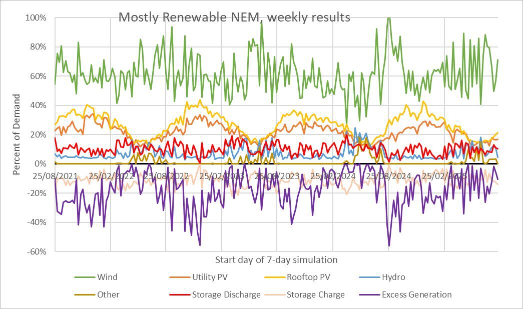
Figure 1: The fraction of demand met by each generation source for every week of the simulation.
Figure 2: Overall fraction of demand met by each generation source over the 156 weeks.
Figure 1 shows the fraction of demand met by each generation source for every week of simulation. It shows that while the target penetration of wind was 60%, the weekly values varied between 27% to 105% due to the variability of wind.
Similarly, while the target penetration for utility solar was 20%, the weekly values ranged from as low as 10% in winter up to 34% in summer.
Figure 2 shows that wind and solar generation ended up slightly exceeding the targets of 60%, 20% and 25% for wind, utility solar and rooftop solar respectively. This was an expected outcome due to the methodology used to rescale the wind and solar data.
Another important observation from Figure 2 is that only 10% of demand was met by discharge from storage. Most demand (89%) is supplied directly from the wind, solar or hydro generation without having to pass through storage.
Figure 3: Percent of weekly demand met by ‘Other’, required in weeks with insufficient wind and solar generation.
Figure 3 shows the weekly fraction of demand met by ‘Other’. Levels of ‘Other’ were close to zero for almost 7 months each year from around September to late March.
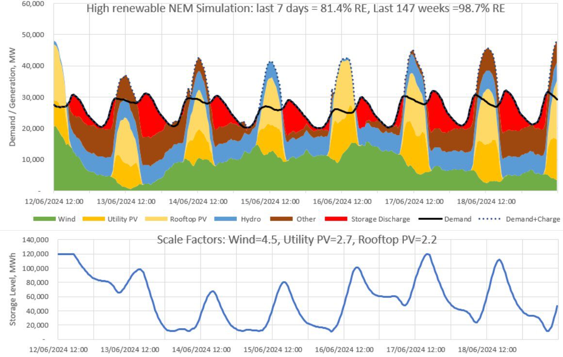
However, by April though to late August many weeks required some levels of ‘Other’, due to the inability of wind, solar, storage and hydro to entirely meet demand. The week starting on 12 June 2024 proved to be the most difficult week of the simulation, with ‘Other’ having to provide 18.6% of demand.
The figure illustrates clearly that late autumn and winter will prove to be the most challenging period for a mostly renewable grid in Australia. It also illustrates that the winter of 2024 was far more challenging than the other winters, primarily due to an extended wind drought, the worst since June 2017.
Indeed, ‘Other’ met 2.4% of demand in the third year of the simulation, compared to 1.2%, 1.1% and 1.4% in years 1, 2 and 4 respectively.
The challenge of matching supply and demand during winter will be even more difficult as we start to electrify gas space heating, particularly in Victoria. Doing so will elevate winter demand much more than summer demand.
In contrast, electrification of transport is likely to elevate demand quite uniformly from season to season.
Moreover, if most charging of EVs is done smartly in response to wholesale electricity prices, namely on days with excess wind and solar generation, then that could greatly assist the integration of renewable supply. It is fortunate that EVs will require significantly more electricity than electrification of space heating.
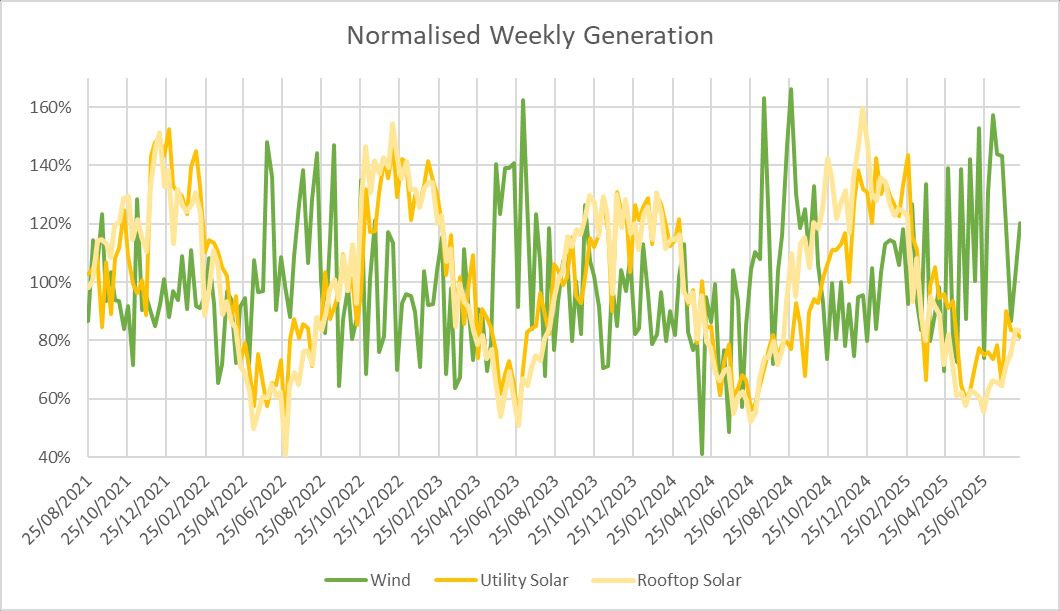
Figure 4: Normalised weekly output from wind and solar. Generation for each week has been normalised by the 4-year average, so that a value of 100% implies generation matched the 4-year average.
Figure 4 shows that weekly solar generation from May to July can occasionally be as low as half the annual average. For most of the four years, weekly wind was rarely below 70% of the long-term average.
However, in 2024, an extended wind drought throughout May and June saw a few weeks where wind generation was below 60% of the long-term average.
This wind drought emphasises that while wind generation tends to be above average during winter, there are never-the-less are many periods where wind generation is significantly below average during these low solar months.
Figure 5: Normalised weekly demand and combined output from wind and solar. Generation for each week has been normalised by the 4-year average, so that a value of 100% implies generation matched the 4-year average
Figure 5 show the variability of demand and of ‘wind+solar‘. By comparison with Figure 4, it is clear that the variability of ‘wind+solar’ is significantly lower than the variability in either wind or solar in isolation.
This reinforces the importance of having a good mix of wind and solar generation. The renewable drought in May & June of 2024 is also highly visible in this chart.
It is important to note that wind in QLD is not well correlated with wind in the southern states. That means that when it is calm in SA, VIC, Tas and NSW, it is often windier than average in QLD, and particularly in Northern Queensland.
This was particularly true during the wind drought during May 2024, but less so in June 2024. For this reason, it is unfortunate that wind only made up 5.1% of QLD demand in FY25, or less than half the NEM average of 14%.
More wind in QLD will greatly help to improve the geographic diversity of renewable generation, making it easier to match supply and demand over the year. It will not completely solve the problem, there will remain many days with poor renewable supply in both the southern states and in QLD, but it will certainly help.
It is interesting to note that the Draft 2026 ISP is predicting that approximately 14 GW of peaking gas or liquids will be needed in the NEM’s generation mix out to 2050, in addition to the 2.2GW from Snowy 2.0.
Combined, these are about 60% more than the 10 GW peak requirements of ‘Other’ so far in this study. This is mostly explained by the ISP assuming a doubling of demand by 2050, whereas this simulation uses current demand profiles.
Table 1 shows some statistics for the 5 most challenging weeks of the 156 weekly simulations run so far. They have ranked them according to the fraction of demand that was needed to be supplied by ‘Other’.
The table shows that the most challenging week was week 147, starting on 12 June 2024, which required 18.6% of demand to be met by ‘Other’. The simulation for this week is shown in Figure 5. All three of the most challenging weeks occurred in 2024, and they all had above average demand and below average wind and solar.
| Rank | Week # | week starting | Other % | Max Other [MW] | Relative Demand | Relative Wind | Relative Utility PV | Relative Rooftop PV | Relative VRE |
| 1 | 147 | 12/06/2024 | 18.6% | 8,999 | 110% | 58% | 68% | 61% | 60.6% |
| 2 | 144 | 22/05/2024 | 17.5% | 6,817 | 102% | 50% | 78% | 69% | 60.5% |
| 3 | 148 | 19/06/2024 | 15.1% | 7,900 | 111% | 86% | 66% | 58% | 75.4% |
| 4 | 97 | 28/06/2023 | 10.7% | 9,043 | 106% | 92% | 51% | 50% | 73.7% |
| 5 | 195 | 14/05/2025 | 10.6% | 6,299 | 102% | 74% | 78% | 60% | 71.3% |
Table 1: Statistics relating to the 5 most challenging weeks within the 4-years of simulations. Relative values for demand, wind, solar and variable renewable energy (VRE) are all expressed relative to the 4-year average of those same quantities.
Figure 6: Simulation of week 147, being the most challenging week within the 4-years of simulations.
Table 2 shows some statistics for the 5 most challenging days of the simulation. Again, they have been ranked according to the percentage of demand coming from ‘Other’. Once again, the list is dominated by events from 2024. Indeed, 7 of the top 10 most challenging days were from 2024.
As with the challenging weeks, it is readily apparent that challenging days are due to the trifecta of above average demand, below average wind and below average solar.
| Rank | day | Other % | Max Other [MW] | Relative Demand | Relative Wind | Relative Utility PV | Relative Rooftop PV | Relative VRE |
| 1 | 4/07/2023 | 32.0% | 9,048 | 107% | 54% | 22% | 26% | 41% |
| 2 | 13/06/2024 | 32.0% | 8,999 | 112% | 21% | 54% | 55% | 36% |
| 3 | 12/06/2025 | 31.6% | 10,196 | 116% | 37% | 68% | 67% | 51% |
| 4 | 5/08/2024 | 30.0% | 8,311 | 110% | 32% | 49% | 60% | 42% |
| 5 | 4/06/2024 | 29.7% | 8,974 | 110% | 34% | 59% | 60% | 45% |
Table 2: Statistics relating to the 5 most challenging days within the 4-years of simulations. Relative values for demand, wind, solar and variable renewable energy (VRE) are all expressed relative to the 4-year average of those same quantities.
My simulation is currently only 4-years in length, which is not sufficient for looking at extreme VRE drought events. But it is nevertheless interesting to compare the results from my simulation with a much longer-term study.
In their 2022 study “Quantifying the risk of renewable energy droughts in Australia’s National Electricity Market (NEM) using MERRA-2 weather data” Joel Gilmore, Tim Nelson and Tahlia Nolan analysed 42 years of simulated wind and solar traces to look at the worst VRE droughts that could be expected .
They found the worst day in 42 years to have a relative VRE supply of 32.8%, or about 4 percentage points worse than the worst day this simulation has seen. An additional deficit of 4% would likely require an additional 1 GW from ‘Other’.
An approximate guess might be that the current peak value of 10 GW from ‘Other’ in this simulation might increase to a little over 11 GW if a 1 in 42-year extremely bad VRE day is encountered.
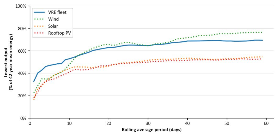
Also of interest from this paper is the figure reproduced in Figure 7 below.
It shows that when looking at 42 years of data, the worst day for solar is a little worse than the worst day for wind, about 18% of the long-term average for solar versus about 22% for wind. The worst day for wind and solar combined is much better at 33% of the long-term average.
Figure 7: Lowest output from VRE as a function of rolling average period from the Gilmore, Nelson & Nolan study “Quantifying the risk of renewable energy droughts in Australia’s National Electricity Market (NEM) using MERRA-2 weather data”.
The worst week is equally bad for wind and solar, both around 40% of the long-term average, rising to 50% when you consider their combined output.
Once the rolling average period exceeds 10 days, the worst periods for solar are much worse than the worst periods for wind.
Figure 7 shows a similar plot for this simulation. In general, the worst periods in this simulation are not quite as bad as the worst periods from the 42-year study, as you’d expect given that this simulation is only 4-years in duration.
But in some instances, particularly for wind rolling averages up to 7-days, they are quite similar.
This may well be because the wind in this 4-year simulation, being based on current wind generation, is less geographically diverse than the wind in the 42-year synthetic traces of their study, which is based on the future geographical mix modelled by the ISP.
Figure 8: Lowest output from VRE as a function of rolling average period from this 4-year NEM simulation
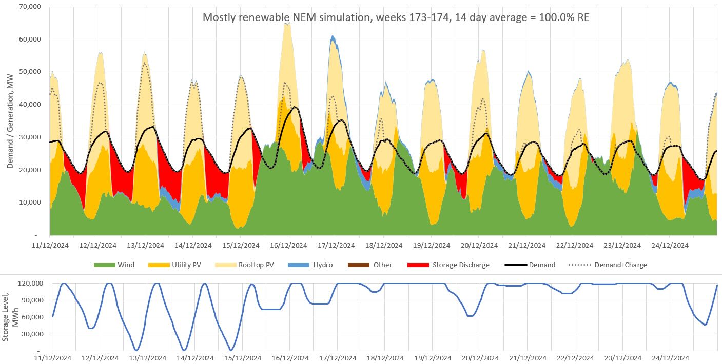
Week 173, starting on Dec 11, 2024, was the week containing the highest demand interval, peaking at 39.3 GW in the afternoon of Dec 16, or 64% higher than average. This was the highest demand ever seen in the history of the NEM. That day also had the highest average demand, at 30.0 GW or 25% above average.
Summer is when the NEM normally sees the day with the highest demand. Wind generation was 61% above average on this day, while utility and rooftop solar generation were 32% and 37% above average respectively.
Thanks to the above average performances from wind and solar, the day ended up being 100% renewable. It is not surprising that solar is a consistently high performer during summer heatwaves.
Perhaps less obvious is that wind is also outperforming on the most extreme demand days. Indeed, this study is increasingly showing that a highly renewable NEM with 5 hours of storage is well placed to deal with extreme demand.
Figure 9: Simulation of weeks 173-174. December 16 had the highest demand ever seen on the NEM, peaking at over 39 GW.
Figures 10 shows the average daily profile of all generation, storage and demand. It indicates that wind has a bias to night-time generation, complementing the solar profile.
The dispatch of hydro and ‘Other’ generation is highly biased to the night-time. Curtailment (not shown) is primarily during the peak solar hours, reaching a peak average value of 10 GW at noon. Average storage discharge reaches a peak value of 7.5 GW at 7pm.
Figure 10: Average daily profile of all generation, storage, demand and curtailment.
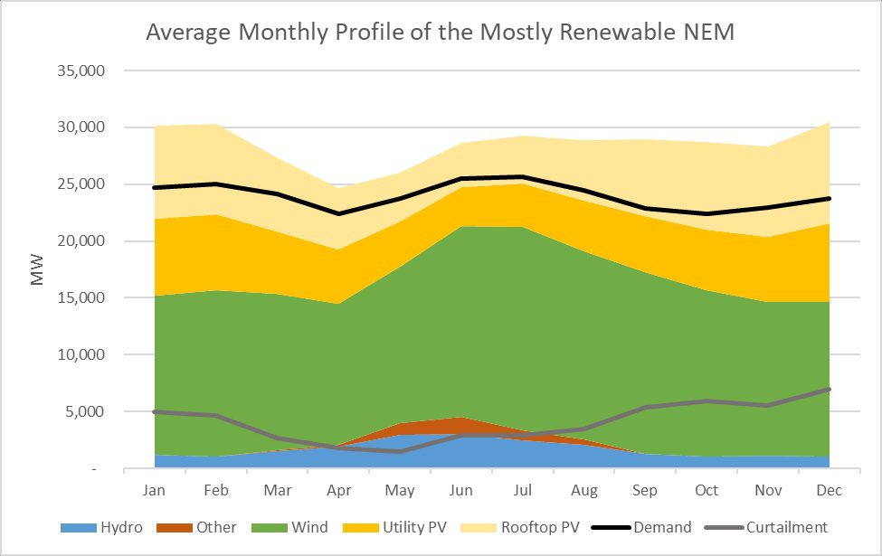
Figure 11: Average monthly profile of generation, demand and curtailment.
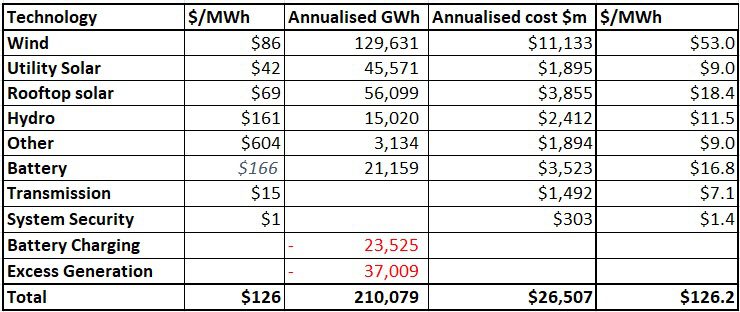
Table 3 and Figure 13 show that this near 100% renewable electricity supply is estimated to cost around $126/MWh, or $26.5b per year.
About 73% of this cost comes from the supply of wind, solar and hydro generation, 7% from ‘Other’, 13% from storage and 6% from extra transmission costs, beyond what we currently pay for transmission.
Table 3: Cost estimates for this near 100% renewable electricity supply.
Figure 13: Contributions to the cost of electricity. Note that the individual cost components do not match the corresponding $/MWh values in Table 3, as they have been re-weighted according to the proportion of generation from each component.
Capex and Opex costs are based primarily on the 2025-26 draft CSIRO GenCost report and from AEMO’s Draft 2026 Input and Assumptions workbook. Capex values are based on a 15-year average out to 2039.
For storage I’ve assumed 18 GW of 4-hr batteries and 6 GW of 8-hr batteries to achieve the assumed 24 GW / 120 GWh of storage, at a total cost of $31b, annualised to $3.5b per year.
Battery capex cost estimates have decreased slightly since last year’s prediction, though an increase in the discount rate from 6% to 7% has resulted in an increase in the annualised cost.
Costs for “Other” assume open-cycle gas turbines, with fuel cost of $13.5/GJ, heat rate of 10.8 GJ/MWh and capacity factor of 3.5%. Hydro costs of $161/MWh is based on a 10% premium to the average price that hydro received over the 3-year period 2023-25.
The $/MWh figures for wind and solar are pre-curtailment. Given that 12% of the wind and 20% of the solar generation was curtailed, the post-curtailment prices would be 13% and 25% higher respectively.
Transmission costs are based on the Draft 2026 ISP. Data from the ISP indicates that each MWh of non-curtailed utility wind and storage generation adds about $15/MWh in transmission costs.
This is then applied to the 100 TWh of additional post curtailment utility solar and wind generation used in this simulation relative to generation in 2022.
Costs for system security (primarily via synchronous condensers) are based on the Draft 2026 ISP, which forecast an average cost of $1.44/MWh throughout the 2040s.
Table 4: Emission estimates for this mostly renewable electricity grid.
Table 4 shows two estimates of the emission intensity of the simulated grid. The first estimate includes only direct (scope 1) emissions from each technology and arrives at a grid intensity of 9 kg CO2-e per MWh.
In this calculation, ‘Other’ is the only technology with direct emissions, assumed to be 580 kg CO2-e / MWh as appropriate for an Open Cycle Gas Turbine (OCGT).
The second figure is an estimate of the full lifecycle emissions, including the emissions associated with building each technology. The table indicates the assumed kg CO2-e / MWh for each technology.
The figure for the battery is based on assumed embodied emissions of 60 kg/kWh, appropriate for a LFP battery built in 2030. The resultant estimated full lifecycle emission intensity of the grid is 37 kg CO2-e / MWh.
It is worth noting that while the wind, solar & batteries have far lower emissions than the ‘Other’ on a per MWh basis, because they are producing far more electricity, the annual full-lifecycle emissions of the wind and solar generation (4.9 GT/yr) is more than double those coming from ‘Other’ (1.8 GT/yr).
The full life-cycle emissions from the batteries are also almost one third the annual emissions from ‘Other’. This emphasises that one should be cautious about aiming to fully eliminate ‘Other’ by building lots of over-generation or storage.
Each of these options involve embodied emissions that should not be ignored when considering the optimal mix for a very low carbon grid.
The 600 MT/yr of annual emissions due to the batteries are easily justified by the reduced emissions from ‘Other’ that those batteries enable, but that may not be the case if battery storage levels are increased dramatically beyond what is modelled in this study.
Along with cost, this is one of the key reasons that this study does not try to fully eliminate ‘Other’. The marginal cost of abatement becomes very high.
Nevertheless, the predicted full-lifecycle emission intensity of 37 kg CO2-e/MWh of this simulation is lower than virtually all major existing electricity grids in the world, particularly those without a majority of hydro.
As mentioned earlier, Australia’s current gas & liquid fuelled peaker plants are mostly likely to fill the role of ‘Other’ in the short to medium term. It should be noted that the importance of peakers such as these are not just a feature of grids with lots of wind and solar.
Even if nuclear was used to mostly decarbonise the NEM, gas peakers would play an important role on days of extreme demand, or during occasions when multiple nuclear units were simultaneously out of action.
It does not make sense to build a nuclear plant that is only required on rare occasions to deal with tail-risk events, just as it does not make sense to build lots of wind and solar farms to enable 100% renewable even on the days with very poor wind and solar resource.
There are far better ways to spend money to decarbonise our society than to build highly underutilised wind, solar, storage or nuclear to eliminate the last 1-2% of fossil generation from our electricity sector.
Except for a few grids mostly powered by hydro, all electricity grids around the world have a need for fossil peaker plants. All these grids will require a low-carbon option for ‘Other’ if they want to fully decarbonise.
There are a few potential options that could fulfill this role. One option is that the fossil plants could transition to being fuelled by renewable gases or liquids such as green methanol, methane, biofuels or hydrogen.
Another option is a greatly expanded demand response market. It is likely that in the future demand will be more responsive to price signals.
This is particularly true for demand due to charging of electrical vehicles, green hydrogen production, generation of heat (such as hot water) or water desalination. Any additional responsive demand is likely to reduce the requirements of ‘Other’.
This simulation has only used short-term storage. But long-term storage options like the 2.2 GW / 350 GWh Snowy 2.0 are currently being built, and they can also help to reduce dependence on ‘Other’.
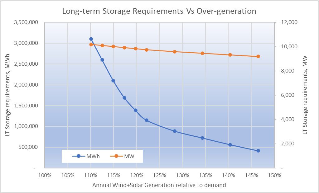
Indeed, this simulation suggests that Snowy 2.0 could reduce ‘Other’ from 1.5% to 0.9% of supply. To eliminate all ‘Other’ in my simulation would have required 10.2 GW / 3,100 GWh of long-term storage, in addition to the 24 GW / 120 GWh of short-term storage already discussed.
However, it is possible to reduce the GWh requirements of long-term storage to 900 GWh if wind and solar generation was increased from 110% of annual demand to 128% of annual demand, as shown in Figure 14.
Figure 14: Long-term storage requirements to remove all need of ‘Other’ as a function of wind and solar generation.
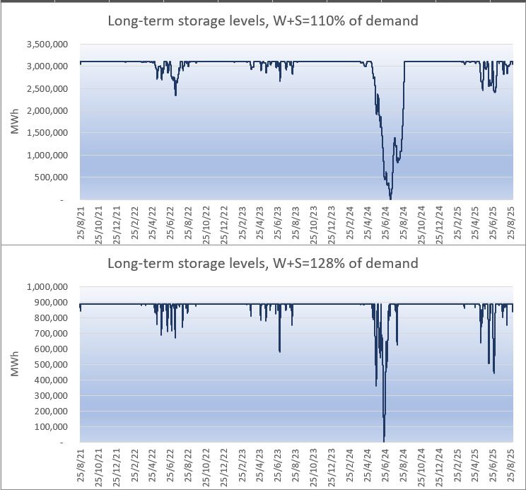
If we were to build 10.2 GW / 3,100 GWh of long-term storage to eliminate the requirement of ‘Other’ in this simulation, then the top chart in Figure 15 shows how the storage levels would have changed over the 4-year simulation.
Storage levels would have decreased to zero on 14 July 2024 after three months of poor wind and solar generation starting in April 2024.
As can be seen in this figure, long-term storage levels remained significantly higher during the other winters of this simulation. Indeed, only 900 GWh of long-term storage was required to get through these winters, less than a third of what was required for the 2024 winter.
The lower chart in Figure 15 looks at long-term storage levels if we instead increased wind and solar generation to 126% of annual demand. Under this scenario, long-term storage requirements would have reduced to 8.7 GW / 900 GWh.
In all these calculations, it has been assumed that the round-trip efficiency of the long-term storage is 70%.
Figure 15: Long-term storage levels over the 4-years of simulations as a function of wind and solar generation. The top chart shows the current simulation which had wind and solar generation equivalent to 110% of annual demand. The bottom increases both wind and solar generation by 15% to 128% of annual demand.
Another option to remove ‘Other’ is hydrogen. If some of the 16% of generation that was excess to requirements was used to generate hydrogen via 5 GW of 70% efficient PEM electrolysers, then it is estimated that they could have run at a utilisation of approximately 35% and produced about 330 million kgs of hydrogen per year.
They would have consumed 42% of the excess generation. If this hydrogen was used to fuel a hydrogen reciprocating generator with efficiency of 32%, then they could have generated 3.5 TWh/y of electricity, which is more than enough to cover the 3.1 TWh/y of generation coming from ‘Other’.
Approximately 330 million kilograms of hydrogen would need to have been stored prior to April 2024 to get through the challenging wind drought of 2024.
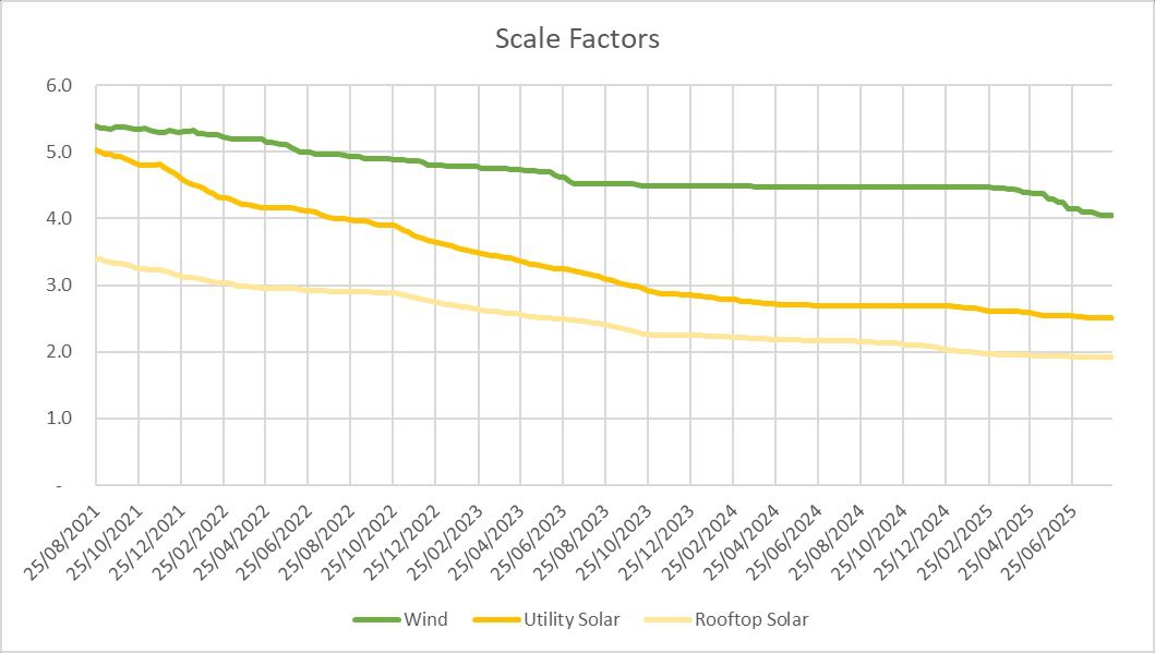
Each week, the scale factors are recalculated to get wind and solar reach their respective target annual penetrations. This results in them slowly decreasing with time, as more renewables are built and supply generation to the NEM, as shown in Figure 16.
The scale factors did not reduce significantly during 2024, thanks to poor growth rate of renewable generation and an increase in demand. Thankfully things have changed in 2025 and the scale factors are trending downwards again.
Figure 16: The change in wind and solar scale factors over the 4 years of this simulation.
Figure 17 shows how the results of the simulation change as the amount of storage is increased or decreased. It shows that the simulation is least cost with approximately 120 GWh of storage.
With less storage, the amount of supply from ‘Other’ increases rapidly, which increases the cost faster than the reduction in storage reduces it. There is very little gain for increasing the amount of storage beyond 120 GWh.
The increased cost of the extra storage greatly exceeds the reduced cost from ‘Other’ which decreases very slowly. Note that this assumes that the extra storage continues to be batteries. If a significantly cheaper form of long-duration storage becomes available then that would change the results.
Figure 17: Percentage supply from ‘Other’ and cost as a function of storage
Figure 18: Cost, spillage and ‘other’ fraction as a function of potential wind+solar generation. Cost with Demand Response shows how demand response can reduce the average cost of supply.
Figure 18 shows how changing the amount of wind and solar generation affects the cost, amount of spillage and supply from ‘Other’. The original simulation had wind and solar generation at 110% of demand.
The figure shows that the optimal amount of wind and solar generation is a little higher at around 113% of demand, though the difference in cost is very small. The savings from the reduced costs of ‘Other’ would marginally outweigh the extra cost of generation.
Figure 18 also shows a second cost curve ‘Cost with Demand Response’. This cost curve assumes that we find a use for 50% of curtailed generation. If that were to occur, average costs could reduce by 10% to $114/MWh, and the optimal amount of wind and solar generation would instead exceed 120% of demand.
Figure 19: Cost and curtailment as the target wind penetration is reduced and the solar targets increased.
The target penetrations of 60% wind & 45% solar used in this simulation were based on rough optimisation experiments conducted a few years ago. Since then, solar and batteries have come down in cost more rapidly than wind.
It is reasonable to expect that the optimal solution might now have more solar and less wind. New optimisation results were performed using the 4-years of data from this simulation, and the results are shown in Figure 19.
It turns out that the ratio of wind to solar in this simulation remains very close to optimal. If the wind target fraction was reduced by 10 percentage points to 50%, and the solar fraction increased 10 percentage points to 55%, then the storage requirements increase to 31GW/155GWh.
This is because, in my simulation wind provides an average of 208 GWh of generation during the 13 hours from 6pm to 7am. Changing the wind fraction from 60% to 50% reduces this night-time supply by an average of 17% or 35 GWh. Hence the extra 35 GWh of storage is required to maintain supply during the night.
Shifting generation from more expensive wind to cheaper solar would save about $900m per year, but this is almost exactly offset by an extra $900m per year in storage costs.
A similar story applies if the wind fraction is reduced another 10 percentage points to 40% and the solar fraction increased 10 percentage points to 65%. However, once the target wind fraction drops below 40%, then costs start to rise more significantly.
This is because the generation shortfall during winter starts to become more severe, which cannot be overcome by simply adding more short-duration storage. Instead, to maintain the supply demand balance in winter without significantly increasing supply from ‘Other’, more over-generation of solar is required.
Namely, a 10 percentage point reduction in the wind target to 30% must be offset by a 12 percentage point increase in the solar target, resulting in significant additional curtailment losses over summer as well as greater round trip storage efficiency losses.
In summary, it is ideal to have a near even mixture of wind and solar generation, due to their complementary nature with wind usually generating more during the night and winter. There is little difference in cost if the ratio goes 10 percentage points either way.
More solar generation results in reduced generation costs, but this is offset by higher storage costs.
However, if the bias swings too heavily towards solar, so that wind generation is less than 40% of annual demand, then more overgeneration is required to maintain supply during winter, resulting in greater curtailment losses in the summer months and higher total costs.
It should be noted that the split between rooftop and utility solar in this simulation was not an outcome of any optimisation experiments. I simply chose a split that seemed reasonable.
The cost estimates show that utility solar is about $27/MWh cheaper than rooftop solar, mostly thanks to the higher capacity factor of utility solar. However, this is partly offset by the extra $15/MWh cost of extra transmission required for utility solar.
Figure 19 shows a variety of Probability of Exceedance charts from the simulation. A few key points worth mentioning:
Figure 19: Probability of Exceedance charts for key variables from the simulation
Very close to 100% renewable electricity is feasible for Australia’s NEM at reasonable cost using just several hours of storage.
This simulation used 24 GW / 120 GWh (5 hours at average demand) and achieved 98.5% renewable supply at a cost of $126/MWh, including the cost of additional transmission, storage, curtailment and system security.
Costs can be reduced further to approximately $114/MWh if additional flexible demand is found to use half of the generation that would otherwise be curtailed.
Wind, solar & hydro generation directly supplied 88% of demand, without the need to pass through storage.
The predicted emission intensity of the simulation was 9 kg CO2-e per MWh when only considering direct Scope 1 emissions, or 37 kg CO2-e per MWh when considering full-lifecycle emissions.
The most challenging weeks in this simulation were all during late autumn or winter and were characterised by above average demand, poor solar generation and poor wind generation. On all days with extreme demand, during hot summer heat waves, wind and solar performed very well.
Approximately 10.2 GW of ‘Other’ generation was required to firm the renewable supply during the most challenging night of the simulation. Over the 4-years of this simulation it would have run at a capacity factor of 3.5%.
Legal bid to overturn state approval of a NSW wind project ends with a whimper,…
Safety has become one of the most defining priorities for solar and energy storage developers.…
The latest gas market outlook is less of a temporary supply-gap reprieve and more the…
Andrew Forrest says fossil fuels carry volatility, political cost and risks for mums and dads…
Tony Abbott's climate attacks inspired a local community to build a first of its kind…
A solar farm inspired by Tony Abbott's climate attacks has finally been opened. Mhairi Fraser…